Monday 18 September 2017

A review of similarities and differences in representations of the Resurrection of Christ with regard to that by Piero della Francesca at Sansepolcro


This article concerns various representations of the Resurrection of Christ as exemplified by the accompanying photos, all of which were taken by me using a phone-camera. Since becoming involved with possibly the most enigmatic example, that of Piero della Francesca (c.1412-1492) in Sansepolcro, I have been noticing other artists' versions in the museums and churches I visit on my travels. These other interpretations, all restricted more or less by the accepted iconography of the subject, do however vary quite a lot, while one or two have clear similarities to Piero's icon.

Before proceeding, a short history of the iconography of the Resurrection might be helpful. In early Christianity, the Resurrection event, which is not described as such in the New Testament, was represented by symbols indicative of the victory of Christ over death (and sin): the first two letters of the originally Greek word 'Christ' in Greek are: Χ and Ρ (chi and rho). These were shown, superimposed such as one might still see in churches today, above a simple Cross and surrounded by a wreath. Later images included the two or three Marys at the tomb, engaged in conversation with an angel who was often seated on a non-Biblical Roman sarcophagus - Christ having been buried in a tomb excavated in the rock; others showed Mary Magdalen talking to the Risen Christ whom she had mistaken for a gardener; sometimes the soldiers, sleeping or not, were included, but not Christ himself. The inclusion of Christ, especially as the central main focus, began seemingly, in Italy, sometime in the 1300s. A final observation concerns the 'tomb' itself: in the Biblical account, Christ was laid to rest in a tomb supplied by a rich man, a Hebrew tomb in Palestine of that period, meaning a hole in a rock, sealed with a large stone. This is significant because the images we normally see do not show a rock tomb, but a Roman-style sarcophagus; indeed, occasionally, both a sarcophagus and a rock tomb are represented! In the image below, Piero has adhered to the contemporary iconography in which there is a Roman-style sarcophagus and no sign at all of a rock (actually a rock wall) with a large hole in it. (1and Note)


Resurrection by Piero della Francesca, fresco (after 1458?, c.1469 according to Longhi 2) in Sansepolcro
(normally, the word 'fresco' is used to describe the technique which Piero used here, but the recent restoration work has shown that, in fact, a considerable portion of this masterwork was not done in 'buon fresco', that is, it was done in 'fresco a secco'. See Note below)


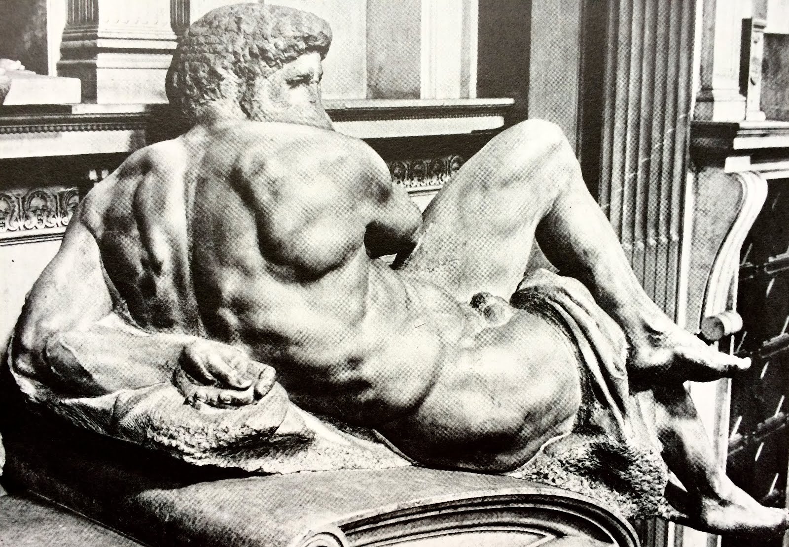
The article will proceed in a kind of ad hoc fashion, that is to say, not in a chronological sequence of examples, so, to begin, let's look at two sculptural versions, produced roughly 150 years apart. The first is, to my mind at least, a surprisingly modern-looking work, and forms the central panel on the front of a sarcophagus (that is, a sarcophagus on a sarcophagus), now in the Museum at Santa Croce in Florence. The work of a wonderfully robust sculptor called Tino da Camaino, it is a marble sculpture in, let's say, low relief with high relief elements. As can be seen from the photo, it bears an uncanny resemblance to Piero's painting, with Christ smack in the middle, his right leg up on the front edge of his sarcophagus (Piero's Christ has his left leg up); in his right hand he holds his victory flag, and in his left, unlike Piero's, he holds a book. Like Piero's Christ, he looks directly ahead of himself, in a way through us and over us. Although the sarcophagus is clearly different in the two works, the inclusion of the sleeping soldiers, who occupy the entire foreground of these powerful statements, is similar in both; perhaps not easy to appreciate at first glance, there are actually three men shown here, in Tino's relief, only one of whom is more or less fully visible: his two companions are indicated by torsos and heads! But these crammed-in, sleeping men are almost Modernist in their necessary synthesis; large, clean forms, conveying both weight and mass, similar in some ways to the work of Jacopo della Quercia. Horizontal deep sleep contrasting with vertical hyper- alertness!


Resurrection by Tino da Camaino, marble sarcophagus (c.1318-19), Museum, Santa Croce, Florence

The next piece is a masterwork by the Florentine sculptor, Donatello; it too is the central panel, this time on one of the sides of one of two bronze pulpits he made for the beautiful church of San Lorenzo, also in Florence. The odd thing about these pulpits is that they bear little or no similarity to the usual rotund form of pulpits, but look rather more like sarcophagi (possibly because Donatello studied ancient Roman examples). These panels however are in bronze and so visually operate differently from Tino's stone work, and from Roman examples: they depend for a start on the reflections of light bouncing around on the polished bronze which had elements finished in gold and silver as well. 

Here there are several deviations from the usual iconography: to begin with, the figure of Christ is not in the centre of Donatello's composition, but radically to the left side; he has his left foot up on the sarcophagus, he carries the flag of victory but, very unusually, is still wearing the winding sheets in which he was buried. And this Christ is not looking in our direction at all, he appears to be looking at some future known only to himself, and from which we, at present, are excluded. In this image, we still have the sleeping guards, dressed in their finest armour 'da parata', that is, parade armour; they are obviously deeply asleep and Christ is very much alone -  and like Tino's, alert! Here again, the sleeping soldiers occupy the entire foreground with our point of view, uncommonly, being from below (note the underside of the lid of the sarcophagus; in fact, in the church, we do look up at these pulpits). But, because Donatello has placed his Risen Christ so far to the left, he has, uniquely, filled the background with a double-arch architectural setting; this is reminiscent of his Siena baptismal font relief, The Feast of Herod. Donatello loved to create deep space with the use of the then newly-rediscovered perspective but, in this particular image, there being no iconographical motive to include architecture at all, he has been quite restrained. This work, as with much of Donatello, is surprisingly rough close to, and, as such, again reminds us of Modernist 'truth to materials', this roughness revealing the fact that the original for this bronze was, of course, made in clay.


The Resurrection by Donatello, bronze pulpit (1460-67) in San Lorenzo, Florence


The next image we might look at is a small painted panel which is part of a much larger painted wooden Crucifix, in the Duomo, or cathedral, of Pistoia. It was painted by Coppo di Marcovaldo in about 1274; at this time, such large painted wooden crosses - three metres or more - were to be found in many churches, at least in Tuscany: we also have examples by Cimabue and Giotto. But our interest is in the beautiful, elegant and refined Medieval representation of the Resurrection. It predates Tino's sculpture by about 44 years and the iconography is also older. In fact, in this image, there is no Risen Christ, instead what we see is the Biblical angel, seated on the edge of the non-Biblical sarcophagus, with its lid askew and the winding cloth still visible inside; it is unclear whether this image is meant to suggest that the sarcophagus is within a rock, or standing in front of a rock or hill. The angel is there to inform the three Marys, on the left, that the one they are searching for has risen, that they will not find Him there any longer.

One thing immediately strikes us, apart from the important absence of any Christ figure, and that is the Medieval, not to say Byzantine, representation of the 'landscape' features: both the rocky hill (or rock-tomb) in the background (?), and the stretch of ground in front (?) of the sarcophagus are treated in exactly the same way, and with the same tones in the colours. There is virtually no attempt to convey the idea or, better, the 'reality' of a real, tangible place: what we have here is rather, an 'idea' used to convey the notion of 'outdoors' as opposed to 'indoors'. The three 'objects' are related in space by being placed one in front of the other: the stretch of ground (?) is placed in front of the sarcophagus, and that in turn is placed in front of the large hill - or protruding from the cave of the rock. Note also that the angel, being a heavenly messenger, is somewhat larger than the earthly Marys. But the most important difference is in the iconography itself: we know that Christ has risen but He is nowhere to be seen. This version of the event, without Christ standing at or floating above (see below) his tomb, is the more strictly correct one, in terms of what is retold in the New Testament. And, further, there are no sleeping soldiers!


The Marys at the Tomb by Coppo di Marcovaldo, 
one panel from a large wooden Crucifix (1274) in the Duomo of Pistoia


The next example (below) is a very large fresco, painted on the ceiling of the large Spanish Chapel, at Santa Maria Novella, in Florence. It was painted after both Coppo's panel and Tino's sculpture. The entire wall surface, and the ceiling of this chapel, are covered in beautiful and (at least some) socio-historically interesting frescos - this because they show certain historical figures and an image of the cathedral of Florence, before Brunelleschi's dome had been built. What is of immediate interest though is the representation of the Resurrection as, in this case, we have an example of both the older and the newer iconography in the one painting.

Andrea di Bonaiuto has included a number of different events in the one large image, although it is obvious that each occurred at a different time. But, from the point of view of this article, his inclusion of both the Biblical story and the later iconography, of Christ rising out of his tomb, with all their attendant details, is most unusual. Let's have a look at them: on the extreme left we see a symbol of a city, probably Jerusalem, out from which seem to have come the three Marys who now appear to be in conversation with one of two angels seated on the sarcophagus. On the right, we have the later scene where Mary Magdalen encounters someone who looks like the gardener but is in fact the Risen Christ. Returning to the central scene, with the two angels on the sarcophagus, we have the traditional Biblical ingredients, minus the rock tomb; however, above and below - or, in front of - the sarcophagus, we also have respectively, the Risen Christ (shown as it were, floating above) and the sleeping soldiers: this later iconography being seamlessly melded with the earlier one. 

Incidentally, in Andrea's fresco, there are six sleeping guards, a couple of whom are dressed in oriental style, that is, not Roman; on at least one shield are inscribed the letters of the Roman republic: SPQR. The figure of Christ is shown as suspended somewhat above the main action, encircled by an aureola(e), or 'mandorla', of divine glory or grace; he is a sublime figure, clothed entirely in brilliant white, and is clearly meant to be seen as such. We might mention here as well, the not-casual representation of the background landscape, 'framing' as it does the main event, scattered with symbols of trees (not portraits of individual real trees) and even another city in the top right. This landscape is interesting as it is in some elements echoed in the Piero della Francesca version.


Scenes of the Resurrection by Andrea di Bonaiuto (also known as Andrea da Firenze), 1365-67, fresco
The Spanish Chapel, Santa Maria Novella, Florence

The next two paintings are included here precisely because they do have clear concordances with the image at Sanseplocro by Piero della Francesca. The first is by a wonderful Renaissance painter called Andrea del Castagno (1421-1457) and the second is by an anonymous Florentine(?) artist. An important point here is that Andrea del Castagno lived and worked mainly in Florence and his masterpieces are there, including his work in the refectory of the convent of Sant'Apollonia, of which his much deteriorated Resurrection is a part. In Andrea's fresco (not a good photo unfortunately) we can see a number of elements which remind us of Piero's great painting, such as and particularly, the horizontal band across the lower third of the image, formed by the sarcophagus and the sleeping soldiers in front if it. One soldier especially is of interest and he is the one with his head propped up against the edge of the tomb; this figure is very similar to a soldier in Piero's painting, in almost the same position. We do not know if Piero ever saw Andrea's fresco but, in general terms, there are some striking similarities: as mentioned, the disposition of the soldiers and the sarcophagus; the figure of Christ supported on the edge of the tomb; the victory flag - although in the other hand; the partially exposed torso, and the trees on either side of the picture. Given these similarities in the two images in question (Piero's and Andrea's), it would seem possible that Piero was influenced by Andrea's work but, as just noted, the date of Piero's fresco is actually unknown at present.


Resurrection by Andrea del Castagno, 1447, much-damaged fresco, Sant'Apollonia, Florence

The next image shows a version I discovered only recently, near the northern Italian city of Piacenza. It is painted on the wall of a small chapel in a small Romanesque church situated on the top of a fortified hill called Castell'Arquato. Although the hands are doing different things in the work by the anonymous painter, the general position of Christ, and the general composition of the image, are very similar to Piero's, so much so as to seem to me to have been directly influenced by him. Apart from the stance of the Christ, similar to that of Piero's image, and the horizontal sarcophagus, parallel with the picture-plane, as in Piero's, note the framing architecture, much simplified but also present - as beautiful Corinthian columns - in the Sansepolcro fresco.

Let's look at the soldiers particularly: again, four men, disposed as a tight group in front of the sarcophagus; the one in red in the centre resembles in many respects the soldier in the same position in Piero's picture, even in the way his head is leaning against the edge of the tomb. The soldier on the right, with his back to us, also mimics in his pose the corresponding soldier in Piero's painting; and, to 'seal the deal' so to speak, the figure on the left, forming as he does a rough triangle with his position, is obviously taken from Piero, where the same figure is a masterpiece of Renaissance composition (and a much more definite triangle). It is interesting to note here the difference in the handling of the same element, that is, the position and drawing of this particular soldier: in Piero's case, a strong, clear structure, containing in its solitariness a forceful humanist emotional charge; while the figure by the anonymous painter, partly perhaps because it is derived from elsewhere and not the original scheme of that artist, is weak and sloppy, lacking any interior force or conviction 3. The anonymous work at Castell'Arquato is a decoration purely and simply, it carries no power of either religious or emotional import, its innate aesthetic heritage is Medieval even though its putative form is of the Renaissance (the sarcophagus drawn in perspective is not possible before that time).


Resurrection by an Anonymous Painter (Florentine?), late-1400s (?), The Chapel of Saint Catherine of Alexandria 
Collegiata of Santa Maria Assunta, Castell'Arquato (near Piacenza)


The image below takes us into another, later period, that of Venetian Mannerism. It was painted by Titian as one side of a processional banner but was later modified to function as an independent picture to be hung on a wall. It is already different from the paintings we have so far examined in that it is a painting in oil on canvas; the others we have seen  have been either in fresco, on a wall, or in tempera on wood. This image is different in many respects from that of the earlier Piero della Francesca: our position is low in respect of Christ, in fact, we can see the soles of His feet! On the other hand, our position in relation to the soldiers is somewhat equivocal: we seem to be more or less on the same level as the they are, although perhaps not really.

Christ is shown floating high above the sarcophagus, looking away into a distance which does not involve us; the sarcophagus is oriented at an angle to the plane of the canvas, pointing slightly upwards because of our viewpoint, and the soldiers are represented as being in a state of confusion, definitely awake, except oddly for the central one. The soldier on our left is actually the largest figure in the composition, a painter's - and Venetian - device to indicate proximity to the scene on the part of the viewer. To my mind, Titian's picture, while obviously of its time, could better function as simply an image of the Risen Christ, that is, with the Christ as the sole subject; the lower part of this painting is rhetorical and over-stated for modern tastes or, at least, for mine.


Resurrection by Titian (Tiziano Vecellio), oil on canvas, 1542-44 
Museo Nazionale delle Marche, Palazzo Ducale, Urbino

The following two images are both from the late-Medieval period, containing many contemporary devices but, at the same time, also indicating future developments. The first, by Benedetto di Bindo, about 1412, shares a few elements with the version of Piero della Francesca, not the least being a (certain) knowledge of correct perspective (in the sarcophagus); the lid of the tomb however, indicates that he still has something to learn! But the central, upright Christ and the geometrically constructed sarcophagus are pointers towards Piero's image. The background unfortunately, is an extremely bland suggestion of place; the soldiers are positioned in a balanced fashion, one at either end of the sarcophagus, and two stretched out at its base. In my opinion, a fairly dreary, unthoughtful image.

The second of these two is by Ugolino di Nerio and dates from about 90 years before the di Bindo. Although the earlier work, it is far more engaging, more thoughtful, and as such, more succinct. In both these pictures, Christ is placed in the centre of the composition, with one foot up on the edge of his sarcophagus; both carry the banner of victory, and both are set in a symbolically-represented landscape, Ugolino's being, while still conservative, clearly the more interesting. I don't know this but I suspect from the condition of the colours that Ugolino's picture has been restored, whereas Benedetto's hasn't been; naturally, this makes a great difference to their 'legibility'. Ugolino's painting indicates that he is apparently unaware of perspective drawing, his sarcophagus being typically Gothic in its odd management of planes and geometric space. Nevertheless, there is force in his Christ and beauty in his colours; the reclining positions of his soldiers have been studied and this has added to  their diversity and interest. He has moreover, balanced the straight lines of the sarcophagus with the gentle curve of his rocky background.


The Resurrection by Benedetto di Bindo, predella painting, c.1412. Siena


The Resurrection by Ugolini di Nerio, 1324-25, predella painting, probably tempera
 National Gallery, London

The final painting is again a predella picture, that is, one of a series of small paintings placed in the carpentry of the frame at the base (predella) of a much larger altarpiece. This one is extremely interesting because it is an example of the type which contains both forms of Christ's 'tomb', that is, the Biblical rock with a hole in it, and a Roman-style sarcophagus; this little painting also has what may be understood as a heavy stone 'door', apparently just dislodged by the divine event here portrayed. The 'rock' is represented as an independent outcrop, in a red landscape, with a walled city in the left background, and a temple (?) in the right. Four sleeping soldiers, two leaning against the rock, two stretched out on the ground in front of it, complete the iconography. Christ is shown in a Gothic 'S' pose, but with clear classical references in His structure. This painting too is a decoration, fulfilling certain iconographic requirements, but offering little else. 

The date of 1480, years after Piero della Francesca is believed to have painted his masterpiece in Sansepolcro, is telling: even at that 'late' date, many artists were still influenced by earlier (late-Medieval) aesthetics; in stark contrast with this however, note the completely Renaissance interior - that is, drawn using perspective - partly visible here to the left in this photo. To be fair, even today, there would be many who would find Piero's image far too refined, far too 'essential', and who would prefer the pleasing decorativeness of Matteo's image, or something similar. Matteo's painting is a delightful thing in its own right and I don't wish to sound as though I don't like it or approve of it; there are many different pictures as there are many different types of people who look at them - or who don't!


The Resurrection by Matteo di Giovanni, 1480, probably tempera, predella painting. Siena


The representation of the Risen Christ is, quite apart from the setting of the scene, one of the main variables in images of the Resurrection; it may be put into three rough categories: the uncommunicative and unattainable divine being (Andrea di Bonaiuto and Titian); the divine-man type, severe but consonant with us, if unrealisable (Piero della Francesca, Donatello and Tino da Camaino); and the softer, gentler type, neither man nor divine, a mere symbol (the Anonymous painter, Matteo di Giovanni, Ugolino and Benedetto, as well as, unusually, Andrea del Castagno 4). Naturally, the absence or non-representation of Christ carries with it other, some may say deeper, spiritual significance.


1 The elegantly simplified sarcophagus in Piero's painting, and in Andrea del Castagno's as well, seems to be a free interpretation of classical sarcophagi; I say this because all those that I have seen, including in Rome, have been considerably more elaborate in their decoration and never, in my experience, with coloured marble inlay or panels. Sarcophagi have enjoyed an exceptionally long vogue in Western culture, being in continuous use from Roman times, through the Medieval period into the Renaissance and much beyond. The point in the frescos of course, was the generalised reference to classical models and the requirement for a clearly horizontal formal element, at least in Piero's case.

An example of a Roman sarcophagus, decorated in a relatively restrained way
Museo Nazionale Romano Terme di Diocleziano, Rome

2 Roberto Longhi, Italian art historian and author of the vastly influential Piero della Francesca (amongst much else), first published in 1927. Longhi's dates for Piero's works are approximate, as they must be, there being a depressing lack of contemporary documents concerning either Piero or his paintings.


3  Some texts claim that the Saint Catherine chapel in the Collegiata at Castell'Arquato was constructed and frescoed at the beginning of the 15th century, others give a date of 1455! In my opinion, the fresco we are looking at could not have been done as early as the beginning of the 1400s, and is much more likely to be the work of a minor painter of the period post-1450. 
Although I would give only a very approximate date for the anonymous Resurrection at Castell'Arquato (late-15th century to early 16th), in relation to the probable influence of Piero della Francesca, as mentioned, scholars have in common that they can't agree on the dating of most of his works. If Piero's version of this subject was painted later than the middle of the 15th century (for example, Longhi's date of c.1469), then I would be confident in saying that his Resurrection was the iconographic source for the image at Castell'Arquato.           

4 Andrea del Castagno, usually a robust and forceful painter, is not well-known for the Resurrection image discussed here, but rather, amongst others, for the much larger fresco below that, his Last Supper, a stupendous piece of Renaissance painting, not to mention perspective construction.


Andrea del Castagno, the Last Supper, 1447, fresco in the refectory at Sant'Apollonia in Florence. 
Above it, to the left, may be seen his Resurrection, as well as other images. On the left wall is a detached fresco of the Crucifixion, also be Andrea.


Note:

Piero della Francesca, detail of the restoration of his Resurrection in Sansepolcro, being carried out this year. The restorers have removed the infill around the painted fictive frame, partially damaged when the fresco was moved, at some time in the past, together with the part of the wall on which it was painted; obviously, when the restoration is complete, all these 'discoveries' will be hidden once again. In relation to the iconography though, it is interesting that the soldier on the right seems to be leaning his elbow on a rock; that rock may have some reference to the legend concerning the founding of the city of Borgo San Sepolcro, as it was originally called, according to which the town was founded by travellers on their way back from the Holy Land, carrying some rocks from the Holy Sepulchre: hence the name of the city itself, in Italian: Sansepolcro.

In relation to fresco technique, there are two basic methods: in Italian, buon fresco or 'true fresco', where pigments mixed with water are painted directly onto wet plaster; there is no opportunity to correct using this technique, once the plaster has dried. The other is, in Italian, fresco a secco ('when dry') that is, painting on top of true fresco with pigments mixed with a range of binders, such as tempera or oil. The problem with this latter method is that it is not nearly so permanent as true fresco and the risk of the paint falling off the surface is always a problem.


Thursday 17 August 2017

Some thoughts on 'Modernism' in Late Medieval Italian Art


In these first 17 years of the 21st century, with Modernism and its descendants as part and parcel of everyday life, at least in Western countries, one is struck by the 'Modernism' or modernity of various periods in the history of western art. Even certain aspects of ancient Egyptian art strike us today as 'modern', that is, modern in a 20th or 21st century way; of course, they were 'modern' also in the time in which they were produced! Often we forget, as just alluded to, that when 'ancient' or medieval or Renaissance art was made, at that time it was 'modern'; in fact, Vasari, a 16th century father of art history, referred to the work of some of his contemporaries as 'modern', and said that they were working in 'the modern style'.


At Palazzo Massimo alle Terme, Rome, a 1st century BC Greek bronze of a Boxer, seen here from the back, found in Rome during an excavation. This image is included to demonstrate what is was that early and later Christian artists rejected; this is clearly not a religious subject but, just the same, this kind and level of imitation of Nature gradually became of less and less interest for the developing Christian faith.

Here we need to be careful, as with all history, not to read our perceptions of present-day reality into the work of the past; the way we might, for example, describe a social situation today may not have anything to do with the way people of a given earlier period understood that same social situation; much less can we judge them for their social arrangements. Similarly, we need to be careful about applying the term 'modern' to work clearly not produced in a period we today might reasonably refer to as 'modern', with regard to ourselves; seeing a similarity is one thing, interpreting it is another. However, when recently visiting some very beautiful old places in Italy, it often occurred to me just how 'modern' many old things looked.

In this article, I would like to discuss some late medieval works, keeping in mind what has just been said above. We could begin with a carving, a relief-sculpture, on the side of a sarcophagus which is now displayed in the museum at Santa Croce, in Florence. It is a stark, frank and deliberate work, made by the Sienese artist, Tino di Camaino. The subject is the Resurrection and, both in its essential formalism and straightforward statement, easily calls to mind many aspects of early 20th century Modernism. In fact, this carving was made approximately 700 years ago and is not 'Modernist' in the sense that a Mondrian or a Henry Moore is. 


 Tomb of Gastone della Torre, Archbishop of Milano, later, Patriarch of Aquileia (d. Firenze 1317) by Tino di Camaino, Siena c. 1280-1337; Santa Croce, Florence

Although made around 1317, this powerful smallish work anticipates at least one compositional characteristic of Renaissance painting and that is its dependence on the stability of the triangle or pyramid as a basic structure or armature. The scene is set within a square format and, on closer scrutiny, we can see that the figure of Christ is placed in the vertical centre, with the slope of his shoulders towards his raised knee and his left arm, creating 'linking' lines towards the bottom left and right corners, thereby forming a triangle with Christ's head as its apex. The 'structure' is very solid and is reinforced by the weighty forms of the sleeping guards crowded into the base of the composition, in front of Christ's sarcophagus itself. The clear similarity to the great masterpiece of Piero della Francesca must be obvious, not just in this triangle-based structure but also in the way the Christ is placed, his pose; not to mention the 'incomplete' guards: these figures are forced into the lower third of the scene, as in  Piero della Francesca's fresco, but, as well, they are not fully visible - that is to say, parts appear to be missing - as has been noted concerning the guard with the red shield in Piero's painting. In Tino's relief-sculpture here, only one of the guards has any hope of being accommodated in this space, with the remaining two managing to have only their heads and upper torsos squeezed in! Tino's career overlapped that of Giotto (in fact, they died in the same year) and it is interesting to see the re-awakening of awareness of 'Classical' art, meaning normally ancient Roman art, in both men: the more angular, upright, straight-lined approach, so to say, of Tino's Risen Christ, has something more of Rome about it, and somewhat less of Byzantium 1.


The Norman cathedral of Monreale in Sicily, begun 1172, whose incredible mosaics adorn nearly all the interior surfaces of this stupendous building. Note the hierarchical disposition of the saints below Mary and the angels, themselves below Christ Pantokrator.

Typical medieval and Gothic religious art tended to reject Classical models, instead deriving substantially from Byzantine aesthetics 2. The 'modern' look comes from the historical process of a rejection of 'pagan' (Classical) forms - imitating as they did to a very high degree, what was in Nature - and the search for a means of representation much more related to the spiritual aspect of life, a kind of step-up from ephemeral Nature per se, into the realm of the transcendental spirit, as well as a clearly hierarchical view of the 'order' of things. It may be noted here the preponderance of linear or frieze-like structure in much ancient Roman work, in other words, a kind of democratic or republican view, where everyone (theoretically) was on the same level. This view persisted to some extent in the late-classical-Byzantine work to be seen in Ravenna for instance; but gradually, the Orthodox hierarchical attitude took over. And, although ancient Roman art was in many respects quite pared back, and Byzantine work on the other hand quite elaborate, as 'barbarian' tribes and cultures began to overrun the late western Roman world, some visual art became more simplified, that is more schematised, more 'symbolic'. The aim also of much art, particularly and most importantly religious art, was to clearly convey a message, often a quite complex one, to a largely illiterate population; clearly legible forms with easily identifiable actors and attributes were the basic requirements of artistic production, along with the need to have these messages comprehensible from some distance, for instance, from quite high up on the facades of Gothic cathedrals 3, or from the high internal walls of those same churches as well as the walls, both interior and exterior, of public buildings such as town halls.


David and Ezechiel, in the Palazzo Farnese, Piacenza: 'School of Piacenza'; second half of the 12th century. Note the almost African stylisation of the faces and the Giacometti-like elongation of the bodies, together with the important rhythmic/structural function of the line work. The two figures still have something of the original square form of the blocks of stone they were made from and so we have 'truth to materials' as well, another Modernist concept.

When we see ancient or very old artworks that remind us of modern aesthetics, we are not therefore necessarily able to read and comprehend either the intentional meaning or the 'artistic' suppositions which produced the work in question. The didactic function (intentional meaning) of much religious art in the medieval period, and therefore its physical forms, are almost at polar variance with the intentional meaning of a lot of early Modernism which, partly as a reaction to the material titillation of Impressionism, sought a far more intellectual approach to both form and content. Such intellectualism would have communicated next to nothing to an illiterate peasant living in medieval Europe; just as the extremely highly-refined illuminated manuscripts, both secular and religious, of the same period, destined for a much smaller, educated elite, would have been so much 'Greek' to those same peasants.

Propagation of the Christian message was the principal scope of religious art, not really individual expression as such. That given however, within the often-repeated themes of the Life and Passion of Jesus for example, with the constant refrain of the same symbols and attributes of both Christ and the other figures in these narratives, it is surprising just how distinct are the individual characteristics of the artists who made that art. Nevertheless, the artist as individual, not to mention the artist as independent intellectual - as opposed to mere tradesman or artisan - was to all intents and purposes, a long way off in the future of art history. What is more surprising then is that artists were able to 'express themselves' to the extent that they did: within the subject of large, suspended wooden crosses, for example, at first glance very similar to one another, there are marked differences between the work of one artist and the next.

This particular subject required a painted image of Christ on the wooden cross - a type known as Christus patiens 4 - itself a very large and heavy piece of carpentry, with images of, on one end of the cross-bar St John, and on the other end, Christ's mother Mary; at the top there was usually the sign with the letters INRI which could be handled in different ways; at the base of the cross, normally some representation of Golgotha and a skull and perhaps some additional elements. Today, in Italy, many of these crosses have been or are being restored and happily, we can now see them once again in their extraordinary beauty - and understand why they were such powerful statements. But here also, given the very restricted iconography, artists were able to imbue these symbols with a high degree of personal formal interpretation and, therefore, individuality.


Crucifix, 1380 by Niccolò di Pietro Gerini and Pietro Nelli, Sta Croce, Florence. This example is complete, having the images of both Mary and St John in place, as well as the sign at the top and the skull together with additional saints or donors at the base. Above the INRI sign is an image of a pelican feeding its heart to its young, an obvious symbol of the sacrifice of Jesus. All the gold-leafed carpentry is intact. 


The badly damaged and now restored symbol of the disastrous 1966 flood in Florence, the stupendous Crucifix by Cimabue, in the Sacristy, Sta Croce, Florence. In iconographical terms, it is complete but the flood waters have left irreparable lacunae in the body of Christ. It is remarkable that these Crucifixes are about double life-size, in any case, very big!


The beautifully restored Crucifix by Giotto (c.1315) hanging in the church of  Ognissanti, Florence. It is missing its conclusion at the base, the blood from Christ's feet normally shown flowing onto a skull, the symbol of both Golgotha and Adam, below the base of the Cross. This example is interesting in that it has an image of God the Father (?) above the sign at the top; note the 'wings' of decorative work on either side of the body of the cross, below the crossbar. The shape of the frames around the smaller images is that used to enclose narrative scenes in other situations, such as the doors (north and south) of the Baptistry in Florence. Note that the Cross is blue and that blue appears in the three minor sections as well.


Another beautiful Crucifix by Giotto, 1290s (?), this time hanging in the church of Santa Maria Novella, Florence. It has the usual images of Mary and the young St John at either end of the crossbar but, below the base of the Cross, it also has a kind of naturalistic representation of the the hill called Golgotha, where Christ was crucified. In this hill is the skull and, in fact, the blood coming from Christ's feet runs down onto this little hill. Again, as in the other example by Giotto, there are decorative 'wings', as it were behind the body of Christ.

This Crucifix (1265), another by Cimabue (thought to have been Giotto's master), hangs in the church of San Domenico, in Arezzo. Like the Giottos, it has 'wings' below the crossbar and, like the other example here by Cimabue, the body of Christ has a typical Gothic 'sway', forming a kind of elegant 's' shape.


An example of a Christus triumphans-type of Crucifix: note that the figure is 'alive', looking at us, and clothed. This example, also known as the Volto Santo (Holy Face), is in Sansepolcro, near Arezzo, and is thought to date from the 10th or 11th century. Unlike the previous examples, it is a polychrome sculpture, not a painting. See Note 4 below.

One reason why it is relatively easy for contemporary viewers today to see 'modern' traits in older artwork is that, since the advent of the Renaissance, with its heavy focus on imitation of Nature - an explicit goal - art has appeared to look more and more 'real'; we could say that, since the then-renewed interest in classical art (Greek and Roman) artists have indeed developed their 'realism' to an astounding degree. So much so in fact, that the average viewer (as opposed to the specialist), when confronted with many of the 'developments' of the early 20th century, saw nothing other than childish simplification. When we see even older work, that is pre-Renaissance, its apparent simplification is precisely what reminds us of 'modern' art, understood as 20th century Modernism. What seems now more likely, is that early Modernists, those working in a figurative style at any rate, were actually returning to a kind of pared-back statement, a more synthetic, purified symbolism, more akin to some medieval aesthetics than to those developed in and since the Renaissance 5.

A particular hall-mark of say, Nicola Pisano, or Tino di Camaino, and a lot of Modernist figuration, is that both deal with the subject of a given work and not with its embellishment; in other words, they both produce succinct, frank statements, dependent wholly or mostly on the representation of the overt subject of the work, devoid of unnecessary or gratuitous decoration or elaboration. An example of this, by the perhaps less well-known Fra Gugliemo da Pisa, is his pulpit (c. 1270) in the church of San Giovanni Fuorcivitas, in Pistoia 6. This characteristic (of specifically dealing with a work's given subject), especially following the Academic and other excesses of the 19th century, and the subsequent counter-development of Modernism, makes works of this type 'aesthetically' accessible to modern viewers.


The marble pulpit, c. 1270, by Fra Gugliemo in the Romanesque church of San Giovanni Fuorcivitas, Pistoia (Tuscany). Note the almost crowded composition, dealing only with the subject event of each panel; no superfluous details. Influences here from ancient Roman sarcophagi.


1 Compare Tino's Risen Christ with the photos of the David and Ezechiel in this article: note the apparent angularity of Tino's work as compared with the sinuous, flowing 'harmony' of the two Old Testament figures. Tino is searching towards a representation of the way a body actually looks as opposed to simply remaking a standardised symbol.

2 Here we should note that, even in the period we might refer to as 'late medieval', artists, such as Nicola and Giovanni Pisano for instance, were already beginning to look anew at Classical art although the general aesthetic of that time was still 'late-medieval' - also known as Gothic (a long and complex study of its own but a term which covers particularly the late-medieval period).
  We may further observe that the monumental or commemorative sarcophagus was itself a 'Classical' art form and still very popular in medieval times. It became even more so during the Renaissance when, however, a declared interest in - and indeed love of - Classical art in all its forms was the prime aesthetic driver of visual art.

3 This requirement of easy legibility, especially from a distance, was one which dated back to the Egyptians and Assyrians and helps to explain the often monumental scale of paintings and sculpture in later public buildings such as churches.

4 The 'Christus patiens' type took over from the earlier 'Christus triumphans' type: respectively, an almost-nude figure clearly demonstrating the suffering, both spiritual and physical, of Christ; the latter, a usually clothed, 'living' figure with arms outstretched in (happy?) triumph over death (or sin).

5 In this regard, it is interesting to contemplate the confused approach of the so-called Pre-Raphaelite Brotherhood, with its astonishingly fanciful notions of the 'purity' and 'simplicity' of the art which preceded Raphael. Part of its members' problem was that they were living in exactly the same period as the heyday of Academicism and, unwittingly it seems, were not able to free themselves from many of the excesses they claimed to stand against. The work of the Pre-Raphaelites is a romantically confused jumble of mis-understood and poorly comprehended art history, fed as much by their Victorian and insular taste as by any clear philosophical conception. I have never seen any Pre-Raphaelite head or composition which even remotely reminded me of the candid, frank and clear-eyed works of a Pisano, a Lorenzetti or a Tino di Camaino, much less a Giotto or a Duccio! 

6 Interestingly, this pulpit, and others like it by Nicola and Giovanni Pisano, all have this 'crowded' composition, often with events occurring in successive 'waves' from the top of the image to the bottom; this same characteristic was later picked up by the Mannerist painter Pontormo, although with clear influences from Michelangelo as well. Michelangelo's use of the crowded composition, whose first manifestation is his very early Battle of the Centaurs, may plausibly be a result of looking at the work of those late-Medieval masters, as well as at the antique Roman sculpture available to him at that time - the same which may have influenced those Medieval artists!


Sunday 6 August 2017

The Restoration of Pietro Lorenzetti's Arezzo altarpiece


Hello Everyone!


This is the first article for a while as I have just returned from Italy where I spent the better part of two months, together with a few days in London. Those of you who follow me on Facebook will know that I came back to Australia with a mission: to raise money to help with the restoration of an altarpiece painted by the Sienese artist, Pietro Lorenzetti. This article will explain a little more the reasons why I have chosen to make this a 'cause', and, I hope, will also stimulate some of you to contribute something to the restoration. An account has been opened to accept donations in Australia but there is an account in Italy as well. Please contact me for details.


In this close-up (here shown horizontally) of the sword held by the saint in the top left-hand compartment in the photo below, is Pietro's signature, in Latin; it reads: PETRUS ME FECIT (Pietro made me).

Pietro Lorenzetti was born in Siena in about 1280 and died there, it is thought in 1348. He was the older brother of Ambrogio Lorenzetti, famous amongst other things for the frescos known as the Allegories of Good and Bad Government in the Town Hall (Palazzo Pubblico) of Siena. Pietro also did some important frescos in the lower church of San Francesco at Assisi.


This photo shows the complete altarpiece, painted in 1320-24, which measures 298 x 309 cm; it was taken before the restoration began. 

My interest in this work goes back to sometime in the 1990s when I lived in Italy (1989-1994). I visited Arezzo several times in those years - and have done several times since,  most recently this year - and, apart from visiting the church of San Francesco where the extraordinary frescos of Piero della Francesca are (in the Bacci chapel, the Legend of the True Cross), I usually tried to see the other churches as well. One of these, also in the centre of Arezzo, is the so-called Pieve or parish church of Santa Maria; apart from being itself a fantastic, ancient structure, it is the home of Pietro Lorenzetti's wonderful altarpiece. This painting, a polyptych painted in tempera on wood panels, was exhibited on the altar which stands in a raised part of the apse, accessible by staircases on either side. It always struck me as odd that such a magnificent work of art was there, alone and apparently unguarded! Normally, I had this masterwork to myself and I found it fascinating in that way that one might find a handsome or beautiful foreigner intriguing or fascinating: I loved looking at it even though I couldn't really understand its language!

This picture was begun in 1320 on the commission of the bishop at that time, a certain Guido Tarlati. It was painted for the high altar of the Pieve and that's where I have always seen it. It is interesting - and almost incredible - to reflect that when I first saw it, this painting was almost seven centuries old and now, in three years' time, it will actually be 700 years old! Perhaps this is one reason why I can claim to have only a superficial understanding of its language!


A close-up, taken in the laboratory of RICERCA in Arezzo, of the central panel of the altarpiece: the small white areas are where earlier restorations have been removed, an initial phase of almost any modern restoration.

Recently, in June this year, I was back in Arezzo and, remarking to some friends that I wanted to visit the Pieve and the Lorenzetti, I was told that it was not there, but being restored at a studio in Arezzo (RICERCA Studios); however, since the restorers were friends of my friends, that we could drop in and have a chat to them. This we did and I was very fortunate to meet two of the three extremely highly-skilled women doing the work. One of them explained exactly what was happening to the various panels of the altarpiece, by now dismembered and lying on different tables, in varying early stages of the restoration. It was also explained that, although they had all the necessary permissions from the Italian government to actually proceed with their work, they had no money! At this point, and given that Pietro's masterpiece had for so long had a hold on me, I offered to try to help them raise some funds, if possible, enough funds, to complete the job.


Another photo taken in the restorers' laboratory (studio) at the request of Beatrice, one of my Arezzo friends; she was particularly interested in Pietro's rendering of the buttons on the saint's garment!

This wonderful piece, for some years now, has spoken to me and that is why I want to support its restoration today. Since the 1990s and right up to the present day, I have seen so many things restored in Italy, everything from statues and paintings to palaces and churches; the difference between 'before' and 'after' is that between night and day, or black and white. I expect the same will be the result of the restoration of Pietro's beautiful work underway now.


Another Pietro painting, about1315, this time from the Museo Horne in Florence: notice the buttons on the shoulders!


The two photos above show the interior of the Pieve di Santa Maria at Arezzo together with the usual position of Pietro's altarpiece; in the church, for the time being, the altarpiece has been replaced by a 'life-sized' digital photograph, which is what you can see here.

Further details of the restoration in Arezzo can be found by doing a Google search which will take you to various articles, in both English and Italian, about the restoration; you will also find information about the restorers doing the job and their laboratory which is called R.I.C.E.R.C.A.

By the way, in case anyone is thinking of a trip to Italy which may include Arezzo - which I would strongly recommend - in the same church, i.e. the Pieve, there is another recently restored fresco, on one of the pillars on the same level as the Pietro: Saints Francis and Dominic, attributed to Andrea di Nerio (1331-1369). See photo below. Naturally, there are many other notable and beautiful things to see in this building alone, not to mention numerous other important works of art in different places in the city.


Saint Dominic by Andrea di Nerio


Incidentally, the bishop Tarlati who commissioned the Lorenzetti altarpiece died in 1327; his imposing and very interesting monument can be seen in the Cathedral of Arezzo, together with many other important things, including the Magdalen by Piero della Francesca.


Wednesday 15 March 2017

Contrapposto (and Michelangelo)


In some previous articles, mention has been made of the concept of 'contrapposto' and it has since seemed that the term itself may need some explaining. The word 'contrapposto' comes from Italian (see Latin contraponere) and, as used in an art-historical sense, means "placed against; opposing or opposite". The term was coined to describe the system of balancing 'weight-on' and 'weight-off' parts of the body - the so-called Canon of Polykleitos - devised by the 5th century BC Greek sculptor and theorist Polykleitos. Polykleitos sought balance and symmetry in sculpture and devised a system for achieving these, which he called his Kanon. This was only one of the developments (note, not improvements) in Greek art away from the conventional static quality of, for instance, Egyptian work. This Greek approach could be seen in the Renaissance in, for example, Donatello's Saint George or in Michelangelo's David, both early works by both artists and relatively static compared with their later pieces. 


The Laocoön, now in the Vatican Museums: a Roman copy (?) of a Hellenistic original, probably in bronze. According to Pliny, it is by Agesander, Athenodoros and Polydorus and is thought to date from between 27 and 68AD. Unearthed in a garden in Rome in 1506, with Michelangelo one of the first to see it.

Contrapposto as a way of composing a figure - in painting and in sculpture - was re-discovered in the Renaissance but was originally a development of Greek and then Roman sculpture, as examples such as the horsemen on the west side of the Parthenon frieze, the Diskobolos, Laocoön, and many other classical works show. With the advent of Byzantine art, and its emphasis on frontality and hierarchy, contrapposto appears to have largely died out. In art history or analysis, the word indicates a representation of, usually, a human figure (but not exclusively: see the horses in Leonardo's Battle of Anghiari), with some parts moving in one direction, and others moving 'contra' or against those ones, in an opposite or opposing direction.


This section, known as the Battle for the Standard, of Leonardo's original fresco was copied in 1603 by Rubens from an earlier print (1553). The original fresco, dating from 1505, is thought to have been destroyed although some believe that traces remain under the later works by Giorgio Vasari, in the Salone dei Cinquecento, in Florence.

Renaissance sculptors, in their search for ever more realism, gradually abandoned the fairly static and emblematic figure (for example, Donatello's St. George from Orsanmichele in Florence), which had its function as symbol of either religious belief or temporal power (or both), and, with the concepts of Humanism and science in mind, began to move towards more complex and, at least initially, more varied compositions of the human figure. This kind of composition was usually used to demonstrate motion, that is, figures not in standing repose, but performing actions involving a change in position as for instance, Leonardo da Vinci's Battle of Anghiari or, Battle for the Standard, 1505, once in the Salone dei Cinquecento, Florence (see image above). Michelangelo, a supreme master of contrapposto, used it as well however, for figures in reclining repose: his four stages of the day - Dawn, Day, Dusk and Night - are all figures in repose or, at most, in languorous movement (in the sense of amorous longing); that is to say, they are not 'action' figures such as were Leonardo's in the Battle of Anghiari 1.


A copy (by Aristotele da Sangallo?) of Michelangelo's Battle of Cascina, based on Michelangelo's own cartoon for the proposed fresco - both now lost. Note the numerous examples of contrapposto.
(Photo: Wikipedia. Public Domain)

Mention might be made here of Michelangelo's own work in the Salone dei Cinquecento, 
his Battle of Cascinabegun when Leonardo was working on the Battle of Anghiari; both are examples of an event where many figures are caught in sudden activity. In this also-lost work, which we know from Michelangelo's own drawings and contemporary copies (sometimes, copies of copies), contrapposto is, as it were, let loose in various figures and is no clearer than in the lower-central figure, a beautiful typical example (possibly to later reappear, with variations, on the Sistine Ceiling as the Libyan Sibyl).


A long view of Masaccio's Trinity fresco in Santa Maria Novella in Florence.
The photo, by the author, gives some idea of the size of this masterwork, painted about 1427.

A perfect example of the persistence of medieval stasis (that is, a certain static quality) and hierarchy in the early Florentine Renaissance, is Masaccio's Trinity fresco in Santa Maria Novella (Florence). The general composition (without the barrel vault) derives from earlier models and this particular one, showing God the Father supporting the crucified Christ from above and behind, stimulated later artists. All the figures in this large painting are shown as still, there is no present movement although preceding and potential movement or action may be inferred in all the actors; all are shown traditionally - that is to say, without notable use of contrapposto - in profile, fully frontal or turned slightly towards the viewer. Masaccio's more life-like rendering of the weight of bodies and garments, and the physique of the dead Christ, are (seemingly) sudden developments; but his rendering of the space in which this transcendental event occurs, by way of his use of the lately-perfected perspective drawing, adds a revolutionary element to the established iconography, making it therefore, a Renaissance artwork, not possible before that time.

The example of Masaccio's Trinity is a good one because it contains the three principal modes of representing the human figure which were, as described above, in profile, from directly in front, or turned slightly towards or away from the viewer; Giotto, amongst others, including Masaccio in his Tribute Money fresco (Santa Maria del Carmine, Florence), also showed people with their backs to the viewer: a formally subtle method of implying space or strata of action in space. All these modes were of course in use during the Renaissance and after, but the development and use of contrapposto, by Michelangelo in particular, introduced not only more 'realism', but also, more space. His extraordinary sculpture of Day (the Medici Tombs, Florence), has its right shoulder drawn around towards the left, as too its right leg; however, the left leg is drawn over the right, thereby creating an opposing movement - or, the contrapposto. And, just to be sure we didn't miss it, the figure's head is turned to the right, that is, against the direction of the shoulder, and the left arm is pulled around and across the massive back. The whole figure is made as though one were taking two objects joined by a string, and, holding one in each hand, twisting them in opposite directions. This clear opposition of direction is not the same as merely having the body of a figure slightly directed in one direction, but having the head, for instance, turned in another. There is nothing out of the ordinary about such a posture, on the contrary, it's an extremely natural one (for example, Michelangelo's David); by the beginning of the 16th century however, contrapposto implies, very often, extreme or exaggerated opposing movement within the one figure - whether standing or reclining - as in Michelangelo's Day 2.


Day by Michelangelo, a marble sculpture (after 1533: De Tolnay), 
 one part of the Medici Tombs at San Lorenzo in Florence.

Unfortunately, contrapposto became an end in itself so to speak, used gratuitously, and often unsuccessfully, to add drama and life to, especially, 'istoria' - history painting (as Alberti and Vasari would have said) - but also in fact, to show-off the artist's skill in being able to draw the human figure in difficult poses, imitating Michelangelo. Michelangelo himself avoided this particular problem, of gratuitous use, notably in his sculptural work, because nearly all of his statues are single or, at most, double figures. The drama exists in the figure itself and is not related to 'external' narrative 3, thereby avoiding the almost nonsensical use of contrapposto which plagued painting, especially from the middle decades of the 16th century onwards; the visual result occasionally resembled nothing so much as physical discomfort!

It may be argued that even Michelangelo may have got a bit carried away with contrapposto in his painted work, and most obviously so in the Sistine Chapel (both the ceiling and the altar wall frescos), for instance, in the Death of Haman. Nevertheless, the expression of internal struggle, feelings and emotions in flux, conveyed by Michelangelo's contrapposed figures usually succeeds for precisely that reason, that is, that his figures express in their sometimes contorted poses, their 'real' internal ambivalences or contradictory impulses - Michelangelo's own of course! In that sense, contrapposto is analogous to his sometimes divergent and recalcitrant leanings or desires. Contrapposto was as well for him, a means to convey controlled, rhythmic progression of movement, from and through one part of a body to another; in doing this, he was able to involve us as viewers in a more physical way, as it were a more carnal way, in the substantiation he sought in his figures. 

The Renaissance wish to (eventually) obtain increased movement was in direct opposition to earlier static and frontal images; some, such as Piero della Francesca and Domenico Veneziano, notwithstanding their being Renaissance artists, still maintained a high level of stasis - understood as immobility - even when movement was implied (in hand gestures and so on). Ghirlandaio's frescos - also in Santa Maria Novella - indicate just how far Florentine artists had got with their imitation of reality; in some ways, his frescos are the late-15th century equivalent of a (religious) soap opera, dealing as they do with as much of the mundane as he could get into any given image (in stark opposition incidentally to Piero della Francesca's 'reticent' accumulation of detail). But the figures remain static - in spite of Ghirlandaio's extremely beautiful and highly-skilled work - as though the movie camera had stopped rolling, so to say. The so-called terribilità (Vasari) of Michelangelo on the other hand, very different from the ordinariness of humdrum, day-to-day living, is in no small part due to his powerful use of contrapposto which, as already implied, acted as an energetic and life-giving technique for the stone (and equally, for the flat surface) on which he worked, while at the same time, reflecting or expressing his own personal, internal dilemmas.


1 One clear example of figures in action in the work of Michelangelo is his very early Battle of the Centaurs, about 1492 (De Tolnay); in this small, high-relief sculpture kept at the Casa Buonarroti in Florence, Michelangelo has his earliest contrapposto in the standing nude figure in the centre-left, amongst others; although, as remarked elsewhere, in his Virgin of the Stairs, of about the same time, the infant Christ is shown in a typical Michelangelo contrapposto. See also his David-Apollo in the Bargello, his model for a Hercules and Cacus, in the Casa Buonarroti, amongst much else.

2 'Piero della Francesca - The Flagellation' by Marilyn Aronberg Lavin, published by The University of Chicago Press, 1972, 1990: p 75 - referring to "the statue on top of Christ's column": "Its nudity and its pose (a third repetition of the contrapposto) relates to ...".

This art historian was also a spur to write this article: in her extremely detailed analysis of Piero della Francesca's Flagellation, Marilyn Aronberg Lavin made reference to a small gold statue situated on the top of a column in the flagellation part of the painting, citing it as an example of contrapposto. In fact, in the text, she refers several times to Piero's use of contrapposto. The author of this most valuable treatise takes the term 'contrapposto' to refer to any standing position which is not bolt upright and, in the case of the diminutive golden statue, identifies the distribution of the figure's weight onto one leg, causing a sloping of the hip, as a pertinent example. As must be obvious from the present article, the meaning of contrapposto for me is wider: in fact, we are hard-pressed to find any example of contrapposto, as used by me, in the oeuvre of Piero della Francesca; by a 'restricted' definition then, many of his figures are in contrapposto (for example, the Christ in his Baptism). Certain unusual figures of Piero do however fall into the meaning of contrapposto as used in my article: at Arezzo, for instance, in the lunette containing the Death of Adam, a youth seen almost from the back and leaning on a staff, contrasts markedly with the other figures, made in Piero's usual way, and is in contrapposto in the way that later Renaissance artists would make common; another example from the same place, is the white-hatted groom to the left of the scene of the Queen of Sheba in Adoration of the Wood (feet and hips in one direction, chest and head in another).

However, the characteristic of most of his figures being drawn in the modes described above - that is, in profile, from the front, or only slightly turned (occasionally also from behind) - is one of his most important, and helps to explain why Piero holds the particular place he does in the hearts of so many art historians who deal with the Renaissance. Piero is so stimulating and enigmatic because his images are a kind of (deliberate?) bridge between the old world of medieval and Gothic sensibilities (and possibly, as argued elsewhere, even Byzantine) and those of the emerging Renaissance. His ethos is one of 'statement' - subtly and almost bluntly simultaneously - and not one of seduction.

A quick check of various sources will reveal that Aronberg Lavin was adhering to the classical meaning of the term 'contrapposto', which described any redistribution of the weight, from bolt upright, in a standing figure. From that definition, I'm not sure whether the Laocoön would qualify as an example of contrapposto or not! Just as a starting point, many, many painted and sculpted contrapposto figures, including some from the classical period (Greco-Roman), were not standing! Michelangelo made and painted both standing figures and many reclining ones, the latter apparently not warranting the description of 'contrapposto'!

3 Obviously, as in the case of the Medici Tombs, there is an implied narrative of sorts, a symbolic, mythological one, and the four figures representing the stages of the day are consequently related to one another; however, as is usual with Michelangelo, each figure may be read as completely independent and therefore containing within the particular marble block all the necessary elements for its reading or interpretation (not to mention enjoyment!).