Thursday 3 August 2023

Some Remarks Concerning 'Sinopie'


Detail of the sinopia of an Annunciation by Puccio Capanna (or, Pace di Bartolo) in the Pinacoteca Comunale di Assisi (Photo: the author)1


What are 'sinopie'? Sinopie are, to put it simply, drawings made with a particular red paint using a pigment which originated near the Black Sea at a place then called Sinope (now, Sinop), hence sinopia; the particularity of this word is that it refers nearly always to the preparatory drawing made by artists as a step in the process of fresco painting. And why are they, sinopie, of any interest, of any importance? They are important because they reveal to us, after hundreds of years of being 'hidden', the creative thoughts, not to say skill, of the artists who made them.

In Italy, between about 1300 and 1500 2, the painting of frescos was, to all intents and purposes, the principal means of expression for painters, not to mention their principal source of income; frescos are normally painted on walls, very commonly on the walls of churches. But they could be, and were, painted on the interior walls of town halls and private houses for example, as well as on the exterior of buildings, both public and private. The other main way for painters to earn a living was by painting altarpieces - usually for churches - and these, unlike frescos, were painted on wooden panels; there was also a difference in the paint used: fresco uses pigment mixed with water, while tempera is pigment mixed with egg or glue. The especial quality of fresco (a fresco or affresco in Italian) is that the water paint is absorbed into the plaster (the intonaco) while it is still damp and, through a chemical reaction with the lime in the plaster, becomes an integral part of that surface; it does not sit 'on top of' the plaster, it is part of it.

The painting of a fresco requires several steps, each of which is crucial to the physical longevity of the work, that is, to the physical integrity of the work as a manufacture; the 'artistic' result, as always, depends on the character and skill of the artist. The first step was the preparation of the wall to be painted on; this entailed the application of a layer of rough 'plaster', known as arriccio; this layer, rather rough in texture, separated the wall from the painting surface as well as providing a foundation for that surface; this latter, a smooth plaster layer known as the intonaco was the layer on which the actual image would sit - or, better, into which it would be absorbed. It is between these two layers of preparation, the arriccio and the intonaco, that we find the sinopia.

If the sinopie are hidden - under the intonaco - how do we know about them? People involved with the making of frescos (painters and patrons) have, of course, always known about them; however, in modern times, many sinopie have come to light because of damage to the upper layer, that is, to the image itself. One of the most important, and destructive, examples of this was the great flood which occurred in Florence on November 4th, 1966; that flood, which took the level of the Arno River several metres above normal ground level, did untold damage to thousands of works of art, not only to frescos. However, as a direct result of this flood, many frescos, dating to pre-Renaissance times and after, were detached from the walls on which they had been painted and restored, some obviously with more successful results than others. In the process of lifting a fresco from a wall (see below), that is to say, the top layer with the image 'in' it, the arriccio is revealed and with it, the sinopia. Let's have a look at some examples.


The sinopia of  a detail of Buffalmacco's painting (1336-41) the Tebaide  in the
Museo delle Sinopie, Camposanto, Pisa
(Image courtesy of Wikimedia Commons, photo credit Sailko)

Given the period in which this work was made, the late-Medieval, the drawing is astoundingly 'modern' and of such high quality. For our purposes, the important point is the very existence of the sinopia; not only does it confirm the use of this technique at that time, so long ago, but, as mentioned earlier, it allows us a glimpse into the mind of the artist, of Buffalmacco, as he devises his composition (see the article in this blog entitled Buffalmacco at Pisa). This is because, although compositional drawings on paper do exist from this time, they are extremely rare: and this because normally, the composition and the individual figures were developed there and then, on the arriccio itself. The painter would first sketch his ideas onto the arriccio in charcoal then, once happy with this, go over the drawing with the sinopia, the red paint from which the drawing takes its name. The charcoal would then be dusted off in readiness for the application of the intonaco; the intonaco, an extremely fine plaster, was translucent enough to enable the painter to see his drawing, the sinopia, underneath.


Madonna and Child with Angels, sinopia, early 15th century, by Paolo Schiavo (born Paolo di Stefano  Badaloni), 1397 - 1478; 
in the Church of Santi Apostoli, Florence (Photo: the author)

This superb drawing, controlled with a central vertical line as suggested by Cennino Cennini 3, again demonstrates the extraordinarily high level of skill attained by Italian masters, this time during the Renaissance itself. Like many such sinopie, but not all, there is a relatively high degree of detail, especially in the folds of the garments worn by the Madonna and the Christ Child. Again, as with too many frescos, there is obvious damage to several parts of this work, notably on the left side and along the bottom (the church, Santi Apostoli, is situated only metres from the Arno). Frequently, damage is due to water leaching through the walls on which frescos sit, producing salts which eventually seep through the plaster and destroy the colour. Sometimes though, the damage was deliberate, as when tastes changed and even very important pictures - such as by Giotto - were either hacked off the wall or whitewashed. This latter expedient however has occasionally worked in the opposite direction insofar as certain paintings, such as the Giottos in Santa Croce in Florence, were unintentionally preserved precisely because they were only whitewashed - then to be rediscovered many years later! (As also occurred incidentally with the Byzantine mosaics in Hagia Sophia in what was Constantinople, now Istanbul). Sometimes as well, war is to blame; but sometimes, natural disasters such as earthquakes are the culprits.


Sinopia of the fresco San Girolamo penitente (The Penitent Saint Jerome), c. 1492
by Bartolomeo della  Gatta (born Piero di Antonio Dei), 1448 - 1502. (Photo: the author)


The Penitent Saint Jerome, fresco by Bartolomeo della Gatta, c 1492 (Photo: the author)
Both this fresco and the sinopia above are in the Museo Diocesano di Arte Sacra, Arezzo


The fresco above, a very large work - slightly damaged and once in the cathedral in Arezzo - is quite a bit more developed than its sinopia (also above) might have led one to anticipate. In fact, in this case, especially compared to the two previous sinopie, the drawing is little more than a sketch and seems not to include the smaller 'life-stories' dotted around the top of the finished fresco. The completed painting is a powerful work, beautifully coloured and shows a typical view of Saint Jerome chastising himself in his desert cave; we know who the saint is because of his 'attributes', in this case, the lion and the (anachronistic) cardinal's hat beside him. Bartolomeo della Gatta was a monk as well as, according to Vasari, a polymath (but who wasn't in those days!), being in addition to a painter, an architect, a musician and an illuminator of manuscripts. Quite a lot of well-known artists were in fact monks, friars or priests, including Beato Angelico, Filippo Lippi, Fra Bartolomeo and Sebastiano del Piombo, to name a few.

As far as the fresco technique is concerned, the sinopia was not the only way of working from a drawing, although it would seem to be the oldest. As the 15th century became the 16th, two other ways of preparing a drawing for a fresco were developed. The first was the so-called spolvero technique which entailed making a drawing at the same size as the intended fresco and, placing that drawing onto the arriccio or onto the wet intonaco, the artist would 'pounce' (a little bag filled with charcoal dust) over the previously-made holes in his drawing, thereby creating a type of 'join-the-dots' image, which he subsequently did, to end-up with his newly transferred drawing; if directly onto the wet intonaco, then only the part he was about to work on that day. This is important because, in what's known as buon fresco painting, the intonaco must be damp so that the paint will become one with the plaster; should the painter wish to add details or correct something after the plaster is dry, it is no longer buon (or, true) fresco but rather, a secco, that is, 'when dry'. The problem (with a secco) is, given that the paint is now on the plaster and not part of the plaster, those parts painted a secco tend, over time, to drop off. In fact, many frescos have a secco additions, or rather, had a secco additions! At any rate, the second and related way, a kind of intermediate step, of getting a drawing onto the intonaco, was that of the quadrettatura, or as we say in English, 'squaring-up'; this involves drawing a grid of squares onto a small drawing or sketch - where most problems could be worked out in advance - and then transferring the 'contents' of each square onto a larger grid on a large sheet, or sheets, of paper; this latter is the same size as the intended fresco or part thereof . 


A very large drawing on 19 sheets of paper glued together: A group of Men-at-arms for the Martyrdom of Saint Peter fresco by Michelangelo in the Pauline Chapel in The Vatican. This cartoon (c.1546-1550) is in the Museo e Real Bosco di Capodimonte, Naples (Photo: the author)

This fantastic work, known as a 'cartoon' (cartone in Italian: heavy paper), already discussed in this blog (see Concerning Borrowings), has visible holes along all the major lines - an obvious sign of the use of spolvero -  and we know that it was utilised for a smallish part at the lower left of the large fresco which Michelangelo painted in the Vatican (Pauline) chapel. This is therefore an example of the spolvero technique being used by a major painter in the middle of the 16th century. A variation of this technique, without the charcoal dust, was the use of a stylus to draw over the lines of a cartoon which had been placed on the wet intonaco; the stylus, applied with some pressure, would leave an imprint of the drawing's lines in the wet plaster and the painter would then proceed as normal. Michelangelo himself used this method in at least some parts of the Sistine Ceiling frescos, the imprint of the stylus still clearly visible in the plaster.


Lamentation over the Dead Christ with Two Angels, c. 1447, by Andrea del Castagno (1419-57); detached fresco. 
Cenacolo di Sant'Apollonia, Florence (both this photo and the next by the author) 


The sinopia of the fresco, in the photo above, by Andrea del Castagno; both photos unfortunately not as clear as they might be.


The two works shown here, and the details which follow, all by the painter Andrea del Castagno, demonstrate the incisive power of expression as well as the emotional depth of this wonderful artist 4. What struck me when I first saw these works in person (Andrea's work does appear in general art history books) was the beauty and extreme mastery of his drawing; having studied at art schools (in Melbourne) in the early 1970s, and being painfully aware of my own shortcomings in this regard, these drawings - not to mention the frescos themselves - came as an enormous shock. A close look at the sinopia reveals not only the beauty and even elegance of his line, but also its precision; the lines 'carry' or intimate the form, not just the shape - even where there is little or no shading - similarly to the way they do in Michelangelo's drawings. And the lines we are seeing here are made with a brush! - albeit perhaps on top of a prior charcoal drawing; note especially the angel on the right, his arm and particularly his face, not to mention the torso of Christ.


The two images above show details of the Lamentation over the Dead Christ by Andrea del Castagno, just discussed (again, not the best photos!)


I have included these two photos so that readers might have a better idea of the work under discussion and to show how such paintings look after having been restored. Contemporary restoration of artworks demands that while lacunae may be in-filled with completely reversible paints, 'corrections' and even 'improvements' are absolutely to be avoided - practices unfortunately very common in earlier times. In the lower photo is fairly easily visible a 'frontier' so to speak between the original part of the painting - the upper part - and the work of the restorer: almost the entire lower portion of the sarcophagus and of the decorative border are restorations. But the photos also reveal what the drawing, the sinopia, has become; in some cases (not this one), from a personal point of view, one might occasionally prefer the exquisite sinopia to the finished fresco! 5

A brief reference now to the actual methods used to remove a fresco from its wall; these are two: the stacco and the strappo. The former removes the pigment layer and a good bit of the plaster while the latter removes only the colour layer with a very small amount of plaster (the decision about which to use depends on the condition of the fresco). Both methods involve glueing layers of material, usually canvas, to the front surface, the actual painting, and, once dried, pulling the now glued plaster surface off the wall; it is at this point that any sinopia becomes visible (still on the arriccio underneath). Again in both cases, excess plaster is removed from the 'back' of the intonaco and another canvas is applied there; after this, the canvas on the front is carefully removed and the now-detached fresco is attached to reinforced masonite sheets. At this point, the fresco is ready to be placed back in its original position, usually of course, after a thorough restoration, or to go into a museum, such as has happened with the della Gatta Penitent Saint Jerome above. 

In conclusion, mention might be made here of an altogether more 'brutal' method of getting a fresco off a wall or, better said, removing a fresco; this because in fact, it is the entire section of wall on which the fresco sits which is bodily removed! This also is a very old technique and involves the careful cutting, around the edge of the picture, of the stones or bricks which make-up the wall itself, and through an obviously very laborious and difficult process, moving that part of wall to another location (where it is inserted into another wall). Perhaps the best-known of this type of transfer is that of the great Resurrection fresco of Piero della Francesca in Sansepolcro; originally situated it is thought in another room of the council building, it was removed - with its wall - to its present site, a fact re-confirmed by the most recent restoration.


The Resurrection by Piero della Francesca, 1458 (?), fresco, 225 x 200 cm - here without the painted columns at the sides. Museo Civico, Sansepolcro 
(Photo: by the author, post the recent restoration)


* Sinopia - singular; Sinopie - plural

1 This beautiful sinopia has been discussed previously in this blog's article entitled 'Bits and Pieces'.

2 Fresco painting has been known since ancient times, not only in the West but also in India and China. The best-known early frescos in the West are probably those at Pompei where many are still in situ while others have been moved, together with those from Herculaneum, to the Museo Archeologico Nazionale di Napoli (MANN), a wonderful museum worth the visit to Napoli all on its own. Frescos from various periods however may be seen in many museums throughout Italy.

3 Cennino Cennini, Il libro dell'arte (The Book of Art), written towards the end of the 14th century or in the early 15th, is an invaluable 'recipe book' for contemporary art restorers and historians. It is what is sometimes referred to as a 'libro di bottega', or, 'workshop book': in other words, a workshop manual of recipes and procedures for apprentices working in an artist's studio - at the time, and later, a kind of studio-cum-retail shop. Cennino's advice concerning the painting of frescos, and other things, has been a critical, indispensable source of knowledge of late-medieval workshop practice.

4 For further discussion of Andrea del Castagno, please see the article in this blog entitled 'Reflections on the Writing of Art History'.

5 An excellent discussion (with one reservation) of this topic, in English, is to be found in a catalogue - actually a small book - of an exhibition held at the Metropolitan Museum of Art in New York in 1968 (later at the Rijksmuseum and in London): The Great Age of Fresco - Giotto to Pontormo (various authors). The one problem I found with this explication of the fresco technique was one which is common: that is, that the specific and critical translucent quality of the intonaco is not properly explained. If the intonaco were not translucent, what on earth would be the point of making such beautiful drawings (the sinopie) if the painter then covered them up in such a way that even he could no longer see them? From a technical point of view, this point is manifestly important but, for some reason which escapes me, art historians and others explain the fresco procedure in such a way that the sinopia is basically rendered useless by the application of the intonaco layer!


Saturday 15 July 2023

Small 'formelle' with low-relief sculptures from the 14th and the early 15th century


A view of the city of Florence seen from the church of San Miniato; in the centre is the Duomo, the cathedral, with its famous dome and, beside it, the bell-tower or Campanile. The tower further to the left is the one at the Palazzo Vecchio. (Photo: the author)


Although many art historians have studied the smallish sculptural works (the form itself sometimes referred to in Italian as 'formella') that once decorated the Campanile (or Giotto's Tower) of the cathedral of Florence, it is unclear as to how much attention is paid to these wonderful pieces by the average 'art lover'. In this article, we shall be having a look at some of these as well as two other low reliefs made for another nearby structure, the Baptistry. Today, cleaned and restored, all of the former works can be seen in the museum of the Opera del Duomo (Museo dell'Opera del Duomo) situated just behind the Duomo itself (the ones visible today on the Campanile are copies). The final two to be discussed are in the Bargello museum, only a short distance away.


A night-time view of part of the façade and south side of the Duomo at Florence with, to the right, a partial view of the base of the Campanile in which some of the 'formelle' can be seen. (Photo: the author)


The Campanile is sometimes referred to as Giotto's Tower because it is believed that he designed it and supervised the initial construction of the base. In any case, on the two lower levels of this structure were attached several series of small stone carvings in low-relief, each series placed on one face of the square tower and having its own theme; these include, on the second level, the Planets, the Virtues, the Liberal Arts and the Sacraments and, on the first level - the one we will look at - amongst other things, the arts and crafts: that is, representations of creative activities as opposed to the more esoteric or spiritual ones above.1


Andrea Pisano, The Beginnings of Pastoral Life, c.1334-1343, marble; from the west side of the Campanile. Now, like the next three, in the Museo dell'Opera del Duomo (Photo: the author)

Let's begin with this extraordinary example representing a shepherd sitting in his tent from where he surveys his flock, seen, together with their watch-dog, at the base of the image. First, we may notice that the 'format' is a hexagon and that, ingeniously, Andrea has contrived the cone of the tent and the flock of sheep to fit nicely into that shape. The tent itself protrudes into our 'real' space, increasing the 'reality' of the representation; but, the cleverest element of this creation is the placement of the shepherd just on the 'doorstep' so to speak, of his tent, partly within and partly just without; the 'reality' of this image is here, in the shepherd's act of pulling aside the flap of his tent: looking closely, we see that the sculptor has shown not only the folding back of that flap but also the imprint of the shepherd's hand, inside, as he does so! This opening causes us to see the shepherd fully lighted against the darkness of the interior of the tent. 

The basic apparent simplicity of the frontally-viewed scene is in part what makes it seem 'modern' to our eyes. 'Apparent' because in fact, it is a subtly contrived combination of planes and complex forms, symmetrically arranged to present a straightforward message. The top of the tent catches the light as do, in this photo, the sides, thereby establishing the three-dimensional form of the object. At first sight, a quite static representation which, nevertheless, with the movement of the sheep and the action of the shepherd, contains clear indications of movement. Despite the obvious solidity and stability of the figure of the shepherd (partially damaged due to wear and tear), his one simple action of opening the tent flap is as powerful and convincing as if it were suddenly to happen in real life. With four elements - the tent, the shepherd, the sheep and the dog - the artist has conveyed the entire message, no other 'setting' or background was necessary.


Andrea Pisano, Painting, c. 1348-1350, marble; from the north side of the Campanile
(Photo: the author)

Another exquisite image, this time representing the art of Painting, unfortunately somewhat damaged, particularly on the left side, including the painter's nose; I do not know whether or not the right side is a reconstruction (I think so) or whether perhaps it is part of the original sculpture; clearly there is a major (clean) break in the centre of this work but the image of a polyptych on the right side is appropriate; the 'background' texture though is different from that on the left side, a texture common to many of these works. However that may be, let's focus on what remains of the original work. 

Here we see a bearded painter working in exactly the way painters still work, making this representation wholly 'actual' for contemporary painters, both then and today. The artist leans forward, tilting his stool, and resting one hand on the other as a support - exactly as any painter might do - his legs apparently spread around his easel to allow him to get closer to his work. It is unfortunately precisely in this area that a lot of damage has been done; it seems that the easel and the panel on it have been broken off, leaving us somewhat confused about what we are looking at to the left of the painter. 

One thing which is quite different from what happens today is the state of the 'support' the painter is working on, that is, the panel itself; prior to the advent and wide acceptance of canvas as a support for pictures, artists painted on wooden panels and these were often constructed, together with their frame, by a carpenter who then passed on the whole object, complete with attached frame, to the painter to work on 2. In our low-relief sculpture, both the polyptych on the right and, I believe, the panel the painter is busy with, as well as the smaller one on the wall behind him, all have frames attached.


Andrea Pisano, Sculpture, c.1337-41: marble; north side of the Campanile (Photo: the author)


Another beautiful image, slightly more complex than those above. Here we see the sculptor diligently at work, hammer and chisel in hand, leaning over his small statue. Compositionally interesting are the strong horizontals in the lower portion of the 'formella' which form the base, the stool on which he sits, and the bench (with the carving on it); further horizontals occur to the left of the sculptor and behind him, on  the wall. That said, there is also a clear triangle or pyramid formed by a line moving up from the right (the remains of an ancient type of drill), through the carved figure to the artist's head, and then down from the head, along his back and disappearing into the area of the back of the stool. Later, in the 15th century, the triangle would become one of the fundamental compositional devices of Renaissance artists. It is possible however that Andrea, so as to soften to a degree this 'geometric' quality, has stressed the protruding right leg of his sculptor, making the figure quite definitely the focus of our attention. Notable incidentally, are the small 'gothic' decorative devices below the 'floor' and under the stool. As with the two works already discussed, this one has suffered damage, especially in the fine detail of the object on the wall (a centering device perhaps?), next to the square. We should remember though, as far as these objects are concerned (we are talking about an age of roughly 670 years), that their entire lives were spent (until recently) out in the open and subject to all the vicissitudes, both natural and man-made, that fortune could throw at them! By the way, in view of the subject of this work, it is pleasing to consider that here is an image of a sculptor made by a sculptor, showing within that same image the carving of a carving!


Luca della Robbia, Grammatica, c. 1437-1439, marble; from the north side of the Campanile 
(Photo: the author)


This next work dates from more or less 100 years later than those shown already and, in some ways, the differences are obvious. Again, as with the Pastoral Life relief, we have a symmetrical composition but, unlike that image, this one has a partially empty space in its centre, with the 'action' occurring at the sides; the lower part of that 'empty' space is occupied by the teacher's lectern or desk, upon which his right hand rests. The figure of the teacher and particularly those of his two pupils are also different: here we see the Renaissance desire to show things as they really are, to observe and take from Nature; the pupils especially are easily identifiable as what we may describe as 'real' people, they are no longer 'symbolic'.  In fact, each person has his own personality, suggested by facial expression and gesture, and again, particularly the boys: while one writes and has his attention focused on that, the other holds his book upright and directs his open-mouthed gaze towards his teacher. The most important difference though is in the representation of space. 

In the early part of the 15th century, the 'science' of one-point perspective had finally been codified, in fact, in these same years (1435-36) Leon Battista Alberti had 'published' (in manuscript only) a book for the use of artists, outlining the principles of perspective: Della Pittura. A confident control of perspective defines and controls the space in our 'formella' representing Grammar; the wholly-convincing floor recedes due to the receding bases of the benches to right and left; the lateral walls (not actually represented!) recede due to the receding tops of those same benches. That the space continues beyond this small room is suggested by the open door in its rear wall; and above that door we find a classical tympanum derived from Greek and Roman architecture, that is, no longer the Gothic forms as seen in the Sculpture panel. At this point, references to and imitations of classical art, architecture and theory (Vitruvius) abound in art, not to mention in literature and poetry. At last, space, as represented or imitated on a flat surface, was coherent!


A close view of the Duomo and bell tower - the Campanile - of Florence with Brunelleschi's dome in the background; on the left is a part of the Baptistry - the Battistero di San Giovanni - the oldest building in this complex. (Photo: the author)


I mention the Baptistry because this is where one of the next two works was destined - had it won a competition. In the Florence of the late Middle Ages and the Renaissance, various buildings were under the care so to speak, of the various guilds which at certain times were extremely powerful. It happens that at the very beginning of the 15th century, the Baptistry was under the control of the Arte di Calimala (and had been since the twelfth century), that is, the cloth merchants' guild 3. The Baptistry has three doors, only one of which was in place at that time, the beautiful bronze south door made by Andrea Pisano; both the north and east doors - this latter opening onto the front of the Duomo - were yet to be done. And so a competition was organised for the east door (note: approximately 35 years prior to the Luca della Robbia above); for this purpose, the sculptors were each given an amount of bronze with which they were to cast their designs. To maintain visual symmetry with the Pisano door, it was also decided that each of the two 'leaves' making-up the door was to have 14 panels: that is, 28 for the whole door; the contestants were to make a 'life-size' work, that is, equal to the size of the panels which would eventually make-up the exterior of the door. The subject of the panels was the Sacrifice of Isaac and the low-relief image was to fit into an established (Gothic) shape: a lozenge with a quatrefoil superimposed (or vice-versa; see the photos below).

The judges eventually had to decide between two contestants, both Florentines: Filippo Brunelleschi (the architect of the dome on the cathedral) and Lorenzi Ghiberti. Ghiberti won 4. Let's have a look at the two competition entries, both of which have survived and are now kept, as mentioned earlier, in the museum of the Bargello in Florence.


Lorenzo Ghiberti, The Sacrifice of Isaac, 1401-02, gilded bronze; Museo Nazionale del Bargello, Florence. Note the shape of the field in which the image fits: an alternation of straight and curved lines. (Photo: the author)


Filippo Brunelleschi, The Sacrifice of Isaac, 1401-02, gilded bronze; Museo Nazionale del Bargello, Florence (Photo: the author)


It is obvious that, given the same subject-matter and one with a long iconographic history, the two artists would arrive at fairly similar solutions. The Ghiberti is an interesting mix of late- Medieval and early-Renaissance elements: the large rocky outcrop which separates the two groups of figures being the most obvious old-fashioned aspect, although the gentle, elegant curve of Abraham's body also belongs to an earlier period. The most up-to-date and, in a way startling part of the composition is the modelling of the figures (including the ass) but, in particular, the figure of the young Isaac, kneeling on the sacrificial altar: this is a fully frontal view, fully modelled - or rather - beautifully modelled, revealing clearly the influence of classical exemplars. The Abraham is also a wonderful, powerful figure notwithstanding the old-fashioned pose. In fact, all the figures, including the angel in the top right, the (unfortunate) lamb in the top left and the two figures of the servants and the ass are all beautiful; of special note are the lamb and the ass, both in interesting poses (also the saddle on the ass!). The fact that Ghiberti has managed to contain his entire narrative within the competition's prescribed borders is however, a major point of difference between these two works.

Starting with that last observation, if we now consider Brunelleschi's piece, one of the most obvious differences is precisely that: Brunelleschi has exceeded the limits of the imposed shape, at least in the lower part of his work. In this he is, to my mind, anticipating what was to develop out of the Renaissance, namely Mannerism and the Baroque. Having said that though, his piece also has some anachronistic elements and they are the two main actors, Abraham and Isaac; both of these figures belong to a previous style and the Isaac especially is weak and poorly conceived, almost Egyptian in its odd mix of two views: the legs in characteristic silhouette and the torso twisted around to show another! These problems aside however, there is much to like in Filippo's work. For a start, despite so to speak, 'colouring outside the lines', he has filled the available space more completely than Ghiberti had done and, in my opinion, in a more interesting way. Apart from the powerful angel intervening from the top left, the entire lower third of the image is much more dynamic and, as far as the influence of Greco-Roman work is concerned, the seated figure on the extreme left is seemingly taken directly, except for being clothed, from a famous ancient statue known as the Spinario, or in English, Boy Removing a Thorn from His Foot (of which there are two known versions, one in Rome, a bronze, and the other in Florence, in marble). 

The figure on the right is a clever and adventurous - and successful - attempt at sculptural foreshortening which also incidentally, occupies its allotted space very nicely. These figures and the device of linking them with the body of the grazing ass - moving, as we read, from left to right - reveals I think, a perhaps more modern (in 15th century terms) conception than Ghiberti had arrived at, his being essentially more attached to an older tradition. The part which lets Brunelleschi's work down, as said earlier, is in fact the subject of the piece, the actual requested sacrifice of Isaac by his father Abraham. To point this up even further, we may notice the 'modern' correct three-quarter view of the altar (present in both works), with, below, a fire burning, as well as a further reference to classical art in the bass-relief on the main face of that altar; for me, the anomalies - the disjunction in style, not to say skill, between the central group and the lower third, including the altar - are curious to say the least.

At first glance, it would seem reasonable to think that the later works, those of Ghiberti and Brunelleschi, are the more modern, are indicative of the change in focus, over the course of nearly a century, from the time of the earlier works discussed at the beginning of this article. Certainly, among the present examples, these later competition pieces are more complex and perhaps, in their anomalies, reveal in fact the transition in progress, from the late-Medieval period to the new style blossoming in Florence in the very early Quattrocento (the '400s), the 15th century. But, if we return to the concept of modernity, present-day modernity, I would have to say that the earlier works from the Campanile are the more 'modern'; I doubt that anyone would today claim that the two works made for the door of the Baptistry look 'modern' in today's terms. The temptation often is to say how 'modern' certain works from the distant past look, including those dating from the 14th century; in fact, on reflection, it would rather seem to be the converse, that is, that many modern works, especially 20th century ones, wittingly or otherwise, were or are recovering the 'modernity' of what was once the ultra-modern!


1 See the previous article, The Burning of a Heretic, on this blog, in which one of the Sacrament reliefs is discussed, albeit in a different context.

2  This custom of having various craftsmen working on various elements of a painting is quite foreign to artists today; in fact, if it does occur, it is made a great fuss of! But, to cite one famous example, Piero della Francesca was, on at least one occasion, obliged to work on a polyptych whose design, and therefore carpentry, had been decided before he was given the job to paint the images. This became a problem for artists working in the most up-to-date aesthetic as it hampered their freedom to develop their image as they needed; as the 15th century went along, the taste was slowly changing from the many-panelled altarpiece (polyptych) to the single large panel.

3 The Arte di Calimala was so-called after the name of the street in which those merchants - wool and fabric merchants -  had their shops.

4 This Ghiberti went on to make the third door, the so-called Gates of Paradise; once they were complete, it was decided to move his first door from the east portal of the Baptistry to the north portal and substitute in its place Ghiberti's newly-finished, and much more modern door, the Gates of Paradise.

* I'll just mention that the dates quoted for the works above can vary quite a bit, depending on where one gets the information. Some of the dates are those from the Museo dell'Opera del Duomo and may in fact be more up-to-date (no pun!) than some others. In short, dates can be approximate, often based on ambiguous documents or on superseded scholarship!


Saturday 1 July 2023

'The Burning of a Heretic' by Sassetta


In this short article I would like to draw attention to a small picture in the collection of the National Gallery of Victoria (the NGV) in Melbourne, The Burning of a Heretic by Stefano di Giovanni, better known as 'il Sassetta' (1392 - 1450). In recent times, this little painting has popped-up in my life, first directly and then indirectly, in two different places, that is to say, in two different books: the first was in Federico Zeri's Dietro l'immagine: Conversazioni sull'arte di leggere l'arte (1990), and the second was The Art of Florence, Vol. 1 - in an essay called The Decline of Trecento Sculpture (Hunisak, 1988)1.

Zeri's wonderful little volume concerns the problems of identification, restoration and copies - not to say forgeries - of works of art. On page 125 he discusses our painting in relation to the identification of its subject which clearly has something to do with the Eucharist, depicted on the right side; the problem was, what is going on in the centre of the image, or, more exactly, who is the heretic? Although not pertinent to this article, Zeri states that the heretic in question is the Bohemian Jan Hus (1369 - 1415), burnt at the stake for his views, amongst others, concerning the trans-substantiation of the Eucharist.


The Burning of a Heretic, 1423 -1426, by Sassetta (Stefano di Giovanni) 
tempera and gold leaf on wood panel, 24.6 x 38.7 cm, The National Gallery of Victoria, Australia
Image by kind permission of the NGV.


Hunisak's essay in The Art of Florence makes reference to the small losenge-shaped relief sculptures formerly on the Campanile (the bell tower) of the cathedral at Florence, that is, the Duomo or Santa Maria del Fiore; these reliefs, now replaced with replicas, are today exhibited in the Museo dell'Opera del Duomo. Those that bear on this discussion are thought possibly to have been made by Alberto di Arnoldo (documented in Florence in 1351 - died post-1364). In any case, one of those lozenges is a remarkable image of part of the celebration of the Eucharist, the raising of the Host during the Mass. It is, to my mind, an extraordinary conception, like many previously on the Campanile, due to its 'modernity': its pared-down, broad statement, apparently simple yet conveying entirely the essence of that most important moment of the ceremony, its centrality and indeed its symmetry. In addition, this is achieved with the even more extraordinary view from the back; although Giotto and others had portrayed (usually) minor figures from the back in their narratives, this relatively small low-relief sculpture is unusual in this regard, albeit that the artist is representing what was in fact the reality: that is, as was the custom at the time, the congregation saw the priest and his assistant (or acolyte) from behind when the Host was raised. 


The Sacrament of the Eucharist, 1343 - 1360, by Alberto di Arnoldo (?), carved stone on a glazed  background; originally on the Campanile of the Duomo of Florence, now in the Museo dell'Opera del Duomo which incidentally attributes the relief (2017) to 'Workshop of Andrea Pisano'.  (Photo: the author)


What concerns us here is the relationship between these two works, that is, The Eucharist (possibly by Alberto di Arnoldo) and The Burning of a Heretic (by Sassetta). To begin with, clearly the former is a low-relief carving, a sculpture on a blue-glazed background, while the latter is a painting; and, to be precise, a quite small painting which originally - as we know from documents - was a part of the predella 2 of a much larger altarpiece painted for the Arte della Lana (the wool merchants' guild) of Siena between the years 1423 and 1426. As unfortunately frequently occurred, due to a change in taste, to damage or sometimes the need for cash, the altarpiece was dismembered in the 17th or 18th century (Zeri; while others specify 1777) and the various parts dispersed and/or lost. Fortunately however (unfortunately according to Zeri!), one of the predella paintings ended-up in Melbourne in 1976 after having been purchased in London.

If we look carefully at the Sassetta picture we will notice the representation in the right foreground of a priest, supported by an acolyte, in the act of raising the Host - the Eucharist - during a Mass; this little group seems to have been taken directly from the sculpture and used as a model for the painting; in fact, it is an almost exact adaptation which includes not only the acolyte kneeling and holding the priest's vestment, indeed, precisely the same type of vestment as is in the relief, but also the Pascal candle (Hunisak); both figures are in the same relation to each other in both works, that is, the priest is in the centre and the attendant is lower, to his left; the only but extremely important compositional difference is that, in the Campanile sculpture, the scene is viewed from directly behind, whereas in the painting, the view is more from the right. 


Left: The Eucharist by Alberto di Arnoldo and right, a detail of The Burning of a Heretic by Sassetta (location and image: the National Gallery of Victoria)


What is the significance of this obvious borrowing? In a general and even in a specific sense - that is, in terms of our enjoyment of these works or in terms of the particular statement that each work makes - nothing of importance to the casual visitor to the art museums concerned. But to the art historian (which the present writer does not claim to be) such relationships are extremely interesting, not to say important. To start with, given that the sculpture was in Florence and predates the painting, this suggests that the painter, Sassetta (from Siena or perhaps Cortona), had either visited Florence himself - a real possibility - or that, if not, he must necessarily have seen someone's drawing of that work - at the time, a common manner for the spread of influence. This sort of information allows art historians to trace the movements, and possibly therefore the development, of any given artist and further, the influence of that artist on the places visited or, conversely, the influence of those places on that particular artist (in fact, Sassetta's work does progressively exhibit more and more Florentine influence). As well, as is the case with our painting, the 'flow' Alberto-Sassetta indicates another interesting phenomenon: the influence of these two 'sister' arts, one upon the other (sculpture-painting, sorelle as Vasari described them 3). Although there are many such examples of this cross-over of influence, perhaps the most obvious and celebrated example is the profound effect of Michelangelo's work - both sculpture and, perhaps particularly, his painting - on not only his contemporaries, but also on generations of artists who followed: Vasari himself is perhaps the 'classic' example but earlier Florentine Mannerists, such as Pontormo, were deeply influenced by many aspects of Michelangelo's art.


1 Dietro l'immagine: Conversazioni sull'arte di leggere l'arte (Behind the image: Conversations about the art of reading art) by Federico Zeri, Edizione TEA Arte, 1990, pp125-127; and The Art of Florence by G. Andres, J.M. Hunisak and A. R. Turner, Abbeville Press, NY, 1988; pp270 ff; note: the two photos of Alberto's Eucharist relief, one in colour (p 256) and the other in black-and-white (p 271) are reversed: the black-and-white version is the correct one!

2 'Predella' is the name given to the substantial base structure of an altarpiece and which also houses small paintings; such altarpieces for this reason are sometimes referred to as polyptychs (lit. having many folds or sections); the main part of an altarpiece normally consisted of a (large) central panel with adjacent subsidiary ones, sometimes two per side which, in some cases, could be folded inwards (hence the Greek polyptych) to enclose the principal image; as well, these large compositions (as opposed to much smaller domestic examples) were framed at the sides and above with more carpentry containing other smaller paintings. The small pictures housed in the predella illustrated events from the life of one or more of the characters in the upper main fields. As the 15th century moved into the 16th, these structures tended to simplify somewhat with only a single large image above the predella - but there are many exceptions (for example: Vasari's Pala Albergotti of 1567 in Arezzo with at least 13 panels!).

3 Giorgio Vasari, Le vite de' più eccellenti pittori, scultori e architettori (The Lives of the most excellent Painters, Sculptors and Architects), Vol 1, Edizioni dell'Orso, 2018 (a critical re-edition of the so-called Giuntina edition (1568) of the Lives of Vasari). In the Proemio di tutta l'opera, p76, during a long discussion of the so-called 'Paragone' - the argument about which of the two arts, painting and sculpture, is the noblest - Vasari says this: "Dico adunque che la scultura e la pittura per il vero sono sorelle, nate di un padre, che è il disegno, in uno sol parto et ad un tempo, e non precedono l'una alla altra ... " (I say therefore that sculpture and painting are in truth sisters, born from a single father, which is drawing, simultaneously in a single birth, and [that] one doesn't take precedence over the other ...). He goes on to say that the difference really is that between different masters: sometimes a painter is better, sometimes a sculptor (p77). It may be remarked also Vasari's designation of 'disegno' (in a way, both drawing and design) as the father of, in fact, all the visual arts; Vasari's emphasis on the fundamental importance and function of drawing is well-known and often debated!


Thursday 19 January 2023

Some remarks about Still-life painting


My most recent painting, completed on December 30 last year (2022), is a still-life picture showing a large Italian coffee-pot (or, moka [sometimes moca] or caffettiera), a small coffee cup with saucer, and a glass of water. I painted this picture, and chose this subject, as I had not done any painting since the previous summer due to the exceptionally cold and wet winter - and then spring - last year. I simply wanted to get painting again and chose the things closest to hand, the objects necessary to compose a still-life. After completing the painting, I began to think about still-life pictures in general and my own in particular, painted over the decades of my life as a painter.

To begin with, the name 'still-life' is peculiar because the objects in such pictures are never alive, nor lively, that is, they are inanimate, they have no life or soul. In a sense, the 'life' the paintings do have as works of art is that given to them by the painter, and to some extent, it is that given life which viewers respond to. But even in some other European languages, still-life has a strange name: in Italian the equivalent term is natura morta, literally, 'dead nature'; in French, nature morte, again, dead nature; in German, das Stilleben, literally, the still-life; in Dutch, Stilleven, still-life, whence the English term. In all of these, including English, the significance is perhaps more that of '[drawn from] inanimate life, in other words, a (usually) careful study 'from the life' as we used to say, imitating 'nature' in the sense of copying something we can see.

Given that the objects in a still-life picture, as varied as they might be, are, as mentioned, inanimate, it is interesting that in a way, the objects portrayed, so to speak, 'come alive' under the gaze and touch of a painter. Good still-life pictures seem to have some kind of 'life' about them and the only source of that life is the work of the painter; the dynamic would seem to be that the painter's observations, his or her analysis of the subject, impart something of the painter's own life into the treatment of the inanimate objects which, in turn, are sufficiently 'lively' to attract and hold the interest of viewers.

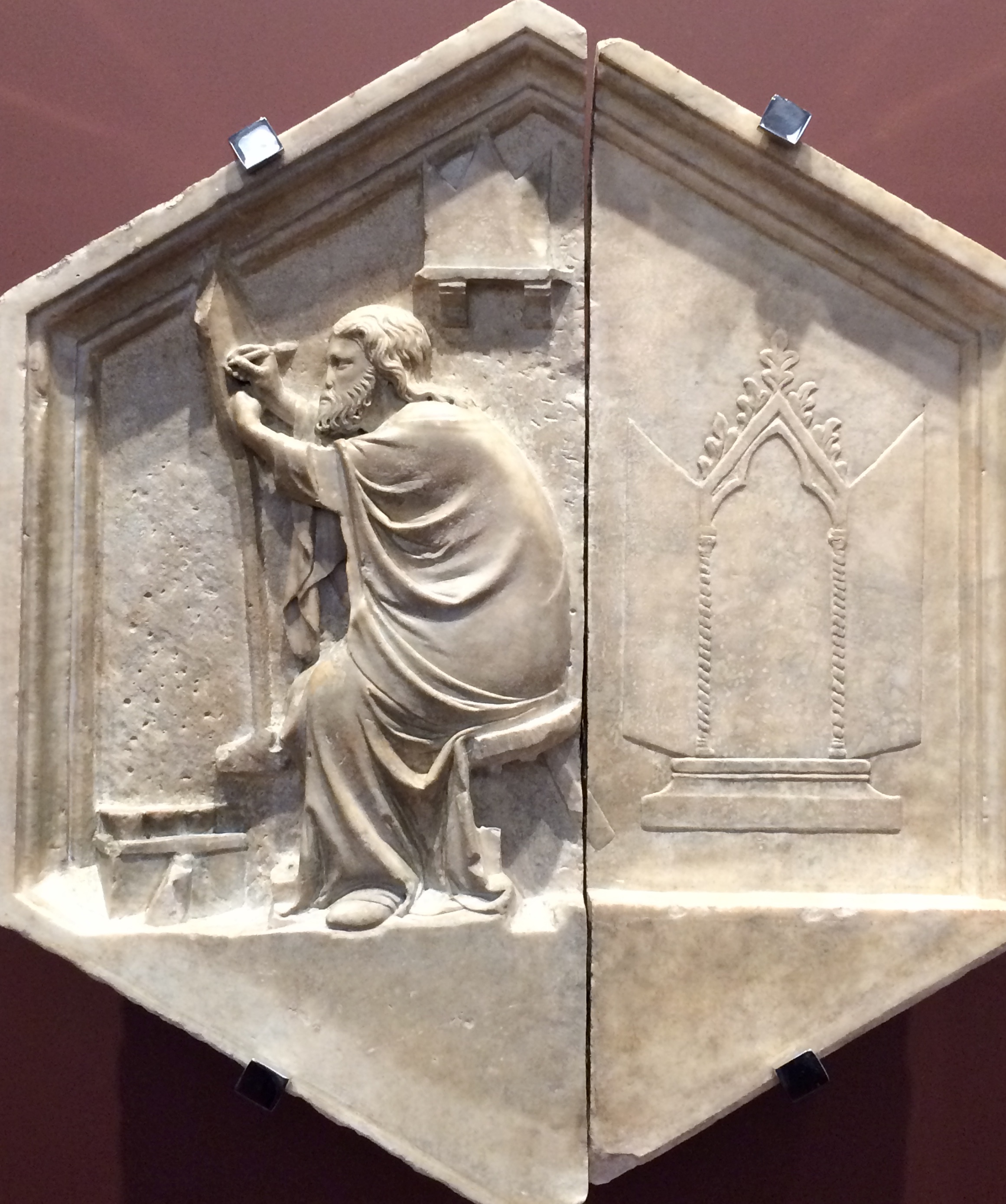
Be that as it may, still-life is a type of painting which has its roots in antiquity; the ancient Greeks and Romans enjoyed still-life pictures, as numerous mural paintings and mosaics eloquently testify. With the advent of Byzantine art however, still-life seems to have gone into a decline (in mural painting) as it had no particular function in the religious and sometimes political art of the time. It did eventually make a cautious return as late-medieval art approached the Renaissance, with small still-lifes playing an inconspicuous role in grander religious and occasionally secular work 1. In both cases, still-life subjects are often 'hidden' in decorative dividing panels between larger narrative scenes; sometimes, still-lifes appear by default as it were, for instance, as the saddle of the ass in a Nativity, adding an element of work-a-day realism to the narrative but placed off to one side so as not to distract. It is obvious, to me at least, that the artist I am thinking of (Alessio Baldovinetti, see photo below) relished his opportunity to do something 'from life', a kind of relief from painting the mandatory characters of a religious image.

Slowly however, still-life came into its own, an image of a slice of reality, normally unassuming, mundane reality, devoid of religious and political connotations (at least, superficially). Since at least the mid-twentieth century however, various critics have seen in still-life paintings concepts of status and power, certain Dutch examples from the so-called Golden Age of Netherlandish culture being prime targets. Some of those observations are certainly pertinent in a social history context, although they do of course ignore the extraordinary artistic skill and imagination of the people (artists) who actually made those same images. As 'documents' of a certain tenor of life, of a certain status, they are undeniable - but also undeniable is their status simply as works of art: a characteristic which has outlived both the power and the status of the individuals - not to mention the individuals themselves - who commissioned or bought those pictures (happily, the critics referred to above should now therefore be able to rest easy in their beds! 2).


A Roman still-life of fish, artist unknown; mosaic, second half of 2nd century AD to early 3rd century AD
Palazzo Massimo alle Terme, Rome (Photo: the author)

Note the high realism of the drawing of the fish above, all specific identifiable species; although not a still-life in the usual sense, the 'objects' not arranged on a table for example, clearly it belongs to that branch of artwork. This piece incidentally, demonstrates very well the wonderful capacity of ancient artists to draw what they could see.


The Nativity by Alessio Baldovinetti, detail of his fresco (1460 - 62) in the Chiostro dei Voti of the church of Santissima Annunziata in Florence (Photo: the author)

This detail shows Saint Joseph leaning on a beautiful 'still-life' of a saddle, with two shepherds entering from the right. The fresco is large and the figures are perhaps half life-size; the saddle is a minor detail in the narrative but, nevertheless, Alessio has observed it closely and rendered it accurately. This fact in itself indicates a Renaissance attitude, one in which artists were encouraged to draw, and learn, from Nature. On the left of this painting is a broad panorama of Tuscan countryside, also drawn from life, from nature.


The Adoration of the Shepherds, also known as The Portinari Altarpiece, by Hugo van der Goes, about 1475; oil on wood  
Gallerie degli Uffizi, Florence (Photo: the author)


This exquisite detail, this time from another huge Nativity (or, Adoration of the Shepherds) by the Flemish painter Hugo van der Goes, shows what must be one of the most sublime still-lifes ever painted: the two vases of flowers, one ceramic and the other glass, have a 'background' of a sheaf of wheat; this de facto still-life sits at the base and in the centre of the central panel of this extraordinary triptych. The flowers of course have symbolic meaning, especially the irises. The whole work is astonishing but it is possible to isolate the 'still-life' in the centre foreground and enjoy it for being just that!


The Annunciation by Pietro del Donzello, tempera (and oil?) on wood, 1498
The church of Santo Spirito, Florence (Photo: the author)

This wonderful picture by Donzello is another instance of a vase of irises appearing, front and centre, in an Annunciation; the flowers in this subject always separate the Angel and the Virgin. This painting exemplifies two important developments which occurred during the Renaissance: the first is the obvious and skilful use of perspective;  the other is the gradual insinuation of realistic landscape representations into paintings - seen here in the far distance, beyond the architecture (which itself resembles that of the real space in which we find this painting). Renaissance art, both painting and sculpture, was extremely interested in the mastery of the human figure (although not so for Pietro here, who seems to have preferred an older style) and, in the case of Michelangelo for example, it was the only subject. Slowly at first, but inexorably, landscape began to appear in paintings - and even in some sculpture - until, quite a bit later, it became its own, independent subject; again, the ancient Romans already had landscape paintings on the walls of their houses but, as with many things of this nature, it (landscape painting) disappeared with the development of Byzantine art.


Still-life by Baccio Pontelli and Giuliano da Maiano, intarsia work (inlaid wood), 1473 - 76 (?)
Lo Studiolo di Federico da Montefeltro, Palazzo Ducale, Urbino (Photo: the author)


The walls of this fabulous small study in the palace of Federico da Montefeltro (1422 - 82), Duke of Urbino, are truly awe inspiring; the illusion of reality, albeit created with inlaid wood, is so convincing that one is continually in doubt about what is real and what isn't! In this example, apart from the open door (an illusion, as with everything in the photo) we see a number of objects, including books and some hanging beads; but the most extraordinary object is the so-called mazzocchio, the circular multi-faceted article often seen in perspective drawings of the time. It was a type of headdress (sometimes covered in cloth) worn by fashionable men of the period but is present also in works of art wherein it was a particular favourite of Paolo Uccello 3. He, like others investigating the 'mysteries' of perspective, loved the mazzocchio for the very difficulty of drawing it. It is seen here as a wooden object leaning against what seems to be a shiny surface where we can see its reflection! In any case, a very demanding exercise with pencil and paper, here absolutely amazing in wood; the whole image is of course, a still-life, which, unlike in painting proper at the time, was an acceptable subject for intarsia. Such illusionistic inlay work can be seen in many places in Italy, including in churches (choir stalls and so on).


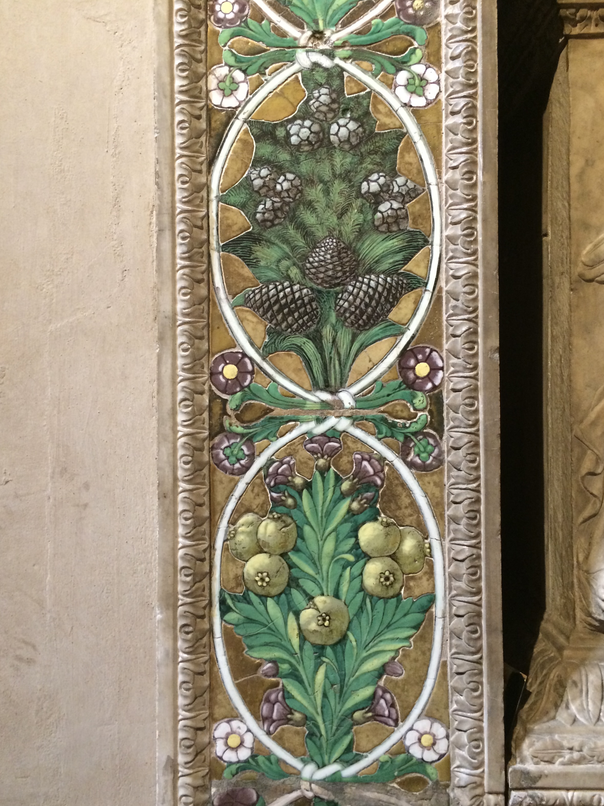
Funerary monument (completed?) by Luca della Robbia; marble sculpture and glazed ceramic border
The church of Santa Trinita, Florence (Photo: the author)

This photo and the next, a detail of the decorative border surrounding the monument itself, show an example of still-life being, so to say, 'hidden' in peripheral areas (here, literally). The work is typical of the superlative skills of Renaissance artists, including in ceramics, a field Luca and his family specialised in. Although not related to the present topic, the painting visible in the photo is the remains of an earlier fresco, a wonderful work in its own right.


From the photo above, a detail of the ceramic decoration showing plants and flowers: a decorative border composed of a series of still-lifes! (Photo: the author)

Jumping ahead to the Baroque period, still-life by then had established itself as an independent subject, that is to say, it was not merely a kind of anecdotal accompaniment to some more 'serious' theme. The influence of Caravaggio was at this time profound and consequently, many works - including still-lifes - are quite dark; a characteristic which contrasts them with both what existed before and what came later: many Renaissance pictures - not all - are quite light in tone, as are many from, say, Impressionism through to various schools of Modernism. Let's begin then with Ribera (1591 - 1670).


Still-life with Goat's Head by Jusepe de Ribera, oil on canvas, c.1645 - 49
Museo di Capodimonte, Naples (Photo: the author)


A medium-sized picture, in tone very typical of the period - and the place (Naples) - it is a classic example of Ribera's wonderful mastery, not only of his craft, but also of still-life. Ribera enjoyed popular favour with his similarly strong and dark paintings of saints; in this image, the extreme chiaroscuro (Italian, light+dark) of the mature Caravaggio is critical to this powerful treatment of food - if a little gruesome for modern taste. Food was (even in Roman times) and still is a common theme in still-life paintings and another great painter of the period specialised in food and her name is Giovanna Garzoni (1600 - 1670). 


Still-life with Cherries by Giovanna Garzoni, gouache on parchment (?), 1642 - 51(?)
Galleria Palatina, Florence (Image by Sailko via Wikimedia Commons)

Giovanna made many still-life paintings as well as other subjects; her light touch and colours were somewhat at odds with the prevailing preference for strong contrast between light and dark; her chosen media were also unusual as many of her works are done in water-based colours on parchment, as here. As is obvious, she was a master painter.


Still-life with Silver Goblet by Jean Siméon Chardin, oil on canvas, c.1728
St. Louis Art Museum, Missouri, USA (Image: Wikimedia Commons)

Chardin is regarded as one of the great masters of still-life but he also painted - also in pastel - portraits and homely interiors, often with working people at their chores; an interesting choice in France at the time, given that the decadence of the court and nobility was in full swing, so to speak 4. Chardin preferred the ordinary, the homely, the modest, themes he treated with a degree of gravitas normally reserved for more 'formal' subjects. He frequently made use of a darker background against which he contrasted not only his lights, but also his beautiful colours, as seen in the example above. His pictures in pastel are extraordinary.

Still-life paintings, such as the three just looked at, might be regarded as typical, even canonical, of still-life as understood right up to the present: a series of objects, including flowers and food of all sorts, and at times, (usually) dead animals, displayed or arranged on a table, sometimes in great profusion; sometimes, as in more recent work, more sparingly, with only a few objects - maybe only one - arranged more or less in a line, parallel to the picture plane. The definition of space was a given as, in realist terms, the chosen objects had to exist somewhere and naturally, that somewhere was in the fictive 'real' space of the painting, a concept with a history extending at least as far back as the Renaissance. In the Roman example at the beginning of this article, there is no 'space' of the type just described; in a sense, it was simply understood that the fish existed somewhere, but it was apparently unnecessary to specifically indicate that place. The development in early 15th century Italy of certain ideas concerning reality, or nature, meant that a picture, of necessity, had to be coherent in its imitation of the visible world, and that ironically included the invisibility of space itself (notwithstanding Alberti's comment that painters are only concerned with the visible 5). That is, any object (be it a person or anything inanimate) placed in a room for instance, had its space defined with the use of perspective - for the physical structure enclosing the object - and light, which was employed to model form; however, light - through the modulation of colour - was also used to suggest the air, the intangible space in which that object existed. Cubism of course, upset the apple cart so to say, and these earlier canons were rejected almost entirely.


Still-life with Ginger Pot and Aubergines by Paul Cézanne, oil on canvas, 1893-94
The Met, New York (Photo: the author)


With the painting above, we now move into the modern period, the school known as Post-Impressionism, and an example by one of its great masters, Cézanne. Even though all good painting is as much about painting per se as about the putative subject-matter, with the advent of 'modern art' this technical aspect asserted itself as a positive, active part of the visual phenomena of a painting, that is, no longer merely its means. An important break with previous still-life is seen here in the deliberate lack of a horizontal platform, indeed, the bowl of fruit seems about to slide out of the painting. Such divergence from the normal behaviour of gravity, and from the requirements of aesthetic balance, was not only typical of Cézanne, it also led eventually to the fragmentation operated by Picasso and Braque only a few years later.


Still-life with Guitar and Glasses by Juan Gris, mixed media - including collage - on canvas, 1914
The Museum of Modern Art, NY (Photo: the author)


And speaking of Picasso, above is a work by his contemporary and fellow-Spaniard, Juan Gris (1887 - 1927). Gris' works are a kind of intellectual refinement of the raw energy of early Picasso Cubism; interestingly, in the picture above we might notice hints, premonitions, of Mondrian and even Vasarely. But importantly, the canons observed in17th and 18th century still-life were now almost irrelevant and a new aesthetic was established, that of the priority of the painting per se, indeed, even the act of painting per se, that is, in opposition to its age-old function of replication of the visible world, of nature.


Nature morte by Fernand Léger, oil on canvas, 1925 (?)
Yale University Gallery, New Haven, USA (Photo: the author)


As a development of Cubism, the work of Léger (1881 - 1955) is one of the more sophisticated, with clear adherence to certain of the basic principles, but also obvious unique contributions of his own, most notably in his definition of layered space. In this example, there is an almost kinetic quality to the 'objects' depicted, with a sort of subtle to-ing and fro-ing, forwards and backwards, of the various components. A view of both space and form radically different from say, a Chardin.


The Song of Love by Giorgio de Chirico, oil on canvas, 1914
The Museum of Modern Art, NY (Photo: the author)

 
The Italian metaphysical painter de Chirico painted this picture in the same year as the Gris, above, was made; the approach in every way could hardly be more different. Although a metaphysical artist avant la lettre, de Chirico made repeated use of Italy's cultural heritage, reaching back in time as far as classical art and combining it with the most up-to-date technology, such as the steam train in the lower left of the image shown here. Clearly, this picture includes elements of architecture and therefore contains a sort of urban landscape backdrop (not to mention the implied motion of the train), but the overlay of still-life is nevertheless present, causing the disjunctions so beloved of later metaphysical artists.


Natura morta by Giorgio Morandi, oil on canvas, 1946
Galleria Nazionale d'Arte Moderna, Rome (Photo: the author)


Giorgio Morandi (1890 - 1964), a painter from Bologna, also began his professional life as a metaphysical artist but quite soon returned to two main figurative themes, landscape and still-life; he was so original in his treatment of both subjects - in drawings, prints and paintings - that it is difficult to decide to which he contributed more. The example here is a typical Morandi still-life, not only in its handling, in its distribution of the objects, in its colour, but also in the very choice of the objects themselves. Morandi painted over and over again the same small group of objects, humble house-hold objects (which he had painted a sort of neutral colour, that is, the physical objects themselves), arranged and re-arranged a myriad times, resulting in a sometimes sublime stillness, a quiet group of 'friends' interacting with each other, at one and the same time differently - each time - and yet oddly the same. As in this instance, occasionally one or two articles were allowed to exhibit some dash of 'personal' colour, but Morandi's control of tone assured that no-one got out of line, so to speak.


Still-life by Ben Nicholson, mixed media, including oil and gouache, on cardboard, 1945
The Art Gallery of Western Australia, Perth (Photo: the author)


The English artist Ben Nicholson (1894 - 1982), once married to the important sculptor Barbara Hepworth, was a significant figure in pre- and post- WWII British art, at one time hosting Piet Mondrian while on his escape from occupied Europe to the USA. With clear attachment to Cubism and not without some influence from his Dutch guest, and his fellow-countryman Henry Moore, Nicholson brought to still-life an intellectual and aesthetic rigour all his own. After making abstract works, both two-dimensional and low relief, he returned to a highly formal figurative style developed out of his interest in the Constructive idea theory (as opposed to Russian Constructivism). Like Mondrian, he was also a theorist, perhaps most notably in his contributions to, and editing of, the book Circle: International Survey of Constructive Art (1937).

The picture in the Art Gallery at Perth is a fine example of Nicholson's sober, aesthetically highly-refined, formal style; it makes use of several media, favouring clean, precise line combined with areas of subdued colour. Like Mondrian's works, it is a rational statement which nonetheless conveys deep if somewhat private emotion; a twentieth-century, intellectually analytical gaze, so profoundly different from 18th century work for instance.

Finally, I imagine that some readers will question why certain of their favourite still-life paintings are not discussed here, such as those by Van Gogh or Picasso, or the world famous (without a hint of hyperbole) Basket of Fruit by Caravaggio; obviously, it would have been impossible to discuss every great still-life picture in an article of this length, and I felt that, precisely because such paintings are so well-known, it was unnecessary to re-state, yet again, their greatness. Instead, I wanted to illustrate how quite divergent artists had approached this subject-matter and also perhaps bring to your attention some names not so familiar but, in the end, just as wonderful.


Glass Vase with Flowers and a Finch Nest by Jan van Huysum, oil on canvas, c.1720 - 21
Private Collection on loan at the time (2017) to the National Gallery, London (Photo: the author)

I could not finish this article without including a fine example of a flower painting, and a Dutch one at that. Van Huysum (1682 - 1749) apparently got these flowers from his own garden but, wherever he obtained them from, his elegant, subtle mastery of every detail in this still-life is extraordinary.


1 I note that the plural form still-lifes used in this article may disturb some readers who might prefer the form 'still-lives'; dictionaries seem to opt for 'still lifes' (no hyphen) and so that's what is used here, except ... I have added the hyphen as I think the words joined in that way function better as a noun.

2 One of the problems with re-writing history with the aid of a politically focused rear-view mirror is that this often ignores another reality of the present situation: without the good, the bad and the ugly people who paid for particular kinds of artwork, we wouldn't have had it! And those same critics would then have had to find some other art form to get stuck into: perhaps literature or music. In fact, they already do so but, speaking personally, I'd rather have the ruins of a Greek theatre or a Roman temple than the remains of some bark-and-thatch hut any day!

3 The mazzocchio makes several appearances in Uccello's famous tripartite version of The Battle of San Romano (distributed among the National Gallery, London, the Uffizi, Florence and the Louvre, Paris); in the supposed 'middle' section, in Florence, there are at least three combatants wearing mazzocchi!

4 I should explain the obscure pun here, as one of the most well-known images of the French Rococo is that by Fragonard (1732 - 1806) in the Wallace Collection in London, The Swing (1767). This painting, as the name suggests, is of a person on a swing, a young noblewoman, richly dressed, and accompanied by two young men: a picnic pastime of the 'idle rich' of the period. The painting's French title, Les hasards heureux de l'escarpolette (The Happy Accidents of the Swing) alludes to its (typical of the period) voyeuristic implications.

5 Leon Battista Alberti (1404 - 1472) in Della Pittura (On Painting), 1436: see various articles in this blog concerning Alberti.