Thursday, 21 July 2022

Giotto's structural form


The Basilica of Saint Francis in Assisi, early morning: the upper church is accessible from the main front door, visible in the photo; the lower church is accessible from an entrance below, on the left. (Photo: the author)

    I have just returned from a trip to Italy where my second stop, and one of my most important revelations, was at Assisi; the revelation was in fact the work of Giotto in the upper church of the Basilica of Saint Francis. This article is about Giotto's construction of objects in space, his attempts to depict three-dimensional objects on the flat surface of the wall in such a way as to suggest their real form.

As for all art students, at least of the past, Giotto was for me a 'house-hold name', a 'given' of art history, even if I understood precious little of his 'revolution'. I had seen the beautiful basilica once before, many years ago, but had understood nothing; Giotto however became an integral part of this more recent journey. My interest in any case had been strongly stimulated by the classic exegesis on the part of Luciano Bellosi, his La Pecora di Giotto (Giotto's Sheep)1. For anyone who has not seen the stupendous cycle of frescos by Giotto in the Basilica of Saint Francis, I recommend it as wholeheartedly as I possibly can: a profound experience not to be missed by anyone interested in art and who chances to be in Italy. 

The 'revolution' worked by Giotto is made plane by its being situated not only in its original ambience, but also in one of the most marvellous de facto 'art galleries' in the world. I say this because his Stories of the Life of Saint Francis are in the upper basilica along with the work of several other masters, including Cimabue, but there is also the lower basilica containing not only other Giottos but as well, the works of Cimabue, Simone Martini and Pietro Lorenzetti, not to mention other frescos by unidentified or at least, 'disputed' masters. In fact, the real identity of the authors of many of the paintings in this extraordinary 'gallery', including those generally ascribed to Giotto, is disputed by art historians; then there is the question of just how much of the agreed Giottos is actually by his hand, that is 'autograph', and how much was done by assistants.

That said, the present article is concerned, mainly, not with the analysis of the scenes as narrative, but rather with the way in which Giotto has handled space and particularly, with his 'built environment' or, more prosaically, his buildings! Luciano Bellosi was extremely interested in this aspect as well and I freely admit a debt to his writings in this instance. However, I think there might be one or two things of interest not especially noted by Bellosi although my own 'awareness' of their existence was certainly cultivated by being familiar with his thesis.

As discussed in other articles in this series, the (apparently accurate) representation of space is one of the fundamental 'conquests' of the Renaissance, a conquest that was either not required in preceding periods of art history or was positively rejected in later ones, such as Mannerism, and notably again in the late-nineteenth and early twentieth centuries. At the time of Giotto, and in the case of Giotto, we could say there was clearly an intuitive awareness that 'space' as conceived of in Byzantine painting - the dominant style in Italian religious pictures - was no longer doing the job required by the developing 'independence' of certain Italian painters.2 This new requirement for a logical space, as opposed to a 'spiritual' or transcendental one, came hand-in-hand with other changes in Italian culture at that time (late-13th and 14th centuries), changes related to literary studies by nascent humanists (in France and Italy) and, in Italy, an awakening interest in classical art and architecture, especially the at-hand Roman variety.

To varying degrees, ancient Roman artists appear to have had a fairly good grasp of something similar to mathematical perspective, but because a rational, realistic space (that is, with the use of perspective) had not been required by the Christian church after the period of late-antiquity, the focus being almost entirely on the transcendent implications of religious imagery and not on its approximation to external reality, the knowledge of how to 'construct' such a rational space had eventually been lost. Giotto and others however began to feel the need to place their narratives into more convincing spaces, that is to say, to represent space, and especially buildings, more and more as they actually looked to the 'modern' western Christian - as indeed he was doing with his figures! Giotto's figures are what sets him apart in the first instance and this is clearly obvious in the accidental 'art history lesson' which is the Basilica of Saint Francis. If we start in the lower basilica by looking at some of the earliest frescos there, and at Cimabue, and then move on to the upper basilica, the new 'description' of human beings wrought by Giotto is, simply, astounding. To be clear, all is beautiful, in both the lower and the upper basilicas, but the abrupt transition from late Byzantine to 'modern' art is patently visible.

Given this, as said, I would like to discuss some aspects of Giotto's exploration of space as seen in his buildings in the frescos in the upper Basilica of Saint Francis. Some representations of buildings - usually invented but, sometimes at least, based-on actual ones - attempt to convey a sense of reality by 'splitting' the visual data into what can or would be seen if the hypothetical viewer were looking down, and what he or she would see if looking up; these two points of view are usually merged in the one building or structure, as well as, sometimes, what would be possible if the viewer were turning his or her head from left to right. One characteristic however of the painting of this period of 'proto-perspective' is its inconsistency: to put it simply, some things are coherent within the limits of the scheme while others are not, and this within the same structure (building, desk, baldacchino, etc.). In other words, the approach was mostly intuitive, there being, at that point, no 'mathematical' process to adhere to - as later became the norm with Renaissance perspective. But the attempt was definitely being made and especially by Giotto.


An Ideal City, c. 1480, author unknown or disputed, oil on panel, 68 x 240cm
Galleria Nazionale delle Marche at Urbino
This is an example of a 'pure' city-scape constructed with the masterful use of mathematical perspective, a formulation unknown at the time of Giotto; the actual painting is quite bright and clean, and does not have the dark areas which appear, unfortunately, in this photo. (Photo: the author)


Let's start our analysis by looking at the scene called The Dream of Francis at Monteluco (below). In this image, divided into a left part and a right part, a large imagined building occupies the whole right side; there is a structure on the left as well, but it belongs to an earlier and more common conception of a single room. The palatial structure on the right occurs in a dream foretelling Francis' future; when studied closely, it becomes clear that this building is rendered in the manner described above: the lower part, with its pale green loggias or verandas, is represented as we would see it when looking down; in the middle, that is, the junction of the lower part and the upper part, there is little if any suggestion of space (in fact, it is a de facto horizon line); above that line, we are supposed to be looking up, as we would if looking at a tall, substantial building (note the undersides of the arched windows and of the terrace on the top). The problem is that the views are inconsistent: it is impossible for us to look down on the lower part of the building from our presumed standpoint (near the right edge of the painting), this because we would need to be quite a distance from the structure as well as quite high up; in fact, our eye-level, on the left side of the scene, seems to be more or less at that of the dreaming Saint Francis, but, on the right, where the palace is, our eye-level is coincident with the horizontal mid-line of that building, at its 'horizon line'. For us to see in real life a building with such a discrepancy between the 'down' view and the 'up' view, either we or the building would have to bend quite a bit backwards, the building thereby forming a convex structure! In short, if we are able to look directly at the reclining figure of Saint Francis, we could not possibly be looking down at a building so close by. It should be explained that, even in mathematical perspective, we can see 'up' views and 'down' views of the one structure but, because of the vanishing point system, those views are wholly consistent with one another.

Nevertheless, Giotto has perceived some aspects of 'real' vision correctly even if he hasn't known how to represent them coherently: on the right side of the palace, both the bottom and the top orthogonals do incline correctly (upwards and downwards respectively) but other orthogonals on that side do not; the reason is that there is no assumed or fixed 'vanishing point', a basic element in normal perspective drawing, so the orthogonals wander off willy-nilly, sometimes consistent with the 'perspective', sometimes not! Those of the 'room' on the left do in fact recede to completely different 'vanishing points', to the extent indeed where the use of the term 'vanishing point' is redundant. Of course, as the much later Surrealism and Dada have demonstrated, anything is possible in a dream and this image by Giotto actually seems to be, so to speak, 'caught' between an attempt at 'realism' and the liberty inherent in the representation of a dream! 


The Dream of Francis at Monteluco (or, The Dream of the Arms), fresco 270 x 230cm, c 1295. 
Upper church of the Basilica of Saint Francis, Assisi
(Image: Wikimedia Commons Public Domain)


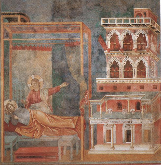
Although not immediately pertinent to this discussion, it might be noted that the lower part of that structure is a 'classical' building (of a type that can be seen in ancient Roman frescos interestingly), with columns and capitals and rounded arches, whereas the upper part is Gothic (and in a different scale), that is 'modern' or contemporary with Giotto's own time; the pointed-arch windows with their elaborate mouldings and the contemporary shields (barely visible through the upper windows) would seem to have some symbolic function, perhaps indicating the 'modernisation' of the church by Saint Francis.


Saint Francis exorcises the Demons from Arezzo, fresco 270 x 230cm
Upper church of the Basilica of Saint Francis, Assisi
(Image: Wikimedia Commons Public Domain)


Now let's turn our attention to the fresco called Francis exorcises the Demons from Arezzo; again an image divided into two parts, although this time physically linked by the figure of a friar. On the left side, behind the praying figure of St Francis, is a very large structure, possibly representing a cathedral; this representation is extraordinary in its attempt to show a large Gothic structure, in fairly accurate detail (there is another in the scene of Saint Francis mourned by Saint Clare). The architecture closely resembles the form and style of a large contemporary church, and the viewpoint is by-and-large consistent (that is, from below looking up from the right). The polygonal apse doesn't quite work but, generally, a successful and original description. On the right side we find one of two famous depictions of the medieval city of Arezzo 3, not a 'portrait' of the real Arezzo but a kind of synthesis of medieval Italian hill-top cities. What is of interest here for our purposes however, is the drawing of this city: because Arezzo is on a hill, it is reasonable that the buildings within it, as it were, 'climb up' that hill and so the depiction is rational in that sense, and in its being shown from below. But what is especially rational is Giotto's observation of a particular visual fact: here we have an example of the movement of the viewer's eye as he or she stands in one particular position - and that position is clearly indicated by certain 'physical' facts. 

Our position is indicated by the fourth merlon (the v-shaped raised part on the battlement) from the principal city gate, on the left; that merlon is shown full-face, that is, we can't see its sides. The merlons to the left and right of the fourth one are shown not only with their front face but also with either their right side or their left side; this is how we would actually see them were we positioned at the point suggested. In addition, we can see the right side of the main gate, and the left part of the inside of the gate, as we can equally-well see the right side of the inside of the minor smaller gate to the right. The merlons on the main gate itself are also drawn so as to be consistent with our point of view. What is clearly a 'contradiction' of these structural facts is the size of the figures coming out of those gates, a perhaps necessary hangover from medieval tradition. In fact, all the scenes have this characteristic, that although the artist has patently been observing the real world in which he operated, he was nevertheless constrained by certain established norms of narrative: for instance, in many but not all of the images in the cycle, the principal actors are arranged, frieze-like, parallel to the picture plane. In terms of spatial arrangement of figures, an exemplary later contrast might be for instance, the Death of Saint Matthew by Caravaggio, in San Luigi dei Francesi in Rome (see photos below).


This photo of the massive gate or 'porta' of San Frediano in Florence - minus its merlons - gives an idea of how large and powerful such structures could in fact be. (Photo: the author)


Next, the scene known as The Homage of a Simple Man. This image is interesting because it differs from the two previously discussed in that the background buildings form a continuous screen or 'curtain' behind the action of the drama; there is a division into a left part and a right part but this is achieved by the groups of figures and not by the buildings, as in the other cases. In fact, the space between the two groups is 'filled' by a temple; this temple actually existed in Assisi at that time and still exists today: it is the Temple of Minerva, an ancient Roman structure in the centre of Assisi, which later, like many such buildings, was converted into a church (Santa Maria sopra Minerva). Giotto's use of this real structure did not however prevent him from adapting it to suit the formal requirements of the scene.


The Temple of Minerva, 1st century BC, Assisi, as it is today (Santa Maria sopra Minerva)
(Photo: the author)


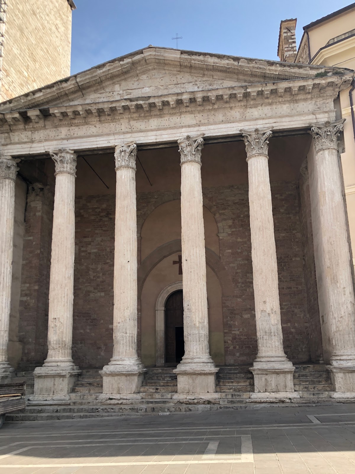
The real Temple of Minerva has six columns in its facade, not five as in the fresco, and none (today at least) within the peristyle (the area between the columns and the front wall): Giotto has two such columns on either side of that 'porch'. Giotto's front wall is just a simple wall with two iron-grilled windows and no door (the temple was at one point the city prison); the current front wall has no windows but a very large central door. What is common to both the present building and its painted image is the herring-bone patterned brick pavement in the area of the peristyle, so beautifully depicted, if simplified, in the fresco. Giotto has also added a 'rose' window to his enlarged timpanum, a completely anachronistic structural element; as well, he has decorated the architrave (the straight beam supported by the columns) with a mosaic style known as 'cosmatesque' (or, Cosmati work), again completely anachronistic for a Roman temple although very popular in medieval religious buildings. The artist's columns are notably much thinner than those of his model (in keeping with the thin and somewhat elongated aspect of the other structures, perhaps a reflection of Gothic influence), thus  appreciably reducing the pagan robustness of the real structure. But why did he paint this building with only five columns instead of the actual six, and those so lean? I would suppose that, while wanting to include this reference - a genuine landmark - to the contemporary city of Assisi, he nevertheless had to make it 'work' as part of his composition; the image is not about the temple  - it's a reference, not a portrait - but that reference serves to reinforce the 'actuality' of the scene which historically took place in Assisi.


The Homage of a Simple Man, fresco 270 x 230cm
Upper church of the Basilica of Saint Francis, Assisi 
(Image: Wikimedia Commons Public Domain)


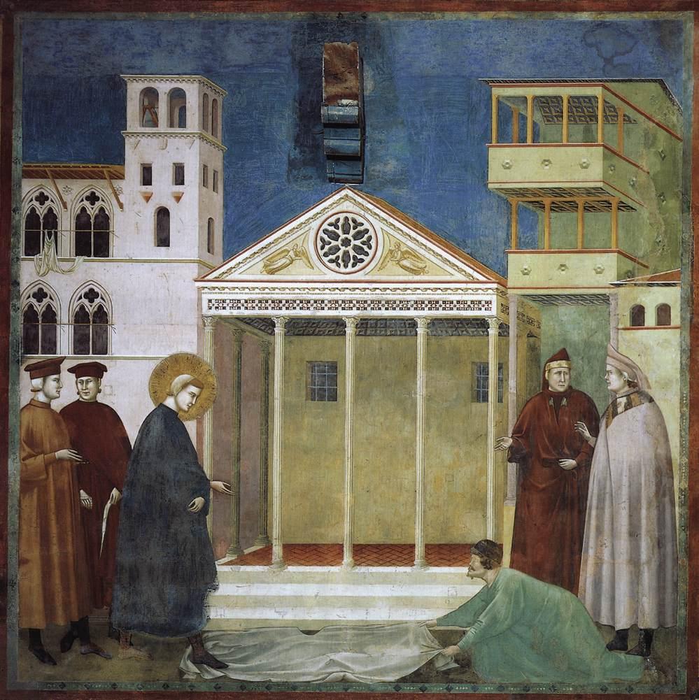
The tower next to the temple also still exists although now with a low addition on its top. But for this article, the interesting thing is the construction of space and objects; we have already remarked the 'frieze-like' disposition of the figures, from left to right across the foreground, and the theatre-like 'curtain' background of the buildings. But, although the artist has positioned us as so we can see the right side of the buildings, including the temple, those figures are all seen from directly in front!  This presents a contradiction because, although the figures can of course be arranged similarly in real life, their position relative to us (or to the temple) should be different: if we can see the right side of the buildings, then we could also see different sides of the figures as well; that is, some from the back or from a three-quarter back or front view, and so on. And again, the figures appear to be out of scale in relation to the buildings: they can seem very close to the background although the size discrepancy may mean to indicate distance between the figures and the buildings (the figures are closer to us). If that were the case, there would seem to be another contradiction because unlike in, for instance, contemporary manuscript illumination, there is no indication of so-called 'atmospheric' perspective, perhaps best illustrated by the backgrounds of certain pictures of Leonardo da Vinci 4. Clearly, the figures and background are not so distant from one another as to seriously reduce the tonal value of the colours of the buildings, but there is nonetheless no clear indication of what I might call 'planar' separation (the relative positions of objects in different planes starting at the 'front' of an image and moving progressively further into the fictive space: a wonderful example being Donatello's Banquet of Herod bronze relief panel in Siena).

In terms of a formal analysis of the 'perspective' in The Homage of a Simple Man, we have an example of what the art historian John White called the 'foreshortened frontal' view 5, that is to say, a full-frontal view of one side of a given structure with one other side attached, usually with some intuitive 'perspective' elements: in this case, the front of the temple with its (viewer's) right side suggesting diminishing (perspective) recession (as was the case with the first scene we looked at).


The Invention of the Crib at Greccio, fresco, 270 x 230cm
Upper church of the Basilica of Saint Francis, Assisi
(Image: Wikimedia Commons Public Domain)

The related 'construction' of an object, as opposed to a building, may be seen in such things as desks and ciboriums, an open-sided rectangular structure built over the main altar in some churches, also known as a baldacchino or tabernacle; White has pointed out the development of the 'foreshortened frontal' structure into the 'complex frontal', in which both of the visible sides of a structure are shown in intuitive recession from their mutual corner. An example of this at Assisi is in the scene known as The Invention of the Crib at Greccio. In this complex scene there is a ciborium on the right side of the foreground; in it, friars or monks are observing Francis as he sets-up the crib. In fact, the rendering of this structure is extremely successful as, not only does it appear to exist in three dimensions, but both the top and the bottom of it recede very convincingly - and in harmony with the pulpit on the other side of the rood-screen 6. Again, we have the looking-up view so that we can see the underside of the ciborium, and the looking-down view of its platform. Incidentally, it might be noticed that the timpanum-like structure of its upper forward face resembles in several details the facade of the Temple of Minerva in the Homage of a Simple Man scene just discussed: a timpanum with a circular motif in its centre flanked by two angel-victories with, underneath, the 'cosmatesque' decoration on the 'architrave'.

A curious 'omission' on the part of many painters at this time, including Giotto at Assisi (and in his panel picture in the Louvre of Saint Francis receiving the Stigmata), is the almost total absence of shadows cast by the human figures! Despite the fact that their clothing is forcefully represented with the use of light and shadow, and that the light-source is generally consistent, the figures themselves - and objects for that matter - throw no shadows on the ground! 


Pope Honorius III listens to the preaching of Saint Francis, fresco 270 x 230cm
Upper church of the Basilica of Saint Francis, Assisi
(Photo, slightly distorted: the author)


Giotto nevertheless made great progress towards an internally coherent representation of a three-dimensional structure: let's look now at the scene known as Pope Honorius III listens to the preaching of Saint Francis. Here we see a room, closed on three sides and open, although divided by two columns, at the front; in fact there are four columns which together serve to 'segment' the scene into three distinct areas. The central area is occupied by the Pope, who is seated on a raised throne, as well as two members of his entourage; in the left segment is Saint Francis in the act of preaching; he is accompanied by a companion who, being seated on the floor with one leg behind the dividing column, thereby links that left space with the central one of the Pope. The right segment is occupied by another three attendants; all of these members of the Pope's entourage are seated on a curved yellow-ochre bench: this bench links all three segments of the image at this level, beginning as it does with the attendant in blue, making up the third person in the left segment. As can be seen, there are three 'actors' in each segment of this image, all more or less on the same level except for the Pope who is naturally higher than the others, and the oddly casual figure of Francis' companion, sitting on the floor! Francis is however, the only person standing.

'Linking' is achieved as well in other parts of the fresco: for instance, along a kind of middle line is hung - or painted - a curtain which runs along all three of the closed sides of the room. Above that, so to speak, in the upper foreground, is the Gothic architecture of the forward face of this structure, its pointed arches repeated in the ceiling structure of the room and in the five bi-forked windows of the rear and side walls. We know there are side walls because the angle of the 'curtain' decoration and of the extreme left and right windows recedes very gently towards some central point. More importantly, Giotto had 'centred' the ceiling arches so that we see the central part from the centre, and the two side parts are convincingly seen as they would appear in real life to a viewer standing where we are, that is, outside the centre of the structure. But, there are two inconsistent elements in this scheme: the first is the yellow-ochre floor. In the lower left corner, the artist has caused the pattern to recede 'correctly' to the centre but, in the middle of the floor, the area 'below' the Pope's throne, the pattern follows the old medieval practice of simply 'climbing up' the image: it is not shown as consistent with a floor which is receding into the fictive depth of the painting! 

The other inconsistency is the throne itself. Naturally, such a construction can, in real life, be situated in any position that seems appropriate and here it is so situated to emphasise the attention of the Pope to Saint Francis's preaching. The problem is that there is no attempt to represent that throne consistent with the strong, pervasive 'perspective' in the rest of the composition! Like that part of the floor it sits on, it has a life of its own, independent of what has been attempted elsewhere in the same composition.

A couple of points in relation to this scene: again, no shadows cast be the actors, nor by the throne, despite the clear dependence on light and shade in the modelling of the heavy clothes worn by those same actors. And I must mention the extraordinary life-likeness of the expression on the Pope's face as well as the incidental detail of his holding his sash in his hand: quite amazing observations of ordinary 'human' traits, so different in fact from the hieratic tradition of what came before Giotto, and indeed was still the norm in his own life-time.

In concluding, I would like to draw attention to some objects included in both The Invention of the Crib at Greccio and another scene called The Verification of the Stigmata; in the former work, astounding in its innovation in any case, Giotto has painted a wooden cross, seen from the back, as it leans into the nave of the fictive church. Such wooden crosses are very often enormous structures, several metres high, painted on one side and, on the other, held together by robust carpentry, visible, as here, from the rear; in fact, several such icons were painted by Giotto himself. What is of particular note is that we see this object from the back, almost a blasphemous act! Indeed, one of the 'hallmarks' of Giotto's frescos is his 'penchant' for rear views, normally of people, but, as here, sometimes also of objects. In the Stigmata episode, again set within a church, we are seeing the event from the nave and we know this because this time, we can see the painted sides of three icons suspended above or on the rood-screen (a screen which once separated the nave from the choir or altar area in churches) 7


The Verification of the Stigmata, detail, fresco
Upper church of The Basilica of Saint Francis, Assisi
(Photo: the author)


In this scene, the three icons are, from the left, a Virgin and Child, a Crucifix and a Saint Michael Archangel; according to some, the Crucifix represents a real one - there were two - made by Giunta Pisano (commission 1236) for the Basilica itself 8. Giotto has here attempted another device to indicate the space in which this event occurs by showing these icons leaning into it in the way such pieces actually did. Today, the rood-screens are gone and frequently these large Crucifixes are hung either in the nave itself or on a wall but originally they decorated the screen on the 'lay' side, that is, the side within the body of the church.


Crucifix by Giotto,  c.1288-89, tempera on wood
Santa Maria Novella, Florence (Photo: the author)
An example of an enormous Cross painted by Giotto and now suspended above the nave of the church of Santa Maria Novella

In this discussion, mention should be made of one of the final scenes in the Saint Francis cycle, the one titled The Healing of the Man from Lerida. In fact, the authorship of the three last scenes in the narrative - but not necessarily in the painting order - is seriously debated and many scholars give these frescos to the so-called Saint Cecilia Master, and not to Giotto! For our purposes however, what is of great interest is the wonderful and mostly visually coherent architecture of the building in which the miracle of the cure occurs; seemingly all the lines, and especially those in the upper part of the structure, recede to some fixed point; in fact they don't, there being at least two distinct areas (not points) where the orthogonals intersect, one (very generally) in the area of the central yellow curtain, near the white-turbaned figure, the other being, for the attic ceiling, somewhere in the region of the forward horizontal separating the main body of the room from its 'attic'. Even the bases of the four marble columns supporting the structure recede towards the centre of the composition - alas, again, inconsistently.


1 La Pecora di Giotto by Luciano Bellosi, my edition published by Abscondita in 2015. The title of this fundamental text comes from the apparent 'legend' which recounts that Giotto, as a boy, was 'discovered' by Cimabue who became his master: that the young Giotto, while minding his father's sheep, would amuse himself by drawing them. Cimabue, happening to pass by one day while Giotto was thus occupied, immediately recognised the boy's talent and convinced his father to allow him to take Giotto as an apprentice.

2 I stress 'painters' here because at more or less the same time, the sculptors Nicola and Giovanni Pisano (father and son) were, so to speak, skipping the Renaissance - of which they were in fact precursors - to arrive at a kind of paleo-Mannerism: their conception of space in the pulpits and other works in Pisa, Pistoia, Prato and Siena, with their crowded massing and piling-up of human figures, anticipates Pontormo for instance, by roughly 200 years!

3 The other and perhaps even more famous view of Arezzo is that in Arezzo itself, painted by Piero della Francesca in his extraordinary fresco cycle The Legend of the True Cross, in the church of St. Francis.

4 The term 'atmospheric perspective' refers to the creation of a sense of, often profound, depth in a painting through the use of various shades of, normally but not exclusively, blue; these very light, cool blues contrast markedly with the much stronger, purer and warmer colours used in the mid-ground and particularly the foreground of a particular picture. This effect can be realised in fresco, as for instance in the beautiful work of Alessio Baldovinetti: his Nativity in the front cloister of the church of the Santissima Annunziata in Florence. Giotto does not appear to use this device (fundamentally a change in tone) in the present fresco (colours much degraded admittedly) although in some others he does seem to be aware of it: in the Pope Honorius III listens to the preaching of Saint Francis, discussed later, the foreground colours are stronger than those used for the background.


The Nativity by Alessio (or Alesso) Baldovinetti, fresco, 1460 - 62
Chiostro dei Voti, Church of the Santissima Annunziata, Florence
(Photo: the author)
Note how the colours in the foreground, effectively the centre and right side of the painting, are much stronger than those in the landscape background, and this even though, as with many works in fresco, the colours have obviously degraded over time, here especially unfortunately in the foreground figures; note also how the artist has 'graded' the colours of the sky from very pale in the distance to quite strong in the area closer to us.

The Birth and Rebirth of Pictorial Space by John White, published by Faber and Faber, 1972, page 27; first published 1957.


6 To see just how successful Giotto was in the representation of this three-dimensional structure, we need look no further than the cathedral of Naples (Santa Maria Assunta) and a painter called Montano d'Arezzo. In the chapel known variously as 'of Saint Peter' or 'dei Minutolo', in a scene entitled The Martyrdom of Saint Thomas, Montano has depicted a similar ciborium, an object which seems to demonstrate his knowledge of the work of Giotto at Assisi; however, his comprehension of just how to represent such an object is, frankly, pitiful by comparison with the Giotto in question. Montano d'Arezzo's biography however is far from clear and critics dispute whether his influences were Roman or Tuscan, or both, and in any case, to what extent - direct experience or second-hand? My impression after having seen what little I could in the Minutolo Chapel this year (at the time, closed for restoration but with the aid of binoculars, still in part visible), is that Montano was principally interested in figures and very little interested in architecture! See the article in 'Prospettiva', Number 175-176, 2019, by Bruna Bianco entitled La cappella di San Pietro nel duomo di Napoli e il problema di Montano d'Arezzo: proposte per una revisione (with Abstract in English on p 189).

7 Painting the rear view of objects or people was a device employed by Giotto (and sometimes other artists at that time) which served to establish a plane, normally in front of the main action, closer to the viewer, and which therefore, psychologically, aided in the illusion of depth or space; the viewer thus had the impression of 'looking over the shoulder' of someone, into the fictive space of the image. Giorgio Vasari later made extensive use of this device.

8 Giotto by Bruno Dozzini, published by Editrice Minerva, Assisi, 2016, pp 50-51

*N.B. The comments in this article in relation to the work of Giotto (and supposed Giottos) apply only to certain scenes in the Life (or, Legend) of Saint Francis fresco cycle in the upper church of the Basilica of Saint Francis at Assisi; they do not concern his work in Padua (the Scrovegni [or, Arena] Chapel) nor his second campaign in the lower church of the Basilica in Assisi.


Addendum: 


The Martyrdom of Saint Matthew by Orcagna, (and/or Jacopo di Cione ?), date uncertain, mid-14th C, tempera and gold on wood
Gallerie degli Uffizi, Florence (Photo: the author)


Above is a painting depicting the Martyrdom of Saint Matthew by an important artist known as Orcagna (born Andrea di Cione, d. 1368) and his younger brother Jacopo di Cione (d.1398), one part of a large work in the Uffizi. I have included this piece to show not only the persistence of old modes well after the death of Giotto (1337) - note the confused attempts at three-dimensional structure, especially in the altar (?) under the baldacchino (ciborium) - but also to compare its concept of the subject with that of another great master, Caravaggio, who treated the same theme in Rome, in 1600. The one is not better than the other but simply different: both periods (late medieval and Baroque respectively), like all of them, have their pros and cons.


The Martyrdom of Saint Matthew by Caravaggio, 1600, oil on canvas
The church of San Luigi dei Francesi, Rome
(Photo: the author; this photo was taken this year and its distortion is due to the fact that photos may only be taken [by ordinary mortals] from outside the small chapel where this picture is hung.)


Friday, 13 May 2022

Looking at Pictures: a Comparison


This article is a revised version of one originally written and published (on another blog) in 2013.


It seems to me after the experience of attending two art schools in the 1970s and living a life since then of painting and looking at pictures, that many people - including some art teachers and gallery people - have only the vaguest idea of how to look at a painting, and of how to interpret what they are seeing. In fact, when I attended art school, there was absolutely no time or instruction given to this complex and necessary skill; one has the impression that what many people 'see' when looking at art works is what they have been conditioned to see, they don't however, know how to 'look'.

I am referring to the 'technical-structural' analysis of pictures or objects which have been made to appeal primarily to the visual sense and, very often, to the intellect as well. Although a broad and, even better, an in-depth knowledge of the history of (Western) art and associated ideas is highly desirable, the ability to analyse a picture can to some degree be learnt independently of these other aspects. In a way, it is like learning the ABCs and basic grammar of a language - and art is a language - before going on to the more advanced grammar and syntax. Unfortunately - from this point of view - because up until the very beginning of the 20th century most Western fine art was in some way or other concerned with images of the 'real' world, many people believed that, since they could recognise the objects which made-up the images they were looking at, they could therefore understand them. This notwithstanding, the vast majority of people would have been hard-pressed explaining just why any given image 'worked' - or didn't - as art. In the first place, understanding how a painting or sculpture works is not in any way related to whether one likes the thing or not; that old chestnut "I know what I like ..." has absolutely nothing to do with the objective merits or otherwise of any given work of art. And here we return to the question of knowledge because the merits of a piece cannot be understood or explained without it!

But, how do we, how can we, look at pictures and artwork generally so as to understand the visual phenomena presented to us by the artist? One way to begin would be to go into a recognised (probably public) art gallery and, concentrating on only a few similar pictures, focus on one or two aspects or elements of those pictures, for example, space and line. If we then ask ourselves the questions: "What things appear near us (in the painting), what things appear further away?", that would be an excellent starting point. This is because the simulation, or not, of 'real' space on a two-dimensional surface has been one of the major concerns of artists since at least the time of the ancient Greeks. If we can answer these questions about one picture (or other artwork) and then answer them about two or three others by different artists, we are already on the way to comprehending how the different artists concerned have tackled one of the fundamental problems in realistic and even abstract painting! Already we will have seen quite divergent ways of dealing with one and the same problem, that of space. All the more so if the chosen pictures are from different periods of art history!

The following therefore is a comparison of two paintings with the same theme, one of which is part of a fresco cycle painted by Piero della Francesca in the church of San Francesco in Arezzo, Italy and completed around 1466; the other is a large oil painting on canvas, now in the Art Gallery of New South Wales (AGNSW), in Sydney, Australia; this latter picture was painted in 1890 by the English academic painter Edward Poynter.

The Meeting of the Queen of Sheba and King Solomon by Piero della Francesca (1412 - 1492). Approximate dimensions: 168 x 373 cm.

The general condition of these frescos in the church of San Francesco is good considering their age but there are lacunae and some serious degradation of certain areas of colour; a restoration was carried out in the 1990s. Let's examine this painting first.

- frieze-like composition, that is, the figures are arranged more or less in a line across the surface of the wall, even if, actually, they form a sort of circle; the action takes place in a relatively shallow space defined by a 'classical' loggia

- all figures are much the same size as each other 

- all the actors are vertical, that is, standing upright, except for the Queen who bows to greet the King

- the Queen and her retinue 'enter' from the right: this is to separate this scene from the one immediately to its left; normally, but not always, in Western art, narrative or story pictures 'read' from the left, in the same way that we read books from left to right. In fact, in the related fresco to the left of ours, the action happens in exactly this way

- stage left and stage right: one male figure and one female figure respectively have their backs to us, helping to form a loose circle around the centrally-placed principal protagonists (the Queen and King)

- all the figures in this fresco are dressed in contemporary clothes, that is, in Italian Renaissance fashion and NOT in historically accurate costume (a similar thing may be seen again in Tiepolo's Banquet of Cleopatra canvas in the National Gallery of Victoria, Australia; that is, none of the actors in an event which occurred in the late 1st century BC is wearing historical Egyptian or Roman costume even if Antony's looks vaguely Roman) 

- costumes are simple, not elaborate, except for those of the Queen and King who both wear one beautifully-patterned article: the Queen a dress (?), hardly visible under a white cloak, and Solomon a gold-embroidered cloak

- Solomon's long garment, once a type of ultramarine (?) blue, is now very badly degraded, as is his gold cloak, affecting our ability to read the colour relationships correctly; he appears to be almost absent from the head down but originally, his dark blue costume would have had a much more solid and determining impact

- the figures stand out against the flat marble wall-panels of a Greco-Roman palace or hall consisting of two rooms or areas; it has fluted columns and heavy architraves, all grey-white; the rear wall panels represent various types of marble; the effect is of austere restraint

- the group with Solomon is entirely male, that with Sheba female

- in each group, male and female, there is one member who appears to be looking at us (the viewers)

- every figure - except for one female in profile - including the two main characters, has its mouth closed

- there are no weapons visible nor other extraneous details (curtains, carpets, lamps, etc.)

- the scene is lit from the left, a fact common in any case to many Western pictures; this often varies in frescos when an artist wishes to take psychological advantage of the real light conditions of the space in which the fresco sits; any natural light usually coming from high-placed or centrally-placed windows, as in this case

- we are at eye-level with the participants; we are standing outside the loggia only slightly to the left of the front column, and at a height which enables us to see the tops of the shoulders of the figures closest to us

- the main colour-scheme for the figures seems to be reds, whites and greens in the foreground, with whites and creamy lavenders and blues elsewhere; as mentioned, Solomon's central blue is badly degraded

- this painting is a fresco which means that it is part of the wall itself, an inherent quality of 'buon fresco', that is, paint applied to the wet plaster; under normal circumstances, it cannot be moved

- roughly half the surface is 'empty' space devoted to the architecture and therefore to Piero's passion, perspective

- in terms of naturalistic realism, this picture is 'unrealistic' but 'intellectually essential'

- in summary, an intellectually defined psychological expression of the meeting of opposites


The Meeting of the Queen of Sheba and King Solomon by Piero della Francesca, fresco
The church of San Francesco, Arezzo
(Image detail: Public Domain via Wikimedia Commons)


The Visit of the Queen of Sheba to King Solomon, by Edward Poynter, oil on canvas, 1890
The Art Gallery of New South Wales 
(Image: Public Domain via Wikimedia Commons)


The Visit of the Queen of Sheba to King Solomon by Edward Poynter (1836 - 1919)

Dimensions: 234.5 x 350.5 cm. Oil on canvas, general condition very good. Let's examine Poynter's painting now.

The scene is set within a deep triangle formed by two sides of an enormous imagined ceremonial hall or palace creating a strong illusionistic effect. The Queen approaches Solomon along a low diagonal which leads from the left of the painting to the right, across the centre of the composition; our position is that of a spectator situated presumably along the wall opposite the one with the sun-lit column. The overall effect is one of unlimited power and wealth.

- the Queen is almost the centre of the composition; she ascends to greet Solomon, he descends to greet her

- nearly all the figures face the meeting itself, that is, they are watching what is taking place in the middle of the picture; consequently many look across the hall in our direction; there are numerous poses and positions with only one main figure - the slave-girl in the Queen's retinue - having its back fully towards us

- all figures are lower than Solomon, including Sheba

- all the figures are dressed in costumes thought at the time - the late 19th century - to be more or less accurate vis-à-vis the historical period of the encounter; this is a notable difference between the two pictures under discussion here: Piero della Francesca made no attempt to imitate the clothing of the Biblical Israel whereas Poynter has gone to great lengths to do just that; certainly he has not dressed his actors in late 19th century garb - probably a good decision! His palace however resembles much more closely what was possibly the case in the time of Solomon

- many different materials have been represented: marble, cloth of many kinds, peacock feathers, precious stones, gold, copper, bronze, the skin of fruits, the fur of monkeys, etc.

- the setting is very elaborate and therefore notably different from the austerity of Piero's image; it is probably based on contemporary archeological discoveries: many details of ancient architecture, materials, colours (the red of the columns for instance); there is an indication of sunny daytime visible at the top of the hall where the curtain is attached and above the wall opposite us; but similarly to Piero's fresco, about half the picture space is given to architecture

- important here is the position of the viewer: we are supposedly standing, or are at least high enough to easily look down on the floor and the tops of the stairs: our eye-level seems to be approximately that of the white edge running horizontally behind the Queen

- there is much historical detail in the costumes of the figures although the Queen's train seems more like an invention!

- the principal colours are red in many areas and gold, white and green

- to modern eyes, the Poynter resembles a scene from a movie, a so-called Biblical epic although, doubtless, the influence went the other way, that is, the makers of Biblical epics probably took at least some of their cues from paintings such as this one

- this picture, because of its attempt to be historically accurate is the more 'realistic' interpretation, helped as well by the academic mode of drawing the figures, that is, with a high degree of anatomical accuracy

- finally, this picture is framed in a very large, highly-worked golden frame of the period which incidentally, provides a kind of 'window' into the depicted scene; it independently hangs on a wall and can be moved.


Discussion 

Apart from the subject, what do these two pictures have in common? In both, there is an ancient setting; the Queen is portrayed in a lower position relative to Solomon (although in the Arezzo painting, this is achieved by her bowing action); the event occurs in a palace or at least, in a grand building: in both cases, the artist has rendered the architecture using perspective but also the contemporary discoveries of and interest in specific ancient structures; both paintings are very large. But really, the dissimilarities in them are the more obvious qualities: let's look at these in some detail. 

We'll begin with the AGNSW canvas. That fact, that it is on canvas - and therefore transportable - is a major difference: this version of the meeting of Solomon and Sheba was painted in England in 1890 and bought in 1892 by the AGNSW - on the other side of the world! The Piero della Francesca in Arezzo is a fresco painting and, under normal circumstances immovable. (Frescos can in fact be lifted off their walls but this operation is normally done when restoration of both the fresco itself and its mural support require serious attention; and oddly, it is a fresco (the Hercules), by Piero of all people, which has ended up in a gallery in Boston, USA, an entire ocean and part of a continent away!). Poynter's canvas is a stand-alone, single statement, self-contained and independent - that is, of any particular building or related narrative; the Piero on the other hand, was conceived as part of a narrative cycle (a series of related images illustrating a story) - The Legend of the True Cross - and is meant to be seen as one element in that story, not as a stand-alone image. Indeed the subject itself is related to the building the fresco is in, both being connected with the Franciscans. Nevertheless, because of its design, Piero's painting is separated from its neighbour by the 'wall' of (painted) columns and this enables it to be considered, as here, as an individual work of art. 

But, back to the Poynter: it is very large and, at first sight, very impressive. There is obvious scholarship here: the artist, possibly advised by others (historians, archeologists, architects), has studied many of the facts and findings coming to light in archeological digs in the eastern Mediterranean at that time; he, like other academic painters, 'shows-off' as it were his knowledge of the historical period's architecture and decoration, the clothing and costumes of high-ranking chiefs and royalty, of places such as Egypt, Palestine, Babylon and so on. His rendering of many different textures, from the plumage of birds to marble and gold, is masterly; he was a highly-skilled craftsman, typical of academic history painters all over Europe in the 19th century, and a skilled choreographer: behind and around the main foreground action he has arranged a huge cast of courtiers, nobles, soldiers and slaves to witness the historic meeting. As a foil to this, it might also be mentioned that at that time, the 1890s, Impressionism was already an established painting movement!

The use of two sides of a triangle - the two red-columned 'walls' which enclose the vast room in which the scene is set - and a rising diagonal leading the Queen, and us, up towards Solomon, is a clever bit of staging. We are encouraged to believe that we too are actually there, witnessing this meeting, in the same way that at the cinema or theatre, the stage design, the lighting, the props and various subtle cues all co-operate to entrance us, to conjure in our eyes, and then our minds, the illusion that we are observing - if not taking part in - a real occurrence. Edward Poynter has worked very hard to convince us of the, at least potential, reality of his invention (such large complex works were in fact sometimes referred to as 'machines'!). I think that to a large extent, he has succeeded.

But at this point a question arises: is Art meant to be 'reality' in that sense? Is that the point of Art, to substitute a pictorial reality - a painted representation of physical reality - for the genuine one, that is, for reality itself? Perhaps 'substitute' is not the correct word, rather to 'imitate' physical appearance as closely as possible; but what precisely is the point of that? -  especially when we consider that many periods in art history had little or no interest in such absolute accuracy, in fact, many actually rejected the literal representation of the physical world (Byzantine and Islamic art to name only two). To a certain part of these questions however I would answer 'yes': one of the functions of art is to make (create) a reality or realities; but I don't think the point is to paint a substitute for the real thing. In fact, much if not all successful 'realistic' artwork, while it may be 'about' reality, does not attempt to re-create it, nor to substitute the art object for the real one. That said, there are twentieth-century styles such as photo-realism and hyper-realism, in both painting and sculpture, which do actually aim at re-creating the physical world, but to such a degree that reality itself is accentuated in one or more facets so as to be, paradoxically, 'unreal! Trompe-l'Å“il painting (usually still-life) was an earlier manifestation of this where the extreme realism of the image was such as to 'trick' the viewer into attempting to perhaps take something off the painting (hence the French term, trompe-l'Å“il meaning 'deceive the eye').

During the period when the AGNSW painting was being made, photography was being developed and one of its initial uses was that of recording: if you wanted a memento of your visit to Paris, you no longer had to buy a painting of the scene (or Seine!), such as Grand Tourists did, all you needed was a camera. The development of photography made clear this fact, that actually art is not a substitute for reality itself but is, at the end of the day, a new reality created by an artist on his or her paper, board, canvas or wall. The artwork is not external reality itself; the painter who merely paints exactly what is in front of him or her is in a sense, a human camera! It is interesting that, at the height of a sort of academic illusionistic mania in the plastic arts - that is, during the 19th century - an invention appeared which put an end to it ... the camera! Interesting too that also during that same period, as mentioned earlier, the Impressionists and others that followed were revolting against all of that academic ethos.

We can admire a painting or a statue and perhaps comment on how 'life-like' it is; of course, when we do this we are complimenting the artist on his or her skill in, let's say, drawing the human body. But, if we look more closely, we'll begin to see that in many great paintings and sculptures the 'reality' is an illusory and that what we are actually looking at is a point of view - the artist's point of view about something in the physical world, the human body for example. However, when artists began to realise that, on a canvas, actually they were free to do as they wished - particularly as the camera had released them from the anchor of realistic representation - they began to make images that were apparently less and less to do with the visible tangible world; many began to openly explore another world altogether: the internal, and often spiritual one. This exploration did not in fact begin in the 19th century; artists such as Piero della Francesca, in the 15th century, had already been constructing their own reality: in Piero's case, an intellectual one which much later artists at the beginning of the 20th century picked-up on and developed further (Malevich, Mondrian, et al). 

The AGNSW picture, as impressive as it is, is in one respect however unconvincing: it is emotionally neutral, not to say flat. In this painting we see a lot of 'reality' certainly, scholastic, historical reality, as well as three-dimensional illusionism. But we feel, or sense, no feeling, no spirit, no engagement on the part of the painter - no point of view! For all its obvious skill it seems to lack one of the most important elements usually seen in great works of art: the passionate engagement of the artist with his or her own work.

If we now look at the Arezzo fresco, certainly there is nothing like the amount of historical exactitude that Edward Poynter has included in his picture. Apart from setting the scene in a comparatively sober Greco-Roman loggia - itself historically inaccurate for the time and place of the visit of the Queen of Sheba - Piero has included not one single piece of historical information. The costumes worn by the actors in Piero's play are the ordinary clothes of any well-to-do citizen in the Arezzo or Florence of his day; his actors are dressed as the people one might have seen on any day of the week, walking the streets of a Medieval or Renaissance city in central Italy. They wear the fashionable but understated heavy woollen material for which Florence was well-known in the Europe of that time. They wear the hats - the women, the transparent, fine linen headdress - typical of the better-off of Piero's day. He has decided to gain a psychological hold on the members of his audience by reflecting them back to themselves on the walls of their own church! He was clearly not interested in the historical staging of the event; he was much more concerned to have his audience identify with his actors and not to place a temporal distance between actor-protagonist and audience. What he was doing was making a picture using drawing, perspective, colour, proportion, scale; he was interested in his drawing, in the rhythm of the colours, in the psychological dynamics between the two groups in the encounter. He wanted his viewers (and us) to see his world, not one about which he knew, personally, almost nothing.

Piero's setting could hardly be simpler: he provides the minimum, not wanting us distracted from the drama of this meeting; he wants this meeting, and the physical contact between the two main protagonists, to be our only focus. Unlike the AGNSW picture, the fresco's centre of attention is the handshake of the Queen and Solomon; in the Poynter, the central area is actually a large, open space which allows our eyes to shift from the foreground drama to the background. In doing this the English academic artist subtly removes our attention from the ostensible subject of his picture to the marvellous scene-painting behind the main action. What we are encouraged to do in fact, is admire his handiwork!

Piero della Francesca instead wants us to think about the deeper significance of this meeting. Actually, we can look at this picture from various points of view; although the subject is the meeting of two monarchs, it is significant that Solomon is surrounded by men and Sheba by women. We have apparent opposites coming together: male and female. In this image, the centre is so important that the artist, while surrounding the King and Queen with a loose circle of attendants, leaves a space open through which we can witness clearly what is happening; we complete the circle. We have no need to go deeper into that area, that image, in fact, we occupy the painter's own space, his own viewing point, the one from which he observed the event. Piero liked large foreground figures which made clear, emphatic statements, unequivocal, unambivalent. His architectural and natural environments are full of clear, bright light.

One critic has claimed, somewhat harshly, that Edward Poynter's figures look "doll-like", I suppose like manikins in a shop window; to our eyes, a similar thing could be said about Piero's figures which do look rather stilted. But I think they also look a little like people photographed, as though caught by the official photographer at some meeting of diplomats. Looking closely at the faces of the secondary characters, one notices subtle expressions which suggest a profounder level to the apparently straightforward portrayal of this particular event. Piero's faces generally, in their seeming detachment, aloofness almost, have the subtlest variations of expression, with no hint of the harsh extremes of some later painting.


* Again, apologies for any eccentric changes in the font size, a function of this site!


Saturday, 2 April 2022

Further considerations concerning Piero della Francesca's 'Flagellation'

This article concerns some works by Piero della Francesca who was born in (then) Borgo San Sepolcro (now simply Sansepolcro) in central Italy, around 1412; he died there in 1492. He is famous not only for his exquisite paintings but also as a theorist of mathematical perspective on which he wrote two of his three books. This blog already contains several posts about Piero della Francesca which examine other works of his.


The Flagellation by Piero della Francesca, tempera and oil on wood, 58.3 x 81.5cm
Galleria Nazionale delle Marche, Urbino (Photo: the author) 
The picture is kept behind glass in its own glass or perspex box; it is noticeably convex (see the photo below) causing some vertical straight lines to appear curved and is quite difficult to photograph. Note how the two forward columns, the pavement between them and their architrave stand out, sunlit, against the interior beyond.

The Flagellation, a small painting on wood kept at Urbino, is one of Piero della Francesca's most renown and most enigmatic works. Its small size belies its art-historical impact, a fact attested by the sheer number of critical attempts to decipher its meaning, to unravel the enigma; to date, an unsuccessful endeavour. It is obvious however, that that enigmatic quality is so much part-and-parcel of the painting's essence that, were it in fact ever to be wholly 'deconstructed', the image would be at risk of losing a good part of what it actually is. This fact is interesting in that it points up a difference between images made-up of  'realistic' representation - such as this one - and those which imitate nature, or physical reality, for its own sake. Often, Renaissance painting is seen as comprehensible because it 'looks like' reality; the best pictures do indeed look like the physical world around us but they contain something else. In other words, their 'realism' is deceptive: it is merely a vehicle of transmutation, a means by which something ineffable may be conveyed - even at the risk of misinterpretation. In a sense, the attempt by art historians to interpret the occult significance of such images as the Flagellation is a type of game, a game in which people willingly participate, but one which no-one really wants to win! The enigmas in any case are two: why is the picture composed in the way it is, especially with the actual flagellation set in the distance; and who are those three figures in the right foreground? To what do they refer? The traditional title of this small painting, The Flagellation, is simply an art historical convention: in fact, along with other things we don't know about this picture, we don't know what the original title was nor, indeed, if it even had one.

Much is made of Piero della Francesca's use of perspective and rightly so since he was, and is still, a recognised master of its theory; not only did he write theoretical treatises on the subject, but he illustrated those books with his own detailed drawings. And he also 'illustrated' them, we might say, in his painted work, perhaps most notably in the Flagellation but also in the Montefeltro Altarpiece in Milan and the top part of the Sant'Antonio Altarpiece in Perugia, as well as in three frescos at Arezzo. His sublime Resurrection in Sansepolcro is constantly referred to as well in this regard, due to its supposed use of two independent perspectives or viewpoints: one for the lower part of the image, where the sleeping guards lie, and the other for the person of the Resurrected Christ.

The viewpoint, or the position from which the imagined viewer witnesses the depicted scene, is of extreme importance in the Flagellation. Analysis of the perspective lines in the left-hand side of this image easily reveals the vanishing point and therefore the hypothetical position (and eye-height) of the imagined witness of the event. This vanishing point is quite close to the central columns separating the left and right parts of the entire image but at a low level, allowing the viewer to see very clearly the ceiling and the underside of its huge architraves. What is not so obvious however is that once we shift our gaze from inside the main buildings to the outside, on the right, although the perspective of those background buildings is in keeping with that on the left side - that is, they recede to the same vanishing point - we see that (again) the perspective has changed when we focus on the three unknown and enigmatic figures in the foreground. When looking at them we see them as though we were of the same height as they, at their eye-level! We are no longer looking up but rather directly ahead! This is therefore apparently the same 'device' as that used in the Resurrection, where a change of viewpoint from one of looking straight ahead (at the guards and the top of the tomb) to one of looking up (at Christ) occurs; in fact though, the figure of the Resurrected Christ is represented as though we were on His level despite the top of the tomb suggesting that that is where our eye-level is (we can't see into it and we are not looking up at it). When viewing the fresco in the Museo Civico at Sansepolcro, we are in fact looking up at the entire painted image, which of course means that the figure of Christ is physically above our eye-level. However, the psychological effect is that we are looking straight at His face or, better, that He is staring directly at us. But I digress!

A closer view of the Flagellation: not a good photo but the difference in lighting between interior and exterior space is clear. The vanishing point for the perspective construction is in the dark wall to the right of the right-hand flagellant's right knee. This applies as well for the buildings on the right side of the image. (Photo: the author)


A very interesting fact within the left side of the image of the Flagellation is that, while the biblical event is taking place within a sort of portico or loggia, and therefore not in direct sunlight, the 'framing' architrave and huge columns nearest us, and the white marble floor linking them, actually form a kind of frame enclosing the entire episode: this because all four elements are sunlit, contrasting with the shadowed area further in. In front of those elements is an open space, that is, an 'outdoor' area in which, coincidentally, are situated the three personages, even if they are somewhat to the right. It occurs to me that it is as though, as a result of this 'framing', the three large figures are related to a painting, that is to say, a painting within a painting! This however, still does not identify who exactly they are, a moot point if ever there were one! Also, I did not say that they were 'discussing' a painting because, as occurs in most of Piero della Francesca's pictures, the actors are not represented as speaking even if one of them, the Byzantine figure on the left, is gesturing with his left hand; incidentally, exactly the same gesture as that made by the turbaned figure with his back to us, on the left side.

Be that as it may, it is a fact of the way we see that our eyes are constantly moving, constantly searching for or reacting to stimulus; in the case of the Flagellation and, for that matter, the Resurrection, the apparent 'contradiction' in the use of two viewpoints within the one image could actually be - or actually is - a means of accommodating this optical fact. To see Christ being whipped we must look directly at Him but to see the ceiling of that portico, we must shift our gaze from Him and look up; what a perspective representation does is combine numerous points of focus into the one seemingly coherent whole; it relies on our knowledge of our world, not on the strict reality of vision. By contrast, and speaking very generally, when our distant ancestors painted the figure of an animal or a hunter on a cave wall, they represented what could be taken-in in a single direct look; it is an interesting fact that it apparently never occurred to them to include trees, lakes, mountains and so on, as a 'setting': what they drew on the walls and rock faces - if not an abstract symbol - was what could be apprehended in reality while looking at one object, or one group of objects - and that normally from a distance.

Here we might mention that many attempts have been made to define the influences on Piero which led to his extraordinary composition, for it is, apart from the identification of the three figures in the right foreground, the composition itself which is of great interest to art historians. This is because generally and in Renaissance art in particular, in religious (and other) imagery, the subject or theme of the image is placed squarely in the centre, not to say in the foreground. Piero's placing of the putative subject, that is, the flagellation of Christ, off-centre somewhere in the background, therefore defies this long tradition. In fact though, the general layout of the composition does have precedents even if the subject in those remains in the foreground. Let's have a look at one which I think could have had some influence (I am unaware if others have remarked on this or not, although I imagine so): it is a large fresco at Castiglione d'Olona painted by Masolino (1383-1447) - one-time painting companion to Masaccio - showing the Banquet of Herod (at which Herod and others were presented with the severed head of John the Baptist).


The Banquet of Herod by Masolino da Panicale, fresco, 380 x 473cm
Baptistry, Castiglione d'Olona (Photo: Public Domain through Wikimedia Commons)


As we can see on the left, Masolino has constructed a very large and elegant, two-storey building which recedes abruptly into the fictive space (as does Piero's); on this side, in the elegant ground-level loggia 1, Herod appears to be discussing something with his courtiers and, I assume, Salome (the young blonde woman near the column), while on the right, in another elegant portico (receding sharply and deeply into the fictive space), the just-severed head is presented to Salome's mother Herodias, the person who instigated the whole affair. Four things strike me about this image in relation to Piero della Francesca's Flagellation: first, at circa 1435 it pre-dates his picture; second, the setting of at least one part of the story (on the left) in an open but covered area, with columns; third, the deep recession of the building on the right and its visual linking with the other, in the background; and fourth, the placement of figures outside Herod's palace. Whether or not it represents a palace, a loggia or some other structure is not important; the salient point is that the general structure could have influenced him ... had he seen it: something we don't know! Perhaps I should say that when historians speak about possible influences or sources for a particular artist's work, they do not always mean to imply that the later artist has taken over someone else's ideas holus-bolus, but merely that some elements - sometimes more, sometimes less - have been adopted, and usually adapted, by the later artist.

The Queen of Sheba paying Homage to the Wood of the True Cross (left) and The Meeting of the Queen of Sheba and King Solomon (right), by Piero della Francesca, fresco, 1450s but date much disputed.
San Francesco, Arezzo (Photo: Public Domain through Wikimedia Commons)


But three other precedents can be found in the work of Piero himself, specifically the scenes concerning the Queen of Sheba, the Verification of the True Cross and the Annunciation, all parts of the fresco cycle (1452 - 55, or - 64?) of the Legend of the True Cross, at Arezzo. The first of these scenes (a pair) represents the queen paying homage to the wood of the Cross and the second, her subsequent meeting with King Solomon. Here also there are two distinct but related events separated by a deeply receding line of columns; the first scene is set outdoors while the second takes place inside a palace, or perhaps it is again a type of loggia. If it is actually inside the palace, we may note that 'removing' a wall so that viewers from the outside could see what was happening was not beyond Piero either (see Note 1)! By his time of course, artists were already placing the presumed viewer somewhere within the staged setting for indoor narratives, as opposed to placing him or her outside, looking in. On the other hand, his - to my mind - later Flagellation is a much-refined and subtler solution to the problem: placing the event in a semi-enclosed but logical space, a loggia for example, with a further true interior implied by the rear doors and the visible stairway beyond one of them. The exterior pavement in front of the loggia merely serves to strengthen the illusion that we are looking from the outside into a kind of porch beyond which is a rationally implied interior space - not visible to us except for the distant staircase. 

Again, in the Queen of Sheba episode on the right, as in the  left of the Flagellation, we are observing the scene from a low viewpoint, or, at least, we observe the building from a low viewpoint; the figures however, we seem to be on the same level with, as we are with the main figures in the left-hand scene - to which figures by the way, we would seem to be actually a little closer: here their feet are not visible whereas, on the right, we can see the feet quite clearly! On the left, we are quite near but, on the right, our viewpoint is somewhat further back. It might be said that generally in Piero's paintings, a low viewpoint pertains for the architecture where it occurs as a major compositional element 2, and human figures are normally represented at mutual eye-level, that is, our viewpoint is at the same height as the actors in the relevant scenes. In the case of the Flagellation - where incidentally, it might be argued that architecture is the de-facto main theme of the image (or at least, perspective drawing is) - this change of viewpoint is somewhat disconcerting. If we focus on the three outside figures and register the actually quite distant buildings behind them as concordant with them, and then quickly shift our focus to the left interior, the transition is abrupt and jolting; this is especially clear if we repeat the exercise with the Queen of Sheba frescos, where there is no major change of scale of the principal actors in the two scenes.

Also at Arezzo, the Verification of the True Cross scene is of particular interest in relation to our present topic. This image with its numerous foreground figures features a large temple-like structure immediately behind them; to the right is another urban street (in front of which are three figures), such as we see on the right in the Flagellation. These buildings are typical of what we can still see today in medieval and Renaissance cities such as Florence, Siena, Pisa and so on. Behind these buildings in turn are situated three towers, one of which is a bell-tower, as well as a cupola or dome, with its lantern on top. Again, our viewpoint is, as far as the buildings are concerned, from below and we seem to be placed more or less immediately in front of the temple; although Piero has suggested that we are ever so slightly to the left of it - judging from the inclusion of a deeply receding roof-line on that side - to all intents and purposes, given that he has shown the facade face-on, we must be in front of it. In fact, the left edge of that structure marks the division between this scene and the preceding one in the same manner that this occurs in the Queen of Sheba episodes, and in the Flagellation, that is, with architecture. As far as the temple facade is concerned, the pediment and massive architraves are clearly seen from below, however its three arches, visually at the height of the foreground actors, are shown as though seen from directly in front, with little underside; this would seem to suggest that Piero was accommodating, as mentioned already, the movement of the eye: directly ahead with no distortion and, as the gaze moves higher, noticeable change in the pediment and so on. Of interest is that the cross being used by the foreground actors shares its vanishing point with that of the temple, however the receding lines of the buildings on the right seem to go to a similar low point but situated further to the left, that is, in the preceding scene! 3

Finally, as far as the frescos at Arezzo are concerned, there is the Annunciation; once again, we find the same elements as in the images already discussed. A loggia with columns separating an exterior section - where the angel is - and an 'interior' section - where the Virgin is; the angel being represented in profile suggests that we are on the same viewpoint level as he is, but, again, we are definitely looking up at the building, a view this time accentuated by its being a two-storey structure and the arch of the window. Indeed, in this painting, we can see the pavement (looking down), the two principal actors (looking directly ahead) and the underside of the loggia's architraves and of the window above (looking up). These examples from Arezzo would seem to support the idea expressed earlier, that perhaps Piero was attempting to encompass the whole field of our vision, very specifically indicating our position as viewers and then allowing our eyes to survey the entire scene as though it were a 'real' one. Naturally, artists had been attempting this long before Piero della Francesca appeared but perhaps none had managed to do it so convincingly that, essentially, we have no question about what is represented, at least as far as the physical ambience is concerned. In addition, he constantly provides us with spatial dichotomies: inside versus outside, our space versus the picture's space, directly in front versus looking up; and often, the temporal and the divine.

Where does all this leave us then when studying these works by this great master? It does seem that his intellectual interest in accurate mathematical measuring - and rendering - of spaces and objects was a preoccupation which developed into a major component of his painting. As I have remarked elsewhere, the top portion of the Montefeltro (or Brera) Altarpiece could easily exist as a complete work on its own, that is, without the religious imagery of the lower portion; or simply have the entire painting as architecture and nothing else. Likewise, the Flagellation could quite happily satisfy us - speaking for myself of course - without any of its human (or divine) figures; admittedly, certain very subtle elements, such as the alternative light source around and above the figure of Christ, would lose their significance, but we would still have - for the 15th century and beyond - an extraordinary and extremely refined statement of the still-new intellectual tool of perspective.

This conception of the 'de-populated' architecture in Renaissance pictures is my own but the idea itself of architecture sans figures is not new, although still very unusual 4. Also in Urbino is the wonderful Ideal City, one of three such images, the authors of which are matters of dispute. The example in Urbino has been attributed to Piero, amongst others; to my mind, there may be an argument for considering Leon Battista Alberti as its author; it would seem to be in some ways a pictorial rendering of both his De re aedificatoria and his perspective theory as set out in Della pittura; howeversome historians have pointed out that certain architectural elements in this large picture post-date his death in 1472, so possibly not. The Ideal City, a beautiful imagined Renaissance city, although it has several potted plants displayed in windows and so on, and at least two pigeons, contains no human life, no human figure; it is essentially an image of an architect's dream, his or her creation untroubled, undisturbed by human beings! Of course, the very idea, that of a city, implies the presence of human beings, not only to occupy it, but initially to build it. However, for the purist architect one imagines, the introduction of human activity into his or her creation, particularly such an ideal one, heralds the beginning of its decline: no longer an ideal in its pristine state as an idea in the mind - not to say in this connection, its neo-Platonic Ideal state!


Ideal City, author unknown, tempera and oil on wood, 67.5 x 239 cm approx., date unknown (c.1475?)
Galleria Nazionale delle Marche, Urbino (Photo: the author)
Again, behind glass or perspex and difficult to photograph: the real thing is light and airy and the dark areas at the top and sides are not part of the painting. Close to, it is possible to discern 'pentimenti' - that is, changes made to the design during the course of its execution - under the arches on the extreme right for instance.


A close-up detail of the portico on the extreme lower right of the Ideal City: note the pot-plant in the upper window and the doves on the ledge; but also, looking closely,  the incised curves of alternative arches are still visible under the first arch.
(Photo, somewhat distorted: the author)


A side view of the panel of the Flagellation: note the marked convexity of the wood. The lighter parts are examples of restoration work. (Photo: the author)


1 Masolino's loggia could in fact be a left-over from medieval convention (see Giotto for instance) where, even though an event took place indoors, inconvenient walls were removed to that the outside viewer (us) could see what was going on within. 

2 Here I am thinking of the Flagellation (Urbino), the Montefeltro Altarpiece (Brera, Milan), the top portion of the Sant'Antonio Altarpiece (Perugia) and the Annunciation, Queen of Sheba and Verification of the True Cross frescos in the Legend of the True Cross cycle at Arezzo. In other works, architecture provides a setting but is not a sort of, so to speak, independent actor: The Madonna of Senigallia (Urbino), Sigismondo Pandolfo Malatesta before Saint Sigismondo (Rimini), Mary Magdalen (Arezzo), the very late Nativity (London) and the Madonna and Child with Angels (Williamstown, USA). This point of view is of course open to debate since there is architecture (buildings) in all of these last-named pictures; but, in these, architecture is a backdrop and not really an enclosing space, with however, some flexibility as far as the Senigallia Madonna is concerned. 

3 Naturally, no discussion of this double panel can omit mention of the very famous view of Arezzo in the top left corner of the left side. Although obviously filled with buildings, it is a type of panoramic view and not a study of architecture per se. It is nevertheless a remarkable 'portrait' of that city, the very city in which these frescos exist!

4 See however the excellent drawings and models, pp 104-7, in the catalogue Piero della Francesca, La seduzione della prospettiva, published by Marsilio in 2018 on the occasion of the exhibition of the same name in Sansepolcro.