Monday, 7 April 2025

Painting versus Illustration


   To be frank, I'm not at all sure of how to justify the general thesis of this article: the difference between painting, understood as art, and illustration, understood as literal description or imitation - in particular of photographs of human faces - which, together with the Italian art historian Roberto Longhi, I don't see as art as such. In the broad sense in which the term 'art' is today used (and abused) of course illustration and related fields such as design are arts; but in the specific sense in which the work of Giotto, Piero della Francesca, Michelangelo, Pontormo, Vasari, Bernini and Caravaggio and many others are classed as 'art' as opposed to other appellatives, illustration is not included. It is therefore hoped that in what follows, the gist of what I mean will become evident even if, as I suspect will be the case, many readers will not agree with me.

 Many young painters start-off, as children or teenagers, copying from photographs, whether those images are of other artists' paintings or drawings, or are photographs per se, for instance, of fashion models. Today, perhaps more than ever since their development, photographs are a ubiquitous source of images for artists, young and old (including the present writer).

 Photographs of models, that is, of subjects for portraits, are commonly used today as this relieves the hapless sitter of sometimes hours of tedium while, on the other hand, providing the painter with a perfectly fixed pose; no need for breaks so that the model can relax and stretch their legs, no need for the sometimes difficult task of getting the model back into exactly the same position. Many painters will make use of photos and then perhaps, when the picture is nearing completion, get the model, the subject, back into the studio for the finishing touches.

 Using photographs is fine providing the painter in question already has experience with working from the live model, has already some knowledge of anatomy and is aware that photographs not only distort what they represent but, for a number of reasons, do not 'reveal all'. This is particularly so with regard to anatomy; due to what photographs do (register light), important indicators of the underlying bone structure for example, clearly visible in the live model, are often obscured or missed altogether in photographs.

  This aspect of picture making has, as it were, come into sharp focus recently, at least for me, as I am daily receiving (unwanted) promotions on social media for art schools and art classes of all sorts. One of the things that the more skills-orientated of these have in common is their use of the photograph. Although some do seem to offer 'traditional' (read: academic) drawing techniques as a foundation to their courses, the photograph also is often to be seen, somewhere in the promotion, sometimes indeed pinned to the easels of painting students, or otherwise displayed, for them to copy from. Why is this a problem?

 Not too long ago I happened to wander into an exhibition of portraits all, or nearly all, of which were clearly derived from photographs. While trying to work out why there was something unsatisfactory about those paintings the answer suddenly struck me: the figures as represented in the paintings had no bones! The painter had copied more or less exactly what could be seen in the photographs used, ending up with, especially as far as the body was concerned - as opposed to the face - a sort of stuffed puppet effect. Most things were in their right places, the lights and shadows had been copied adequately well, but there was no underling structure, no skeletal scaffolding to those figures.

 And here is the problem, one which incidentally had been observed a good 400 years before the advent of photography: this because the problem is often not the photograph per se but rather the use of an already resolved 2-dimensional image. When Leon Battista Alberti (1404-72) published his treatise Della Pittura (On Painting) in 1436, he warned students against copying from other paintings: this is because the difficult work of translating 3-dimensional reality into 2-dimensions on a flat surface has already been solved by the author of the painting being copied. All the student has to do is put all the marks in the right place on the canvas and he or she will end-up with a faithful copy of the original. The difficult job of really seeing and understanding what one is looking at (the same subject in real life) has already been done by someone else! In fact, for Alberti, it was better for a student to copy a mediocre sculpture than a good painting; at least here, copying a 3-dimensional sculpture, the student still had to grapple with that fundamental problem.

 As a result of the growing dependence on photographs, therefore, we today see many pictures of the human face and figure which are substantially flat - in effect - like the photo from which the image was copied. Another related problem is one which is fairly typical of the work of students who rely on photos and that is the tendency towards a graphic representation as opposed to a painted picture. Many young and autodidact painters admire, quite rightly, the work of their art heroes and do their best to imitate the pictures of these usually older artists. Naturally they use photographs from which to copy; in many cases however, it is extremely easy to get a quite erroneous idea of what a given (old master) painting or drawing actually looks like 'in the flesh'. One of the problems with photos of artwork in books say, is that they give an entirely false impression of the size of works of art while at the same time, especially as regards paintings, fusing the colour transitions and the brush strokes, giving the unfortunate copyist a quite misleading idea. 


Above are two photographs of the same detail taken from the supposed Caravaggio called Narcissus, c1597, kept at the Gallerie Nazionali Barberini in Rome. The one on the left is from an art book while the one on the right was taken by me last year (at the Barberini in Rome); note the clear difference in the colour and clarity between the two images: the left one, a reproduction in a book, has an overall brownish tinge whereas the right-hand one has no such tinge. In fact, the right one shows very well the independent functioning of the various areas of colour. Admittedly, my photo may also be influenced by external factors such as the lighting in the museum, and so on, but the point is that relying solely on reproductions in art books - or on the Net - can lead to quite wrong impressions. The photo on the right by the way happens to be quite accurate in terms of the colour.

 In the Renaissance period, beginning around 1400 in Tuscany, drawing - which of course included the outline - was of paramount importance and, due to this Tuscan predilection for the outline, it became a sort of common-place that the difference between Florentine painting and that of Venice for example, was that in Venice colour was the more important thing. To my mind this has always seemed a questionable dichotomy or distinction, because of course, in both cities, colour and line were important and the weight given to each depended on the attitude and aims of a given painter. There are many examples of absolutely beautiful colour-work in Florentine painting of the 15th and 16th centuries just as there are examples of beautiful line-work in Venetian painting. Nevertheless, in a sense there is a technical difference between the work that was being done in these two cities and this is due not so much to the preponderance of line over colour or vice versa, but instead it is due to the method of applying the paint itself. 

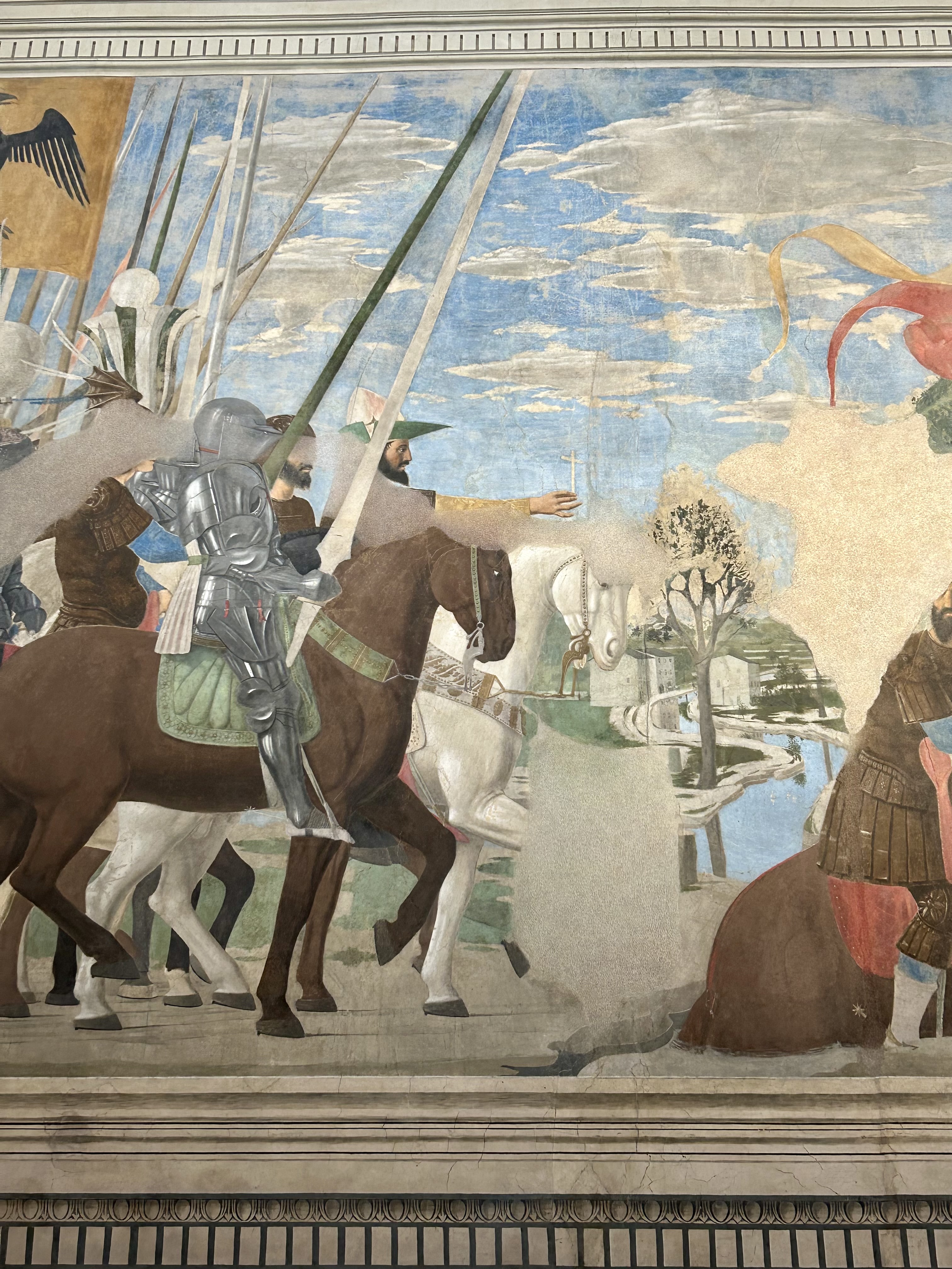
 The use of canvas was particularly common in Venice, perhaps less so in Florence where there was a strong tradition of fresco painting and also the persistence of transportable images being painted on wood as opposed to canvas; this is a generalization of course as both fresco and wood panels were used in Venice as well. But once canvas took over, the Venetians made particular use of its being a fabric with a warp and weft which meant a texture, one quite distinctly different from the completely smooth surface of a wall, or a prepared wooden panel. This natural texture of the sometimes heavy weave of Venetian canvas allowed painters such as Titian and Tintoretto to drag their paint-laden brushes across the weave, thus enabling subtlety and texture of brush-stroke (impasto) quite different from the often smoothly painted surfaces of their Florentine colleagues.

 What I have observed in the many figurative works now available on the internet, both from painters promoting themselves as well as in publicity for art classes, is the very common leaning, deliberate or unconscious, towards basically flat areas of 'filled-in' colour: filled-in because there is obviously a careful drawing made before starting with the paint to which the 'neophyte' painter then adheres as though their very life depended on it. In fact, in relation to a 'painted' picture and a 'coloured-in' drawing, it may be noted that many artists, as they age - Titian being a prime example - become less and less concerned with 'colouring-in' and more and more involved with (the pleasure of) manipulating the stuff, the paint, and with allowing the real materiality of that paint to speak, giving thereby their pictures yet another layer of meaning and intensity, related to but independent of the 'illustrative' or narrative function of their images.


Venus Blindfolding Cupid by Titian (Tiziano Vecellio, c1488 - 1576)
Oil on canvas, c1560-65. Galleria Borghese, Rome

A late work in this master's long life in which the dragging of the paint across the woven texture of the canvas is clearly visible, especially in the white garments and in the background; this technique may be compared with Titian's own early works in which the outline is still a controlling element.


The kind of work one so often sees on the internet is, generally speaking, illustration by another name, illustration 'dressed-up' as what used to be called 'fine art'. The fact that a painted (or drawn) artwork simply looks like the photo from which it derives does not therefore qualify it as 'painting' in the art sense: unless there is more to it, it is and remains an illustration. Painting is as much about the stuff itself, the material paint, the belle matière; that substance has a life of its own, a life quite different from its illustrative capacity or usefulness. If that is all that the paint is doing, that is, merely illustrating a photograph, then the result falls into the category of 'illustration', or design work, or graphic art, but, in my opinion, should not be misunderstood as 'painting' as the term is used in an art historical sense. Of course, art history contains many ways of painting including Western book illumination, Japanese and Chinese ink painting, fresco painting on the walls of Pompei, and the sublime illuminations of the holy works of Islam - and many more. A close study of the wall decorations at Pompei indeed, will perhaps point-up the difference between illustration and painting in the sense in which it is used here; a great number of the wall paintings at Pompei are in fact illustrated narrative - of architecture, mythological stories, nature - but the way of applying the paint itself (although, being in fresco it has no active texture) - is 'painterly' as opposed to being coloured-in drawing. These pictures in fact resemble in their looseness and dexterity certain types of Japanese work, with an obvious 'feel' for the flow of the brush-stroke.


Artist unknown, Jason and Pelias (detail), wall painting (fresco) from the House of Jason at Pompei,   25(?) BC. Museo Archeologico Nazionale di Napoli.

A beautifully made image of a man (Jason) skilfully using a minimum of expertly placed brush-strokes; in all likelihood this artist was merely repeating an image which he (or she) had made many times before. That notwithstanding, the concise confident brush-strokes, while being to some extent illustrative, are also painterly.


 I do not wish this opinion to be mis-interpreted; I, since my beginnings as a young boy drawing pictures without any guidance, and later at art school (with minimal guidance!), have fallen into these traps myself, many times. I have made drawings especially, which I was very happy with only to look back on them some years later and realise their shortcomings in 'art' terms. Some were actually passable efforts, some still work as illustrations but they're not, so to say 'real' painting. To understand this, it is extremely important to see, in person, as many recognised (old) master paintings as possible, which means visiting serious public art galleries and museums, getting away from art books and reproductions (as useful as these might be at the right time), and learning to 'separate the wheat from the chaff' amongst the thousands and thousands of pictures which we might encounter in local art shows, in art classes, on the internet and, especially, in museums of contemporary art. 1


A small painting by the author, Athletes, oil on canvas. This little painting, a cut-down detail from a larger original, was derived from - copied from - a photo in a sports magazine. This is an example of what is described in this article as a somewhat flat, graphic image, albeit that there is some illusion of depth; the sense of its being a 'coloured-in' drawing is very strong.


 Some might here object that, for instance, much of what is called Pop Art is in fact flat - and derived from photos - and deliberately so (as was much early 20th century art); this is completely true and so it can be said that Pop Art relies on the currency, in magazines, posters, commercial art, of the flat images used; in other words, the public knows how to read the source images even if they are assembled in novel ways by the artist. So yes, generally, one of the peculiar technical/formal qualities of this kind of art is its flatness, this quality being directly derived from the source material (various forms of graphic art and photography), nearly all of which was flat - which therefore goes to my point! For me, some of the least successful modernist images are, for example, the screen prints - as flat as you like - of the Pop artist Andy Warhol, no more 'art' than the photographs from which he made them; and not to be mentioned in the same breath as Titian, Velazquez, Rembrandt, et al!

 Discussing the taste and influence of the Grand Prince Ferdinand de' Medici (born 1663) in his wonderful book on Baroque painters and patrons, Francis Haskell says that the painters Crespi and Ricci had in common " - a looser brush stroke, a more painterly and spirited manner, a greater display of individual temperament ... ."2 In this quote are mentioned two of the elements - apart from my theme of painterliness - I feel are often missing from the type of 'illustrative' work this article is discussing, and those are a 'spirited manner' and 'a display of individual temperament'. Very frequently, this kind of, so to say, 'default illustration' is marked by the absence of just these qualities: little or no 'spirited manner' or individuality (that is, the independent character of the painter). One of the hallmarks of commercial graphic design and illustration is that they are produced more or less despite the personality of the particular artisan 3; much graphic work is obsessed with the accuracy of fine detail and, usually, this trait is the only one also ascribable to the maker of the work. It is this insistence on the graphic skill of copying 'exactly' what one sees (in a 'fine art' context) which is, to my mind, a major part of this problem.

 It would also appear that the common opinion of this type of painter, visible on the Net, is that the more one's paintings resemble the object or image (photo) in front of them, the better artisan they are and so the better their work is; a point of view perhaps related to the mistaken art historical notion of 'perfection'. Simply because the appreciation of art is such a personal matter, the concept of perfection is redundant; certainly, in the terms just mentioned, a given painting or drawing may be more or less similar to its model, in the same way that a given piece of paper may be perfectly rectangular or not. But that perfection has nothing at all to do with the 'art' aspect of a 'work of art'. Works of art have within them the character of the painter (or sculptor for instance) and that character is one of the ingredients which help to distinguish one work from another, one painter from another, one style from another and so on. But 'perfect' illustration of a given object, whether from a physical model or from a photograph, is the same whenever and wherever it is made; there is little or no personality there - as excellent illustrators and copyists are to be found the world over - if the measure of excellence is the exactness of the reproduction, of the imitation.

 Interestingly, recognised 'great' artists did not draw or paint 'perfect' pictures; their paintings and drawings are admired, yes because of the great skill they embody, but more because the artist in question has given us a point of view which is not only unique but also instructive. Painters who aim at a sort of technical perfection, by which I mean an ability to exactly imitate what they see - a residual of academicism -, are I think often misled by the admiration of those who view their work. Still today, even after the revolutions of the first part of the twentieth century, many lay people admire this ability to imitate - certainly worthy of admiration, agreed - but mistake that ability for art 4; unfortunately, so do many artisans skilled in this type of imitation.

  The use of the living model enjoys the imprimatur of historical tradition and of great artists, portraitists and history painters alike. Even leaving aside the ancient Greeks, the Greek painting tradition may be at least intuited from the so-called Fayum portraits of Hellenistic Egypt, most obviously painted from the living model; contemporaneous these with ancient Roman portrait sculpture. After the fall of that empire and a rather long gap, during which portraiture as such was so stylised as to be something quite different from our modern understanding of the word, it (portraiture) was revived in Italy as the Renaissance approached, from which point it has continued to be an important branch of the figurative art of the West. Modern portraitists include such people as Lucien Freud, Alberto Giacometti, and Graham Sutherland for instance; these three all worked with the live model (with results that are all quite different) and the first two are famous - or infamous - for having required the model to sit on dozens and dozens of occasions; Giacometti especially working and re-working his faces, be they in paint or clay, scrubbing off his day's work only to start all over again - possibly to the immense frustration of the model in question!

 The great Baroque sculptor, architect and painter, Gianlorenzo Bernini, in discussing his attitude to the live model, is reported as saying that " ... tenne un costume dal comune modo assai diverso, e fu che nel ritrare alcuno non voleva ch'egli stesse fermo, ma ch'e' si movesse, e ch'e' parlasse; perche in tal modo, diceva egli ch'e' vedeva tutto il suo bello, e lo contraffaceva com'egli era; asserendo che nello starsi al naturale immobilmente fermo egli non è mai tanto simile a se stesso quanto egli è nel moto, in cui quelle qualità consistono che sono tutte sue e non d'altri, e che danno la somiglianza al ritratto."5 [' ... (he) maintained a habit that was very different from the usual, and that was that in portraying someone he didn't want him to keep still, but (rather) that he should move and speak; because in that way, he said that he saw all his (the sitter's) beauty, and he portrayed him as he was; asserting that in keeping motionlessly still he is never so similar to himself as when he is moving, in which (movement) those qualities consist that are his and no-one else's, and which give the likeness to the portrait.' (translation my own and bracket insertions)].


Giovanni Lorenzo Bernini (1598 - 1680), Cardinal Scipione Borghese, marble, h. 78cm. 
Galleria Borghese, Rome. 

As must be obvious, this wonderful portrait bust was (originally) made from the live model, that is, the cardinal himself, most probably as well from at least one (known) drawing and a clay model. As it happens, there are two versions of this bust, both at the Galleria Borghese, because, as the finishing touches were being made to the first version, a crack appeared in the marble, across the forehead; so Bernini 'secretly' made another (above), based on the first.

 Here we should note that Bernini was principally a sculptor (and architect) and really an 'amateur' painter and so his remarks apply perhaps more to making a portrait sculpture than to painting a portrait and for that reason are even more pertinent. One imagines that when making a portrait sculpture he first started, apart from drawings, by making a clay model of his sitter rather than risk ruining a piece of marble; compared with making a mistake on the marble, repairing or changing something on a piece of clay is a hundred times easier (although not impossible, witness the substantial changes made by Michelangelo to his marble statue of Moses)! Be that as it may, the point of the remarks quoted above is that, not only is the living model to be in front of the artist but also that the model is to move and talk more or less freely (things a photo cannot do) while the artist works (note that this procedure is described as being quite unusual for the time). It is for this reason that the works of artists as different as Bernini, Giacometti and Freud have in common certain qualities of life-likeness which are almost impossible to achieve by the use of photos alone. As must be obvious, an artisan working from a photograph is at least one step removed from the living model and the more that artisan depends on the photo - that is, attempts to imitate exactly what can be seen in the photo - the less the finished work is going to be a painting with 'life' and the more it will simply resemble, so to say, a hand-made photo.

 From my own experience I would say that the use of photographs is quite alright so long as they are regarded as guides and not as a 'canon', that is, it is neither necessary nor desirable that they should be slavishly copied; the result of slavishly copying a reference photo is very often a 'dead' image; unfortunately, this is not to say that portraits painted from 'the life' cannot also be quite 'dead' or, ironically, 'lifeless'. And yes, the copied result may look exactly like the photo but, in that case, if that is the finished product, why bother copying it? The use of photographs as stimulus, as guides, as reference points is I think acceptable and useful, even if one is painting a portrait of a living person, but the living person must be the ultimate reference, not the photo. 

 To some extent, this can be explained more clearly by looking at Renaissance techniques; these involved, especially when painting pictures of historical, mythological or religious subjects, the use of studies of real people made from life, that is, drawings of living models: these drawings, very often quite small, were then scaled-up to the required size of the painting in hand. Such drawings from life would most usually be quite definitely generalized or stylized in the finished panel-picture or fresco as portraits as such in a religious or historical picture were not the point - unless of course, an actual portrait was required, possibly in the portrayal of an historical event in which a certain individual had really taken part. This was so much the case that when a genuine portrait appears in say, a mythological painting, it is at once obvious. Sometimes actual portraits were included in religious pictures and these represented the donors, the (rich) people who paid for the religious icon; however, in these cases, the donor(s) was nearly always set apart somehow, commonly positioned in one of the corners or at the very bottom, away from the main subject of the image 6. But if a portrait of a living person appears as a protagonist in such a picture it is, shall we say, painfully obvious. This is, again, a generalization as artists did sometimes insert their own likeness, or those of colleagues or important locals, into all sorts of pictures (Filippino Lippi, Botticelli, Vasari, etc.) A glaring example of this is Ghirlandaio's Sassetti Chapel frescos in the church of Santa Trinita, in Florence: there are in fact several obvious portraits in his ahistorical rendering of Saint Francis Receiving the Approval of His Order from Pope Honorius; the artist has set the scene in Florence with members of the Medici family present, whereas in fact the event took place in Rome, and certainly not with Lorenzo de' Medici in attendance!


Artist unknown, Head of a Bearded Man, Ptolemaic Period (Egypt), second half of the 2nd century BC, stone. Museo di Scultura Antica Giovanni Barracco, Rome.


Artist unknown, Head of Aphrodite, Roman copy of a Hellenistic original, marble. Museo di Scultura Antica Giovanni Barracco, Rome.


The two photos above (taken at an almost totally ignored once-private collection in the centre of Rome) demonstrate the difference between portraiture as generally understood and a stylized human face, typical of formal public and private sculpture in the ancient world. The first is of a sculpted head in black diorite and is obviously a portrait (made at roughly the same time as the Fayum painted portraits); it is clearly the result of direct observation of a living individual and this fact is immediately apparent when one comes upon the head in this remarkable collection (kept in what has substituted the original museum donated to the state by this late-19th century collector, Giovanni Barracco, still a public museum, the so-called Farnesina ai Baullari). The second head, as beautiful as it is, is very typical of many classical and Hellenistic female sculpted heads and cannot in any way be mistaken for a 'portrait' of a living individual.

And here possibly is the crux of the matter, portraits suggest the reality of an individual experience, they fix a point in a given person's life, their time here revealed by the signs of that life lived as a human being and therefore influencing a personality; other images of the human face, and I would include much of what was described at the beginning of this article, as well as heads such as the Aphrodite above, suggest a form of what we all know to be a human likeness but without a personality: expression, emotion perhaps, but no internal life. Both the black stone sculpted head above and the painted portrait below have a personality, and a strong one at that.


Carlo Maratta (1625 - 1713), Pope Clement IX, oil on canvas, 1669. Musei Vaticani.


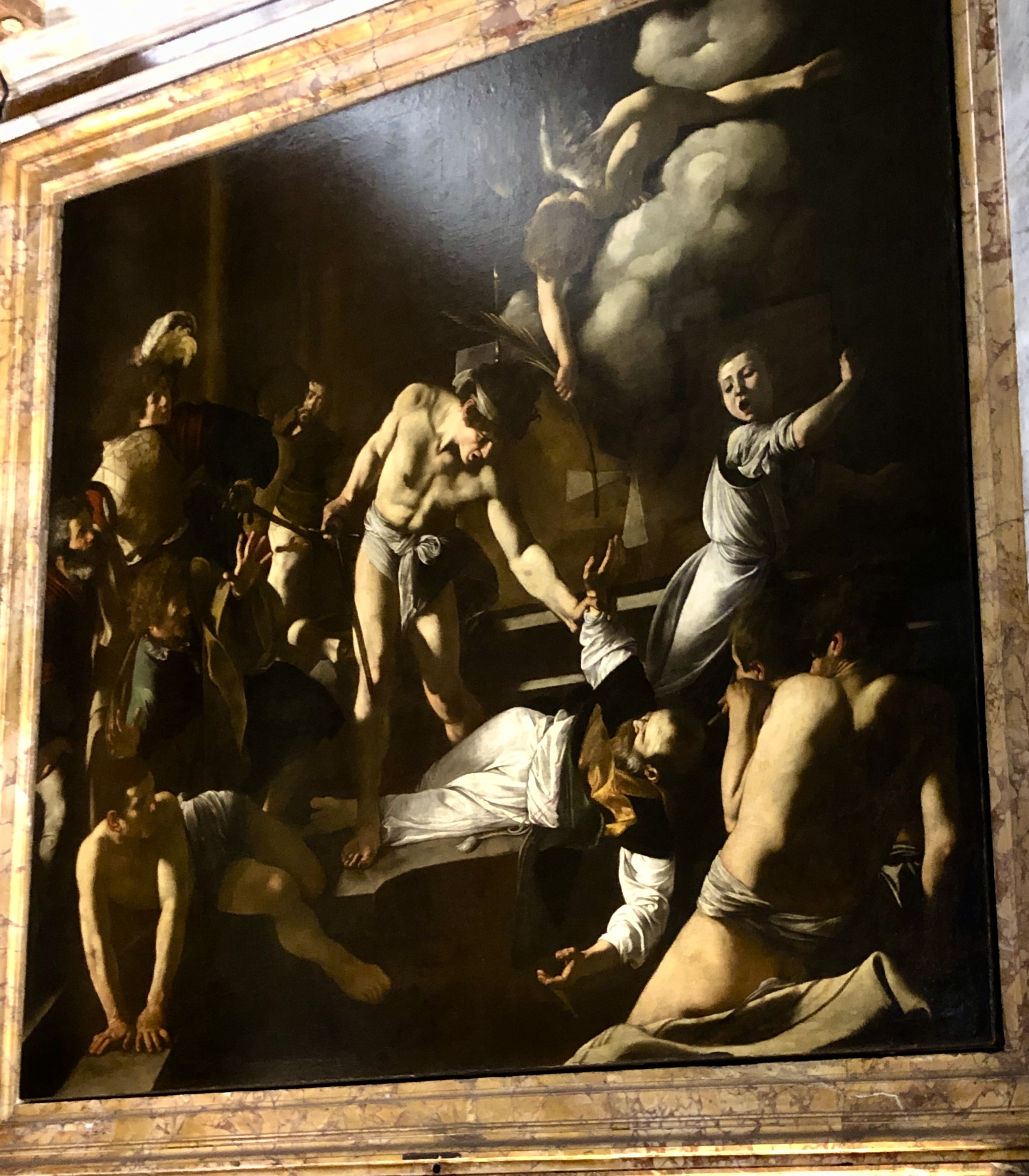
 At this point, let's have a look at a portrait from the Vatican Museums, the extraordinary portrait of Pope Clement IX by the portraitist Carlo Maratta. This portrait of the Pope was clearly made from the living model, so much so that we have the sense that the Pope is listening to the artist while he talks and works and is possibly about to say something in response. The very lively gaze of the sitter supported by the equally lively and beautiful handling of the clothing (and hands) contribute to our impression of having the man sitting in front of us! Maratta lived during the Baroque period at the height of Bernini's fame and virtual domination of the Roman scene; both artists were influenced by the naturalistic realism of Caravaggio's revolution. This revolution consisted, partly, in his insistence on painting directly from live models in a sort of, for the time, 'warts-and-all' approach; this contrasted and collided with the time-worn concept - from the early 1400s onwards - of 'selection'. That is to say, from at least the time of Leon Battista Alberti, artists were encouraged to 'select' the best parts of their models and so to speak, 'cobble them together' so as to create an ideal face or figure, this ideal stemming from an adherence to neo-Platonic theories, classical canons of beauty, and from stories about the working methods of famous ancient artists.

 The distinction I am attempting to make in this article is a difficult one to express as it depends on a certain awareness of and familiarity with a wide range of Western art, and to a large extent, art history. There have been many great graphic designers and illustrators, in the normal sense of the word, the commercial sense let's say, and there have been many wonderful artists who worked in various graphic mediums in the 'fine art' sense; people such as Dürer and Rembrandt, although it should be remembered that both of them were also painters. 

 Many artists at the beginning of the 20th century were in fact also commercial designers, the Bauhaus for instance being a kind of hot-house of graphic design of a very high level, as well as fostering the overlap of various fields of artistic production. Photography was also important there and in early 20th century art of various kinds, Dada for example. If a work of painting in particular is avowedly illustrative - as were many of the public murals made in the 1930s and '40s - I see no problem with that; but, on the other hand, if a work of painting is pretending to the status of 'fine art' while obviously being in reality a work of cold hubris merely demonstrating the artisan's skill, then that is where I see a problem. The scene is further complicated by the common confusion of functions or results; in the just-mentioned murals of the 1930s and '40s there is clearly a high level of technical 'fine art' skill and a broad awareness of art history put to the illustrative purpose - especially in the US and the USSR - of propaganda of one sort or another. The astute reader will of course remark that much of the art produced in Europe, and in Italy and Spain particularly, in times gone by was also (religious) propaganda. At this point however, we might compare, using our favourite art history books (the ones with the great photos), the Renaissance or Baroque periods with some of the things I have discussed here, those things to be found on the internet, and ask ourselves: is there a qualitative difference, is there a function difference?

 As an aside, by now that same reader will have noticed my use of the terms artisan or painter as opposed to the more conventional - and ubiquitous - artist; this is because that word, the description 'artist', is nowadays a much abused term. So much so that it seems to me that we need to invent another expression for those people contriving all manner of installations full of political and social messages - and for those practising the illustrative forms discussed here - and perhaps reserve the term 'artist' for those still working in the methods and with the materials and aims of the 'traditional' painter (sculptor, printmaker, etc.), keeping in mind that technical ability equals neither understanding - nor art! 

 At the very beginning of this article I mentioned the name of Roberto Longhi; in his book entitled simply Caravaggio, he discusses the difference between Caravaggio and some other painters working in Rome at that same time (early 17th century), saying: "In the over-fastidious and morbidly refined description of the 'ecclesiastical and civil portraits' of (Scipione) Pulzone, perhaps even with the window (of the studio) depicted in the pupil (of the sitter); ... it is always an almost mystical form of mental abnegation before the (tiny) detail, the particular, ... ." 7 (insertions in brackets my own). In this passage Longhi was contrasting the meticulousness of certain contemporary Baroque painters with the, may I say, more genuine, the more ad hoc realism (or naturalism?) of Caravaggio. The distinction between these two terms, realism and naturalism, is one of the themes of Longhi's book and need not concern us here; what is relevant is the observation that certain forms of figurative art are obsessed with an accumulation of detail at the expense of a more solid, robust and 'natural' depiction of the real world; a distinction the present article is also at pains to illuminate.

 To conclude, a note to the beginner: using photos once you can already paint without them is fine but relying on them before you know what you're doing is a trap. And if an art class or school bases its teaching on the use of photographs then you know you're in the wrong place!


1 "... esercitare l'occhio, preferendolo ai libri." [ '... exercise the eye, preferring it to books.'] So said Guglielmina (Mina) Gregori, highly respected Italian art historian who has just celebrated her 101st birthday. She further told how: "... she had learned to pass whole days in museums and art galleries, looking for hours at the works on view ..." (translations my own). Both quotes taken from an internet article regarding in fact her recent birthday. (March, 2025).

2 Francis Haskell, Patrons and Painters - Art and Society in Baroque Italy, Yale University Press, New Haven and London 1980; p237.

3 A distinction needs to be made here: in this article we are not discussing graphic work as understood in the manner of someone such as Dürer or Rembrant or Piranese or even Picasso; their work was graphic art in the 'art' sense, not in the imitative sense in which those words (graphic, illustration, illustrative, etc.) are being used in this article.

4 I realise that I am potentially wading into deep waters here as, for some, as a way of course of derailing the argument, such statements introduce the (as they know) unanswerable question: what is art? At this point, in my experience, such people enjoy side-tracking the argument at hand with that all-winning rejoinder thus, in their humble (?) opinions, destroying the validity of the points being made in the said argument. If, on the other hand, they feel that their 'art' is being belittled or dismissed, perhaps they might offer the much-sought answer to that vexed question, what is art? By what definition is their work automatically 'art'?

5 Tomaso Montanari, La libertà di Bernini - La sovranità dell'artista e le regole del potere, published by Einaudi, 2016, p179. The quote apparently comes from one of the well-known biographies of Bernini written by the Florentine Filippo Baldinucci: Vita del Cavaliere Gio. Lorenzo Bernino, Scultore,  Architetto, e Pittore, MDCLXXXII.   N.B. Bernini's surname was often spelled Bernino as opposed to Bernini in texts written at that time, that is, during the Baroque period and later.

6 As if to confute all that has just been said, I should here mention a picture painted by Giorgio Vasari (about whom see various articles in this blog) in which a large number of portraits made from life - as well as one based on a papal portrait (of Clement VII, 1531) by Sebastiano del Piombo, and another based on an earlier portrait by Vasari himself of (then dead) Duke Alessandro Medici - feature in what is ostensibly a religious subject: The Feast of Saint Gregory the Great (c1540) which is in the Pinacoteca Nazionale in Bologna. The Pope Clement portrait did work in this picture as the face of Pope Gregory while the numerous other portraits were of people somehow connected with the commission itself (monks, abbots, etc.).

7 Roberto Longhi, Caravaggio, 1968 Editori Riuniti, the second edition of his book originally published in 1952 under the title Il Caravaggio. The quotation is to be found on pp12 and 13 of Caravaggio (1968) and the translation is my own; "Nella preziosa e accurata descrizione dei 'ritratti ecclesiastici e civili' del Pulzone, magari con la finestra ricamata nella pupilla; ... è sempre una forma, quasi mistica, di abnegazione mentale di fronte al particolare, ... ."


Tuesday, 31 December 2024

Alessio Baldovinetti at the Chiostro dei Voti


This article was prompted by a question from an Australian friend who lives in Italy (and has lived there for decades); she had remarked that she and a mutual friend had recently visited the wonderful church of the Santissima Annunziata in central Florence. The enclosed entrance atrium (known as the Chiostro dei Voti) of this beautiful place has Renaissance frescos on all four walls, all of which frescos have suffered over the centuries and so, despite recent restorations, are clearly not as the various artists had left them, they are no longer in their pristine state.

These artists by the way include Andrea del Sarto and his students Pontormo and Rosso Fiorentino. One of the others who also worked in the Chiostro was Alessio Baldovinetti (1425 - 1499) and it is his fresco which I would like to have a look at today. This fresco has already been briefly cited in reference to still-life painting in the article Some Remarks about Still-life Painting (on this blog), but let's look at it again from a couple of different points of view.


The photo above shows Alessio's complete painting as it appears (albeit slightly distorted by the camera) in the Chiostro dei Voti, situated to the left of the entrance door of the church proper; it is painted on the wall between two arches and has a semi-circular top. It is bordered by a design which includes portrait heads, something which we see also on the sculpted frame of Michelangelo's Doni Tondo (The Holy Family, Uffizi) and, in a similar way, on Ghiberti's so-called Gates of Paradise, the east doors of the Florentine Baptistry.

The painting shows the Nativity, the birth of Christ, before a tumble-down structure with a make-shift roof; the principal characters in the narrative are of course the baby Jesus and his mother Mary and father Joseph. The supporting actors, so to speak, are  some shepherds - both in the foreground and in the left middle-distance -, the ox and ass, or donkey, as well as a flock of sheep and five rejoicing angels hovering above (one delivering the good news to the shepherds on the left). Because of the photo here, the ruined building appears somewhat oddly-shaped but in fact it is a simple, normally vertical box. This building occupies slightly more than half of the width of the image, from the right. It is, as it were, balanced on the left by a vast panoramic view of what we may assume to be either the Tiber Valley or, if closer to Florence, the Arno Valley: in either case, the man-made contrasted with, or complemented by, the natural.


A detail of the landscape view on the left of Alessio's Nativity, 1460-62


This juxtaposition of the solid, comparatively dark stone structure and the light, airy expanse of the sun-lit landscape fulfils at least two purposes: first, it provides, on the right, a setting for the stated subject of the image, the Nativity of Jesus Christ, and contains all the requisite elements, as listed above; and secondly, the contrast between the overall darkness of that right side with the clear open brightness on the left is symbolic of the advent of the Light of the World, that is, the birth of Jesus. This is an important departure from the usual symmetry in Italian painting of the Nativity scene, with the adoring mother and her child firmly the central focus. In Alessio's version however, while Mary is still almost the centre of the composition, the vast, highly naturalistic landscape panorama on the left constantly draws one's eye to that side of the picture.

And this landscape is astoundingly compelling as a verifiable space; it recedes ineluctably towards the hazy mountains in the far, far distance, taking us, almost like the flight of a bird, down from the high-point of the Nativity building, across the broad plain of the Arno (or Tiber) River and, following its meandering course, past outlying farmhouses and other structures, past a distant walled-city at the base of that mountain range and finally into the ethereal transformation at the meeting of 'fluid' solidity and moist sky. It reminds one of nothing so much as Alessio's contemporary, Piero della Francesca (1412 - 1492), a painter noted, amongst other things, for just this kind of limpidly lit airy spaciousness. *


Another detail, distorted in the photo, of the right side of the Nativity

In the detail above we see part of the stone building where the young couple has taken shelter, two shepherds (?) on the right, and Saint Joseph on the ground in the centre, reclining on a saddle; it is this small area I would like to examine now. First, it should be mentioned that certain parts of this fresco have suffered substantial losses of colour, in particular almost the entire figure of the shepherd on the left here and certain parts of his companion on the right. I say 'substantial losses' but it does seem possible that in fact various parts, especially of the shepherd on the left, may have been left unpainted! The underpainting seems to be complete but almost all the colour is missing; this applies as well to the canteen or water-bottle just in front of Joseph: the outline form is clear but again, absolutely no colour! Similarly, while Joseph's cloak could be white - if so, a unique invention - it too appears to have been left at an earlier stage and is missing its final colour. Where the colour itself does seem to have suffered over time is the blue of Joseph's tunic; the colour is there but all the modelling has apparently worn off. This could be due to certain technical problems with the application of the paint in the fresco technique, or to weather or rubbing; the same could be said of the ass in the background here, which also looks as though it is without (final) colour. In addition, apparently, Alessio, like Leonardo da Vinci, devised his own experiments with paint, many of which (in both cases) were unsuccessful.

Interestingly, a similar situation exists in Piero della Francesca's fresco cycle in the church of San Francesco, in Arezzo. In this series of related narrative scenes there are two battle paintings and in both - unless the colour has actually dropped off (unlikely if 'buon fresco' [true fresco] had been used) - various parts appear to have never had colour. In this case however, the areas in question are so much part of the whole that they function almost as though they were actually coloured; some of the lances in the scene of the Battle of Constantine and Maxentius for example or, perhaps the most obvious, a trumpeter in the Battle of Heraclius and Chosroes: his large 'eastern' hat seems to me to have never been painted-in and exists as an uncoloured abstract shape which, within the context of the scene, works perfectly well (and generally unnoticed) as a kind of 'neutral' colour. This same type of hat is featured three times in the lunette above (The Exaltation of the True Cross), at the top of the same wall, in which at least one is unpainted as well as a section of its wearer's cloak.


A detail of the Battle between Constantine and Maxentius, by Piero della Francesca, c 1452-55 (?), fresco in San Francesco, Arezzo. Note the apparently unpainted lance held by the rider of the brown horse on the left and the limpid landscape between the combatants. The large lacuna above the rider on the right is where an entire section of the plaster has been lost.


The already remarked similarity between Alessio's treatment of landscape and that of Piero della Francesca may be exemplified here as well, that is, in the scene of the Battle between Constantine and Maxentius (see photo above); in the central space which separates the two belligerent forces, Piero has placed a view of a bend in a distant river, a river also, like Alessio's, in a broad plain, with a few houses and small figures along it banks and even a couple of swans, a scene so tranquil and mundane which thus contrasts dramatically with the battle frieze in the immediate foreground! The pale summer blue of the sky and its candid clouds, the brilliantly clear light of Tuscany, painted on various occasions by Piero della Francesca - and by Alessio Baldovinetti at Santissima Annunziata - are true and real observations of fact; whether or not one painter was aware of the work of the other is not known at present. The supposed dates of Piero's work at Arezzo (1452-55) would suggest that he had painted his magnum opus prior to Alessio painting his (1460-62) but it should be pointed out that scholars have great difficulty in agreeing on the dates of many of Piero's works. However, so as not to fall into a common error, and as a painter myself, I may observe that it is more than possible that these two painters knew nothing of each other and simply, because of the similar time and place - mid-15th century Tuscany - arrived at very similar perceptions of the world around them. Both artists indeed are recorded as having worked with Domenico Veneziano whose understanding of this particular quality of light may have contributed to this common outlook.

In the Chiostro dei Voti it is possible that artists such as Andrea del Sarto might attract more attention - as they did with me initially - and especially so since his students, Pontormo and Rosso Fiorentino, also became extremely important painters in their own right. There is something a little awkward in the drawing of the two shepherds(?) in Alessio's Nativity although the figure of Saint Joseph in repose and other objects - the saddle for instance - make it perfectly clear that he knew what he was doing; often his figures do not have the kind of Renaissance 'gravity' about them which is perhaps more obvious in some of the other frescos in this cloister. The slightly more 'illustrative' look of this painting may dissuade closer scrutiny by some visitors: I admit it took me some visits before I really 'tuned in' to Alessio!


Annunciation by Alessio Baldovinetti, c 1457, in the Uffizi.


To finish, I have included the photo above so as to show an example of Alessio's 'easel painting' as opposed to the fresco we have been discussing; incidentally, note the beautiful bright colours, giving us an idea of what his Santissima Annunziata fresco may originally have looked like. This largish picture is kept in the Uffizi Gallery in Florence and demonstrates two things about Alessio's work: first and perhaps most obviously, his complete command of perspective drawing - in fact, some might argue, and I amongst them, that the real protagonist of this picture is actually illusion created by perspective, together with the beautiful colour; and secondly, it further exemplifies the earlier observation that Alessio's figures have an anachronistic quality, in this case, an adherence to the earlier courtly style known as International Gothic. Their graceful elongated bodies and static gestures are out of keeping with the very 'modern' perspective-derived setting: not only the perspective construction itself but the 'modern' rounded arches as well. It should be remembered that at this point, about 1457, we have already seen major works by not only Masaccio, but also Donatello, Mantegna and Andrea del Verrocchio, all of which have a robust vigour about them; even Lorenzo Ghiberti, with whom Alessio shares the qualities of his figures to a certain extent, can be quite robust when so inspired.

For the present writer at least, the work of Alessio Baldovinetti was an 'an acquired taste' but once I gave him the time he deserves, I was rewarded with some wonderful moments notwithstanding some reservations. But, in fact, it may be (naively) asked, in the Western tradition, do 'perfect' pictures actually exist? A kind of nonsense question! My response to Alessio's work would seem to suggest that the answer lies more within the viewer than in the objects themselves; does the perfect viewer exist, subject as we are to moods, temper, our culture (education) and so on, even to the effects of the weather? We bring all of ourselves to the act of gazing at art works, including our age, our maturity, and for this reason it is necessary, and fulfilling, to look again and again at not only our favourite works but also at those for which, perhaps, we may have little initial sympathy.


* Indeed, Piero della Francesca also painted a very famous Nativity, unfinished, damaged and apparently a very late work (perhaps 1475), so, later than Alessio's it would seem (now in the National Gallery, London).


Note the distant but clear panoramic river-valley view on the left and also other 'coincidences' such as Saint Joseph, on the right, seated on a very similar saddle. Alessio's and Piero's paintings are not the same but similarities nevertheless exist. Apologies for the poor-quality photo.


Note: all photos in this article taken by the author who reserves copyright.


Monday, 9 September 2024

Announcing a Little Space in Ognissanti


I am now returned from Italy and thought I might continue the mini-series I began there, that is, of short articles concerning something which it takes my fancy to write about. On this occasion, let's have a look at a 'new' fresco, new to me I mean, although this work was made about 1370.

While in Florence, I happened one day to be walking past the church of Ognissanti whose imposing façade faces, across a piazza, the Arno River. I was actually headed for my favourite bookshop (arte&libri), in Via dei Fossi, but I could not resist the temptation (so to speak) to revisit this important building; important because it houses frescos by Taddeo Gaddi, Ghirlandaio, Botticelli, a large painted Crucifix by Giotto, and so on, but as well, in the refectory of the attached convent, a Last Supper, also by Ghirlandaio.


Saint Augustine (1480) by Botticelli, detached fresco, on the east wall of the nave of the church of Ognissanti, Florence. Sandro Botticelli, whose real family name was Filipepi, was buried in the family tomb in this church; the remains however seem to have been lost during later building works.


As it transpired, I did not see the Last Supper but got involved with the works in the church itself. And, as I discovered several times on this trip, parts of the building never before accessible to the public were now opened. And the area which interested me the most was an old sacristy which, as I say, I had not seen previously. This sacristy is situated at the end of the left transept of the church and to reach it, one has to go past Giotto's powerful Crucifix, suspended above the opening of a side-chapel.

In the sacristy were three large fresco remnants, two virtually complete, as well as the 'sinopia' - the painted under-drawing - of one of those, a Crucifixion with Holy Figures, c.1350, by Taddeo Gaddi. But the focus for us today is the other almost intact fresco of an Annunciation attributed to an anonymous artist known as the Maestro di Barberino. At first sight, this picture may seem a conventional image of that important event, the announcing Angel on the left and the compliant Virgin Mary on the right. 


Annunciation, c.1370, by the Master of Barberino; detached fresco, now in the Sacristy but originally in a chapel situated against the inside of the façade wall (controfacciata). Because of the height on the wall, there is some distortion in the photo used here; vertical planes are vertical, not inclined as this image suggests.

A curious eye regarding this image may start to wonder, given the period, about how our painter dealt with perspective (not fully developed or described until about 50 years later). In a booklet concerning the church and its artworks, this painting is described somewhat dismissively as not being of any particular note artistically. I agree that from some points of view, it is problematical and, in terms of the two main protagonists, not especially inspiring. However, this painter's interest in space is worth examining as, although perhaps not so powerfully done as certain things by Giotto (d.1337), he has definitely understood the nature of recession.

The 'staging' of the encounter is conventional in that it takes place in what we may assume to be Mary's study, or something similar. What might strike some observers as especially odd is the miniature figure in the lower centre of the image; in fact, this is also conventional, in two ways: first, this figure represents the 'donor' or patron of the fresco, that is, the (human) person who paid for it, and, although he is pictured conspicuously in the centre of this Annunciation, his presence in and of itself is not unusual for the time. Secondly, the fact that he is so diminutive is due to the convention of hierarchy: in Christian art, God and Jesus were represented as the largest figures, followed by the Virgin and St John the Baptist, followed by the angels, then the saints and finally, smallest of all, any donor or donors who happened to be included 1. Needless to say, only fairly wealthy people or corporate patrons could afford to pay for such a work of art (this one incidentally, quite large).

Another conventional element, although by this time, a little anachronistic, is the painted words of the dialogue which occurred between Mary and the Angel: he greets her - his words are in white just above the yellow back-rest of the large chest in the centre of the painting; her answer appears in gold letters coming from her mouth and directed, not at the Angel, but rather along the shaft of light coming in from the top left of the image (along which descends the Holy Ghost in the form of a small dove), originally the site of the face of God.  

Large parts of the beautiful Angel, with his arms folded and holding the traditional lily, appear to have been added in 'a secco' work, that is, not painted in 'buon fresco', but added after, when the 'fresco' part was dry; this is suggested by the many areas where the paint has clearly dropped off the surface (note the almost vanished wing on the left), and the underlying 'fresco' has become visible. This is extremely unusual as a major figure such as this would certainly have been painted in 'buon fresco', as seems to be the case for the Angel's head and neck and the green parts of his cloak. Naturally though, damage to a fresco can also be the result of many other things, including simple vandalism and carelessness.

However, it is in the representation of the architectural environment, and therefore the space, that this anonymous artist has attempted to move away from convention. The whole composition, excluding the figures, is based on a series of horizontal strata, beginning at the 'front' edge of the image and, as it were, climbing up the wall, to reach the top of the surface. These horizontal planes represent, in a receding series: the floor and carpet as well as the forward edge of the ceiling of the 'room'; the front face of the yellow trunk or bedroom chest; the back-rest of the chest; the green lozenge design of the rear wall; the ceiling of the 'room'; the pale green wall of some further-distant structure pierced by four windows; and then lastly, the sky (whose blue colour - now red - has been lost due to the technical requirements of using a particular blue in fresco). 

Beginning with the carpet, we see that the design, centred on the star pattern, recedes harmoniously - if intuitively - towards some imagined vanishing point; two of the next large areas, the front part of the yellow chest and the green wall with its lozenge shapes, are verticals; the seat or lid of the chest is not a vertical but a receding plane, indicated by fine lines at its right, near the Virgin, and near the centre; note how that latter line recedes from the front of the chest to the back-rest. More evidence of the artist's intention has been revealed - by chance - by the loss of paint on the left side of the yellow chest, in the now-visible space between the Angel's left elbow and left knee, where the receding lines are clearly visible. The two sides of this room meet its ceiling in convincing recession and are already indicating that, at this point, we are looking up; in fact, we do see the ceiling, with its receding boards, as though we had to shift our focus upwards as opposed to looking at the two actors straight on. 

This recession - of the ceiling and its join with the left wall - is carried even further into space by the use of a Gothic arch doorway cut into the left of the green rear wall. Through this arch we gain admittance to another, more distant room where we glimpse a large wooden structure, perhaps a bed of the type common in medieval houses of the wealthy; drawn across our side of the bed is a lace curtain establishing yet another 'layer' of space. This device, of a hole in a rear wall giving access into a further distant space is not unique to this picture 2 and, incidentally, was one taken-up and significantly developed by Piero della Francesca, in the next century, in his painting known as the Madonna of Senigallia (1474).


This is a (not very sharp) detail including the 'back room' with its lace curtain and what appears to be a large wooden structure, possibly a bed. In this detail as well, the loss of paint in various areas is obvious as too is the original perspective drawing of the left side of the yellow chest. Note however, that the face and neck of the angel are in 'perfect' condition compared with the wing and the wine-dark robe.

The area above our 'room' is a pale green wall situated, both by virtue of its less-strong colour and the (badly-drawn) receding lines of the adjacent structures leading to it, at some distance much further back in relation to the front edge of the carpet for instance. The curiosity here is that the separating grey columns of that pale green wall are crowned with statues of Christian saints (amongst whom, one or two martyrs), even before Christ himself is born!

While being able to assure you that this fresco is a lot more arresting than it might seem in a small photograph, and admitting its various shortcomings, I feel that the artist's attempt to comprehend and represent three-dimensional space must be acknowledged, and even that there are one or two subtleties there as well. The artist, rather than being a figure painter per se, appears more to delight in patterns, in which this picture abounds, and therefore in details: a close-up view of the centre lines in the seat of the chest show that on its front surface, a thin yellow strip, he has continued those two lines so as to show the function of the woodwork: in other words, that the top of the chest opens on either side! 

Our fresco does not seem to be a 'great' work, but, at the end of the day, like many such 'minor' pieces, it still contains small 'jewels' of beauty and intelligence and, after all, what more do we need to help us through our day?


Piero della Francesca, c1412-1492: The Madonna of Senigallia, 1474. Tempera and oil on wood panel, photographed in the Galleria Nazionale delle Marche at Urbino. Despite the reflections caused by the glass case in which it is displayed (particularly bad on the right), it is possible to see the 'room' visible through the doorway on the left of the painting behind the Angel in blue. Piero has even included the floating particles of dust made obvious when strong light comes through a window, as in this image.


1 A very interesting example of this is in the apse mosaic of Santa Maria Maggiore in Rome. As said, Christ and Mary are by far the biggest figures in the composition; they are surrounded at their feet by numerous angels, much smaller; in an intermediate size, but still much smaller than the two main protagonists, are six saints, three on either side; on the extreme left of this group of saints we discover one of their newer members, Saint Francis of Assisi (canonized 1228). The mosaic dates from around 1290 and was commissioned by the first Franciscan Pope, Nicholas IV; although St Francis is with the other saints, he is the 'new boy' and is somewhat smaller than his companions, Saints Paul and Peter (who were in any case actual apostles); the Pope however, is by far the smallest figure on this side, despite being a Pope! He has a companion on the right side, Cardinal Giacomo Colonna, one of two brothers Colonna who actually paid for the picture. The mosaic is the work of the painter Jacopo Torriti who signed it in the lower left corner. In our fresco, the Angel is apparently the same height as Mary but, notice, he is kneeling; were he to stand upright, he would then be much larger than the Virgin who, at this point it will be remembered, is still a (mere if particular) human being.

2 As a device to suggest further and deeper space beyond the action in the foreground areas (and so too, beyond the surface of the support: wall, canvas or wood), a 'hole in the wall', so to speak, was not uncommon; apart from its use in interiors as here, it was also used to suggest the inner parts of fortified cities for instance, often seen through one of the city gates. Examples from our anonymous painter's time include Duccio - in his stupendous Maestà (1308-11) - and Pietro Lorenzetti in his Birth of the Virgin (1342), both in Siena; and a bit later in Florence, circa 1420, Lorenzo Monaco's version of the same subject in Santa Trinita.


Wednesday, 14 February 2024

The Calling of Saint Matthew by Caravaggio


Michelangelo Merisi da Caravaggio, 1571 -1610; the name 'Caravaggio', as Michelangelo Merisi is universally known, derives from his family's ancestral home near Bergamo and was long thought to have been his birthplace; he is now believed to have been born in Milan.


The Calling of Saint Matthew by Caravaggio, 1599-1600; oil on canvas, 322 x 340 cm  
The Contarelli Chapel in the church of San Luigi dei Francesi, Rome

The photo above was taken by me in Rome in 2022; it shows one of Caravaggio's master-works, the Calling of Saint Matthew. What has prompted this article is a recent re-statement by an art historian of what I believe to be a mis-reading of the dynamics of this picture 1. What follows is the result of having not only read about Caravaggio and about this work in particular, but also - and to some extent, more importantly - of having seen the actual painting, in person, in situ (that is, in the chapel for which it was originally painted). 

To set the scene: the chapel, not large, contains three masterpieces by Caravaggio who was commissioned to fulfil the will of the patron of the chapel (whose first name was Matthew 2) . The paintings therefore concern events in the life of the Gospel-writer Saint Matthew. The three paintings are: Saint Matthew Inspired by the Angel (a second version, altar wall); The Calling of Saint Matthew (left side-wall); The Martyrdom of Saint Matthew (right side-wall). The picture we are interested in represents the event when the Saint, at the time said to have been a tax-collector (for the Romans) and possibly named Levi, was called by Jesus to abandon his current life and to follow Him.


The Martyrdom of Saint Matthew by Caravaggio, 1559 - 1600; oil on canvas, 323 x 343 cm; Contarelli Chapel; begun before but completed after the Calling.
Note that, visiting this chapel as a tourist, it is not possible to stand directly in front of the paintings which, unfortunately, results in somewhat distorted photographs.


The apparently usual reading of the action in this startling image is that Christ, on the extreme right of the painting and almost wholly obscured by Saint Peter and shadow, is pointing his index finger at the man called Levi (or Matthew) whom he is more-or-less commanding to follow him, to become one of his disciples. The presumed object of this gesture is the bearded man seated between two others on the opposite side of the table; this figure appears, in the action of seemingly pointing to himself, to be indicating that he is indeed Levi. And this choice of a bearded older figure conforms with the normal iconography of Saint Matthew, so it appears the obvious and logical one. But let's have a closer look at the internal dynamics of this great painting.

Caravaggio is routinely credited with an outstanding and dramatic use of light, and, as in this case, also of deep shadow. In fact, his accentuation of the contrast between lighted areas and those parts in shadow are the essence of this Lombard painter whose approach went on to conquer Rome, Naples, Sicily and eventually the whole of Europe. The other, earlier, essential development in Caravaggio's art was his high degree of realism: in fact, he got into a bit of trouble with various authorities and patrons (including in our case) precisely because his sacred images were too realistic - or, to put it another way, not otherworldly enough. That however is not our concern at present, but his use of light is.

As with many religious works of art - and non-religious for that matter - symbols play an enormous part in their meaning. Light, which in a technical sense is used to mould forms and create space, is highly symbolically charged and perhaps the most important significance it has is that of divine light. Even in contemporary English, we still use the phrase 'to see the light', meaning to finally understand or get the point. The Bible is replete with passages describing divine light, or being brought out of darkness into the light, and so on and so on. Clearly, in Christian art, light is a powerful tool, both technically and as metaphor or analogy. And it is as metaphor that I believe the function of light in the Calling of Saint Matthew has been overlooked 3.

Looking now at our photo of the painting what we see is, yes, Christ with His raised arm pointing towards the men at the table on the other side of the scene. We see as well the bearded figure there, pointing seemingly at himself, as though to say: 'Who, me?' Now let's have a closer look at what the light is doing. An enormous shaft of light streams in from the top right corner of the image and travels across the space of that environment lighting as it does, not only the face, neck and raised hand of Jesus and the back of Saint Peter, but also all the faces (and many of the hands) of the men at the table - all of whom are looking in the direction of Christ ... except one! The young man - nearly always ignored - seated at the left-hand edge of the table (capotavola in Italian, the head of the table), the figure furthest from Jesus.

The physical attitude of this figure, his demeanour, betrays his mind: his downcast face, his shoulders around his neck, his (lighted) hand abstractedly pushing around the coins in front of him 4 and ... the very minimal light on his face (unlike all his companions); all these suggest a man troubled by his life, unhappy with the world and himself. The Bible tells how Levi, a Jew, was despised by his countrymen because he worked for the Romans, he collected their taxes from his own people! In addition, of all those seated at that table with their heads turned to look at the mysterious figure addressing them so strangely, the only one potentially facing Christ directly, directly in the line of His gaze, is this troubled young man; actually and metaphorically, the only one not seeing the light.         

My contention is that, despite normal iconography, our Levi-become-Saint Matthew is that man seated at the head of the table. Further comments may be made though concerning the figure usually described as the Saint Matthew, that is, the centrally-placed older man. Apart from his seeming a man of rather nondescript character and therefore an unlikely candidate as a saint (!), his much-remarked gesture is, to say the least, ambiguous. It is possible, as mentioned, that he is incredulously indicating himself, but his gesture could just as easily be interpreted as indicating the even older man to his right; or the younger man at the head of the table. 

The history of this commission tells us that already, having begun work first on the Martyrdom of Saint Matthew, Caravaggio had run into difficulties as he was quite unused to working on the large scale required by this commission; as well, he had started by attempting a kind of Renaissance-style composition with which he became unhappy. Temporarily abandoning this, he turned to the Calling and it was here that he 'found his feet', so to speak. He dropped the grand setting and opted for a simple, open theatrical-style 'backdrop' so that it is unclear if we are inside or out. The action occurs in a frieze-like composition although unusually reading from right to left, a decision almost certainly dictated by the source of natural light in the chapel; in fact, in the Martyrdom, the direction of the light is reversed, that is, also in keeping with the source of light in the chapel. Given such adventurous departing from the norm, it does not in the least surprise me that Caravaggio interpreted the Saint - who had plenty to do afterwards - as a robust youngish man; to me at least, he seems quite a bit older than his two younger companions seated on either side of the other end of the table while clearly younger than his obviously senior ones.

To finish, I would like to draw to the attention of the reader the name of a great Italian art historian, Roberto Longhi (1890 - 1970). Apart from crucial studies on such people as Piero della Francesca, Longhi has the distinct honour of being one of a small group of people who rescued Caravaggio from the near oblivion into which he had slipped shortly after his death. In 1951 Longhi organised an exhibition at Milan's Palazzo Reale to celebrate the long-forgotten and oft-maligned artist. Later, in 1952, with additions, Longhi's findings and understanding of Caravaggio were published in a book entitled Il Caravaggio 5. In this re-published book, reviewed last year by Francesca Saraceno, we read (quoting from the Sarceno article): 'E sebbene Longhi individui il San Matteo della Vocazione nel personaggio barbuto al centro, come da consolidata tradizione, tradisce forse il dubbio - sebbene di un attimo - rispetto a quel "giocatore a capotavola che vorrebbe immergersi nell'ombra lurida della propria perplessità"'. (trans: 'And although Longhi identified the Saint Matthew of the Calling as the bearded personage in the centre, following established tradition, he betrays a doubt - if only for a moment - regarding that "gambler at the head of the table who it seems would like to lose himself in the lurid shadow of his own perplexity"'). Some things to note regarding Longhi's quotation: first, the Italian name used here in shortened form for the Calling of Saint Matthew is La Vocazione, meaning the Vocation of Saint Matthew (the same painting under discussion in this article); secondly and importantly, Longhi's apparent doubt, according to Francesca Saraceno, concerning the true identity of the Saint in our picture; and thirdly, Longhi's reference to our man as a 'giocatore'.

In his book, Longhi, as various critics had already suggested, also posits that the future Saint and his companions are actually engaged in a game of chance, that he's gambling; how they managed to arrive at such a conclusion is beyond me as what is on the table in the painting would seem to be the necessaries of a tax collector: account book, ink-well, coins, money bag, etc. Although I cannot see these people as gamblers, the accepted reading of our picture was as an interrupted game of cards (or dice as Longhi insisted), despite the fact that such articles do not appear on the table; this reading also follows a 'consolidata tradizione' (that is, established tradition), probably based on the similarities of the younger men at the table - and their clothing - to similar characters in at least one of Caravaggio's known earlier pictures which deals explicitly with cardsharps (The Cardsharps, in two known versions: at Fort Worth [1595-96] and London [according to Sebastian Schütze - see Note 1 - possibly a copy]).

As said at the outset, it is common opinion among art historians that the bearded figure seated at the centre of the table is Saint Matthew and I have yet to read otherwise, that is, an opinion which frankly supports my own; Francesca Sarceno does seem to intimate that she also sees Saint Matthew in the young man seated at the head of the table and I imagine there may be other critics who concur. In addition, the figures at the table are not gambling but are rather a tax collector and his associates, perhaps finishing off the day's work.


Saint Matthew and the Angel by Caravaggio, 1602; oil on canvas, 296.5 x 195 cm. Contarelli Chapel.
This is the second version of the subject, the first being still extant in Berlin up to 1945 when it was destroyed as a result war.


1 Caravaggio, The Complete Works, by Sebastian Schütze (pub. by Taschen, 2021); Caravaggio, A Life by Helen Langdon (pub. by Pimlico, 1999); Emerging from Darkness (catalogue), pub. by Hamilton Gallery (Victoria, Australia) 2023, various authors including David R. Marshall: Caravaggio and Painting from the Model (chapter, p.131);

2 A French cardinal, Matthieu Cointrel (in Italian, Matteo Contarelli), died 1585. Cointrel had bought the chapel and therefore the obligation to decorate it and had specified that he wanted it painted with scenes from the life of his namesake, Saint Matthew. This project dragged on for some years after Contarelli's death, with the usual accusations of financially inspired delays, until Caravaggio - after several others - was given the job to complete the commission. The fact of it being a Frenchman to own the chapel was perfectly normal, given that the church which houses the chapel, San Luigi dei Francesi, actually states in its name (dei Francesi) that it was the church of the French community in Rome; at that time, many foreign communities in Rome had specific churches which served their nationals who were living and working there (ambassadors, businessmen, etc.).

3 In the catalogue of an important exhibition held in Rome in 2010 to mark the 400th anniversary of Caravaggio's death, Italian art historian Maurizio Calvesi has this to say in his catalogue essay on Caravaggio's Basket of Fruit:: "It [the underlying religious aspect] also exalts the value of the light, which in Merisi's paintings is always a light of salvation, a liberation ..." (my italics). Caravaggio, held at the Scuderie del Quirinale, 2010; catalogue in English published by Skira,  ed. by Claudio Strinati (various authors); pp 87-88.

4 Helen Langdon in her book Caravaggio, A Life, on page 170, discusses the desires of the Cardinal Cointrel-Contarelli for the decoration of his chapel, saying that "he wished the saint to be shown in the tax collector's office, busily counting money, ...". Having noted this fact however, Langdon then goes on to refer to the 'usual suspect' as the Saint, that is, the older man apparently pointing to himself. In the present painting, an interesting aspect is that both the older man and my choice, the younger one, have one hand on the table - both in front of the younger man - and both men appear to be involved (although the younger rather abstractedly as mentioned) in counting that money. It at first sight appears that those two hands both belong to the younger man who actually, on closer inspection, is seen to have placed his left hand under his right arm (holding perhaps a money bag).

5 Roberto Longhi, Caravaggio, reprinted (my edition) 2006 by Editori Riuniti with an introduction by Giovanni Previtali. Previtali's excellent and scholarly Introduction traces the development of Caravaggio studies from the 19th century up to the Longhi exhibition in Milan in 1951, as well as the development of Longhi's own critical appraisal of the work of Caravaggio.


* There is nowadays a virtual 'Caravaggio industry' but if anyone is considering buying a comprehensive book on the master, I can recommend the Taschen publication referred to in Note 1.


Tuesday, 13 February 2024

Why do we make and look at pictures?


The Mind, 2023; oil on canvas, 152 x 152cm


Why do we make and look at pictures? By pictures I mean paintings, drawings and artists' prints produced by hand. Why do some of us still enjoy the action of deliberately looking at, of studying face-to-face so to speak, two-dimensional artwork made by other men and women? And, perhaps more to the point, why do some people, I amongst them, want to make these objects in the first place? I have asked myself these questions because ever since I was at art school - and before - painting as a 'valid' activity, that is, the making of pictures, has been regarded in some quarters, by some art movements and theorists, as passé, as redundant, as irrelevant.

Live long enough and one will witness the passing of many 'isms', the ephemeral nature of many contemporary theories and ideas, of many attitudes. All the while, the great art galleries of the world are busier than ever, full of people wanting to do something which, as just said, is seen by some as absolutely redundant; leaving aside the very existence of art galleries per se, as even those have been threatened. And, ever since the unfortunate and, to my mind dreary contribution of Marcel Duchamp, there has been a certain section of the 'art world', those who regard themselves as at the forefront of development, which has attempted to turn people* - artists and public alike - away from the enjoyment of pictures and towards the (often incredulous and perplexed) pondering of bits-and-pieces of this-and-that, the obscure meaning of which apparently lends to such things an air of intellectual sophistication (obviously unattainable by the masses); that is, towards works which, cogitated at such a simplistic level, a level of banality so low, so obvious (especially politically-motivated work) as to be an affront to anyone taking the whole activity seriously. The role played by ego - that of the 'artists' as well as that of the various hangers-on - is nowadays such a part of the whole 'industry' that certain of those involved have reached the level of pop celebrity (I won't say whether that level is upwards or downwards), a dubious and dangerous accolade.      


Large Coffee Pot, 2023; oil on canvas, 51 x 66cm


But, to return to the original question ... why? Why, notwithstanding all the cultural and social changes which have occurred just in my lifetime alone, why do people still want to make and look at pictures hand-made by other people? And here I stress the term 'hand-made', that is, produced by the manual manipulation of 'stuff'  - paint, pencil, ink, etc. - by another human being. One of the charges levelled at people serious about such things, and at museums and art galleries, is that the activity is 'elitist'; elitist is a 'dirty word', a term implying that something is only for the enjoyment or delectation of a select few, a limited group of those 'in-the-know', or perhaps rich enough to participate in such rarefied activities.

Growing up when I did, I could see the reasoning behind such attitudes and, like many of my generation, attempted to accomodate my artistic activity (oh, is that where I should say 'practice?) to such a view. Now things (and I) have changed: I now believe that the true or real enjoyment of art is elitist, but in the sense of being an elitist capacity; it is elitist (if by that term I may signify only certain people rather than certain privileged people) because at a given level, the deep enjoyment of visual art is a possibility for those with a particular turn of mind, with a particular aptitude for the appreciation of such objects. I am not for one moment suggesting that the enjoyment of art is, or should be, restricted to some specific group or other, I am merely stating what I have observed: that deep engagement with art is a natural capacity - as opposed to a prerogative of the wealthy for instance - within some people but not within all. Of course, there are those who choose to inform themselves, to develop a strong interest in, even a passion, for art; but I am referring to those for whom such a passion comes naturally, for whom it is innate.

That said, one can only really talk about one's own enjoyment of hand-made visual artwork. My first experiences of two-dimensional artwork were when I was a very young child and I found myself enjoying enthusiastically the illustrations in various books that were introduced into my home by my parents. These were illustrated story and history books, not art books; but I was, if anything, more captured by the illustrations than by the written content. The next step, one common to many visual artists, was that of copying those same illustrations followed by the desire to invent one's own drawings: that is, to imagine, for example, battle scenes (with lots of gore naturally) and individual particular studies of military dress, weapons and so on (of course, I am describing my own experience and do not presume to suggest that other children, boys or girls, did the same as me). As I grew older, my interest in drawing became an interest in art, that is, I became aware that there was a discipline called Art and that some people spent their adult lives doing what I was doing; I became aware of The Artist!


Night-time, Carlton, 2023; oil on wood panel, 40 x 50cm


In my case, the childhood awakening of the 'visual self' was the first step in a life-long process, one which led me to attend art school and then to a brief formal study of art history. But I suppose I could say that my 'learning' and understanding began much later, when I lived in Italy and was 'tempted' from all sides by one form of art or another; naturally, with some rare exceptions, I am talking about 'old' art: ancient Roman, early Christian, Byzantine, Medieval, Renaissance and Baroque (indeed, the gym I frequented in Florence, situated in an old 'palazzo', had Rococo frescos on the ceilings). Interestingly, it was there, in Florence, that I discovered that a very great deal of important art is not in museums but is, rather, to be found in those places for which it was initially made, the churches and monasteries, and secular public buildings. This discovery was critical for my appreciation of the importance of place for the understanding of the significance of a lot of 'old' art. 

Perhaps more importantly though was what might be termed the 'deep immersion' afforded by the experience of living in Italy. One became aware of the profound importance of drawing - for Florentine art especially - and of the infinite variety of expression: for instance, an extremely common subject, the Annunciation, could have dozens, if not hundreds, of interpretations (that is, in formal pictorial terms). This might seem obvious but, especially for those coming from 'new world' countries, such a theme as the Annunciation may have formed in the mind as a sort of sclerotic image, that is, one may have developed, as it were, a 'standard' Annunciation; in fact, there are as many differences amongst Renaissance depictions of this subject as there are artists painting - or sculpting - it.

Visual phenomena of many kinds feed me as if they were food: all sorts of things-seen stimulate the same or a similar response as that which I experience when looking at pictures. I can't say whether or not a love of pictures led to a wider appreciation of visual phenomena in general - the landscape, the light on particular buildings, incidental shadows or reflections, the effect of the wind on those things, and so on - or whether that more general appreciation is just part-and-parcel of a particular visual sensitivity. Whatever the case may be, a love of pictures is not an indiscriminate love of anything and everything, quite the contrary; for me, much of what finds its way into contemporary public and private art galleries is a modern version of the old Roman pacifier panem et circenses (bread and circuses): keeping people happy, even supposedly cultured people, with ever more novelty, things which illicit the desired 'ohhs-and-ahhs' but which are forgotten as soon as the next one appears, and often well before. Being entertained is quite different from being a lover of pictures!


A Piero (To Piero), 2022; oil on canvas, 152 x 152cm


Needless to say, many artworks in the past were created basically to amuse and perhaps flatter the individual who commissioned them; these are (or were) often to be found in the homes of, usually, wealthy people, and in the palaces of princes, kings and queens; depending on who it was who required such pieces and upon who executed them, their content, the result, might contain more-or-less of the 'art' element - or more-or-less of the purely decorative element. Much Rococo art for example may be regarded as quite frivolous when compared, for instance, to the Disasters of War etchings of Goya; in fact, there is absolutely no relationship between the two, other than the fact that both may be grouped under the heading 'Art'. Goya's deep and personal experience of the French occupation of his country is light-years away from the comfortable, fundamentally aristocratic ability to surround oneself with a kind of painted fantasy-land. Goya's images of the brutality of war deal in hard facts ('hard' in both senses); the depiction of fairy-like mythical gods and goddesses is, however beautifully or skilfully done, a retreat into a superficiality only certain strata of society could permit themselves.

To return to our original question, why do we make and look at pictures? One answer may be that of René Ricard who said: "Pictures are an extension of the artist's need to see them". From a historical point of view, such an explanation can obviously be applied to much 19th and 20th century art although it is a little problematical when we consider the 'craftsman' status of the 'artist' of earlier periods. Earlier artists were tradesmen employed to perform certain tasks, tasks often amounting to no more than the imitation of what others had done before them. Over the course of many centuries, those tradesman (and sometimes women, as in the case of nuns illustrating manuscripts) eventually moved up the social ladder and gained the epithet of 'artist', implying a certain degree of autonomy (and respect), especially concerning the manner in which they depicted or sculpted their subjects. With the decline of their usual 'client base' - the rich and powerful, in particular the Church - and the gradual rise of wealthy professional and merchant classes, artists obtained, de facto, more-or-less complete independence and therefore freedom: freedom to make their own decisions about what to make and how to make it.

It would seem however, that, even in by-gone times when artists were employed to fulfil the wishes of clients and patrons, the type of individual who elected to become a craftsman-artist (Michelangelo being a classic example) was the same type, in a general sense, who might choose to be a painter or sculptor today. That is to say, a person with a strong natural tendency, a passionate desire even, to make tangible objects which are the result of a combination of idea, invention and manual skill; a sort of transactional fusion, a transmutation of conceptualisation into physical existence, resulting in the visual statement (an object) of the relationship between idea and concrete form. Using Ricard's definition therefore, when artists are free to do what they wish, the prime-mover of why we make art is the will of a certain type of individual in society; the reason we look at his or her products is, initially perhaps, a natural curiosity about what this particular type of individual is up to, this then joined to a personal identification with the given work - if not with the maker him- or herself. This desire to see (and possess) such objects has led to the foundation of 'picture galleries' and museums; here we might recall by the way, that the very word itself, museum, derives from the Greek word for the Muses, the sister-goddesses of the arts and learning, that is, inspiration.


Heron, 2001; acrylic on masonite, 122 x 91.5cm


People who have innately the desire to paint pictures or make sculptures can otherwise be described as being inspired to do so; and perhaps, other people who do not see themselves as inspired in this particular way - the visual way - are nevertheless drawn to admire, to enquire into, to enjoy the products of those who are. It should also be pointed out that it is not necessary for everyone to be interested in the arts any more than it is for everyone to be interested in wine or sport. The arts, and maybe painting in particular, are there for those that find them naturally attractive, and that may not be at all times or throughout an entire lifetime. Certainly, the existence, dating back millennia, of cave and rock art in places all over the world would seem to support the notion that art is a natural product of being a human being; that the making of images which reflect the occupations of our minds and bodies is a kind of necessity. If that be true, is it any wonder that 'art' which drifts too far away from that function becomes very quickly tiresome and irrelevant?

An unfortunate recent development in fine art is the need for artists to, as it were, excuse this basic human activity, their own artwork in fact, with 'art-speak' justifications. Currently popular 'concepts' such as 'challenging', 'subverting', 'disruptive' and so on, have found their way into artists' biographies and 'statements'; apparently, the simple desire to paint an image is no longer acceptable 'practice'. In a contemporary exhibition catalogue seen a few days ago, the majority of exhibitors seemingly felt the need to support their visual work, their physical objects, with a certain amount of politically-correct verbiage, establishing thereby it would seem, their social and art-industry credentials! Merely painting a picture is no longer sufficient, it must be accompanied - nay justified - by words, that is, by a different medium. The fact that most of this verbiage is unoriginal mimicking of the currently acceptable ideas is not the point but heaven help anyone who diverges from the present orthodoxy! (Orthodoxy and avant-gardism ... surely that's an oxymoron! Nineteenth-century academicism had nothing on today's gallery hierarchies). For a good part of the 20th century, it was common practice (there's that word again) for painters to hang their paintings on the walls of a gallery and let the viewing public make what it might from looking at the work ... not at the explanation stuck on the wall beside the picture which, in those times in any case, was merely indicative of the subject-matter ('Light-house at Sunset' for instance) together with the name of the artist and the date of the work. A significant aspect of the current malaise is that all sorts of individuals who are not themselves artists (and who often have only a rudimentary grasp of grammar) are, nevertheless, making a career out of precisely this sort of obfuscation; at this point, they are simply writing about writing and are so far removed from actual pictures that the understanding and sheer enjoyment of them is beside the point.

My feeling is that if an 'artist', art commentator, gallery director or curator, art historian or critic wants 'challenging', he or she should take him-or-herself off to various parts of Africa, Asia, the Middle East or Central and South America to find out what 'challenging' means in real life! Surely by now we know that, compared with the real life-experience of many millions of people, to invoke words such as 'challenging', 'confronting' or 'subverting' in an art context - not to say an artistically barely literate, middle-class one - is just so much intellectual (and not very, mind) self-abuse ... as religious people used to call it!


*     This trend has even entered many art schools (universities, I beg your pardon) so that, today, 'art' students no longer learn to make pictures but are, let's say informed (or 'indoctrinated'?; no, that's something which happens at high-school level ... and in totalitarian states) about all sorts of social and political concepts and about the most appropriate ways to express 'their' opinions. Of course this is all nonsense: what students need are the skills and techniques traditionally ascribed to artists (be they painters or sculptors) and to be allowed to observe the world and arrive at their own conclusions about what they want to express and how they want to do it. Contemporaneously, the very word 'artist' has become so debased that some now much prefer to describe themselves using the humbler term 'painter' or 'sculptor' or 'printmaker', rather than the ubiquitous and all-encompassing (thus meaningless) one of 'artist'! To be fair, I was recently surprised on a visit to a local art school (opps, there I go again! university!) to discover that some students at least were actually using brushes and paint on canvas; perhaps there is some hope! On a probably irrelevant historical note, I don't believe that Giotto, Donatello, Piero della Francesca, Leonardo, Verrocchio, Bartolomeo della Gatta, Michelangelo, Raphael, Artemisia Gentileschi, etc., etc., etc. had university degrees; just think how much better their work would have been had they had one!


Note: all images painted and photographed by the author who claims and reserves copyright.